GD U.I Elements
his is the User Interface elements wiki page, including details on the core features of the U.I in Project5001. U.I include but is not limited to: health bars, item bar, menus and sub-menus, money & or other resources.
##History
Let's break down a very simple U.I in the goal of identifying the key feature it contain in a traditional top down view adventure game: Zelda: A link to the past.
-12.jpg)
From left to right we have the following elements: Magic meter, Active Item, money counter, bomb counter, arrow counter and finally life meter. Each of these element was deliberately placed there to facilitate user interaction with the different game mechanics of the title. The Magic meter is right next to the active item to help the player understand the correlation between items and magic consumption, the counters for money, arrows and bombs are placed in a way where it's easy to read but at the same time they are very subtle because the player does not need that information at all time and finally the famous heart meter, displaying the most important information in the game; how close are you to a game over screen. The magic meter are clearly distinctive not only in form but in color, this also help setting them apart when the player tries to replenish one of them via potions or hearts found in the game, each sharing a distinctive color, in this context green = magic & red = health
Each of these active part of the UI are there to help to player feel at ease in the game and feed him/her incredible feedback on the interaction that are possible with the system.
let's compare this to a traditional side scrolling game, Megaman 2 and Super Mario 2 for the Nintendo entertainment system.
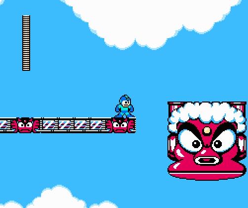

Notice the similarities, there is only one health gauge situated in each cases on the top left of the screen. This is deliberate, both these game have a very specific point in common, they are played left to right. In both cases the player must focus his/her attention to go to the right of the screen to win. Using subtle mind manipulation techniques by putting the gauge on the left of the screen, the game designers of back in the day helped to shape a focus on the right of the screen by negative contrast. It would be possible to make a game that focus on up to down action by putting UI elements on both side of the screen, games like Tetris.

Thus we can conclude that to have a great and timeless U.I it must be informative and placed in a way that contribute to the player experience, a U.I should never try to be an artistic statement and should be easy and quick to read for the player, ergonomic presentation is key. An example of U.I that does not follow these guidelines can be found in the Super Nintendo game Boogerman:

Observe how all the information is spread and how it would be difficult for a player to focus on the game while trying to understand the various meters, gauges and counters presented to him/her.
That kind of U.I for top down adventure/rpg games can be as complex or minimalistic as possible observe this screenshot from Link's awakening:

Observe that there is only 3 information on screen at once, active items both linked to the button on the system (A & B), money counter and heart/life counter system. All of these information are displayed at the bottom of the screen and once again this is intentional. The traditional Game Boy has no button or useful feature on it's hardware at the top of the screen, the player eyes are drawn automatically towards the bottom of the screen due to the button of the hardware being placed in that area. If our game would be played on a mobile device in portrait format it would be logical to place the U.I on top of the screen because the user fingers would be covering the bottom part of the screen, same goes for playing the title on a landscape format since the fingers of the user would be placed on both side of the screen to play, ideally the U.I should be slim in that case and centered in the middle of the screen.
##Featured U.I elements of project5001
###Health meter
Graphically the health meter should be easy to read for the player, it should contain the following functions:
- Deplete itself after getting damaged by any hazard or monster
- Scale as the user get health permanent bonuses
- Restore itself under circumstances such as power-ups
- Have a special status when the player is full heath
- Have a special status when the player is about the die
Ideally the Health meter should not use numerical values unless the player can gain more than 40 Health points. For instance the health meter could be little nondescript red or green keyboard touches that explode when the user get hit.
###Resource counter
Resources counters should be consistent, they should use numerical counter and be used sparingly to not clutter the screen with a large quantity of numbers, the human eye can only track so much data at once. Font used and counter should be easy to read and easy to scale since the title will be playable on a multitude of screen formats on android.
Numerical counters should have the following features:
- Icons displayed over them to indicate what resources they track
- Dynamic font colorization for minimal value and maximal values
- They should dynamically be adjusted when the player gain or lose resources
- The maximum amount possible should be up-gradable via power-ups.
For instance if we decided to use an arrow counter, at 0 on the counter the number should be dimmed to a darker color, the player then picks a quiver of arrow power-up on the ground the counter increase by 20, the counter font is now white. Then the player picks another quiver and reaches the maximum limit of arrow (40), the counter font is now green showing that the player cannot pick up any more arrows. When the user gains a large quantity of numbers in a counter there should be an odometer incrementation type animation and sound effect to make the user pay attention to the correlation between actions in game and their consequences on the U.I.
The active item/weapon U.I. uses are there to indicate the player what item they are currently using, they should be linked to button input and actively give feedback when the user activate said item. For game play and game mechanic reason we should limit the user at using 2 items at once, using more than that would exponentially make game control harder to integrate, imagine the user activating a grappling hook, a firestorm spell and swinging his sword at the same time!
Similar to "link's awakening" our item input system should have the following features:
- 2 item slots presented in the game U.I.
- Visual feedback in the U.I. when items are activated
- possibility of a "cooldown" feature on certain powerful items with visual implementation for user feedback.
- A feature to swap between items from the game item menu.