Process
Information about the design process and decisions behind LaserGraph.
In real-life laser tag, some arenas will print out and distribute score cards to players, featuring detailed stats about their performance and final score. In light of The Laser Game's core design to be authentic to laser tag, it is almost required to offer a similar feature to players.
While using D3.js is a requirement for the corresponding course project which this website is developed for, there is motivation for implementing a web client rather than implementing entirely in-game. Implementing a separate website allows us to distribute the visualization system open-source, as part of Quantonium's mission to contribute to the games industry. The web backend can form the foundation of a more sophisticated stats page, with server management and stats sharing, as well as be reused for other games by Quantonium and other companies. Being implemented within a website, the service can be viewed cross-platform, including mobile, and with Unreal Engine modifications, inside the game itself.
LaserGraph in its original form depends on data generated by The Laser Games, generated and explicitly shared by players. At time of writing, the public build of the game does not support the export features, however that will be present in the next major update.
LaserGraph itself was inspired by real life laser tag scorecards. Examples include scorecards given by LaserQuest and LaserMaxx facilities, however the actual visualizations present are inspired moreso by visuals seen in other games' stats websites. Many of the stats pages are community-made, using official and unofficial APIs and other means of data collection, to present game stats for an entire game or for specific players, in a visually appealing format.
Some examples:
- Overwatch's character stats (overwatch.blizzard.com)
- The Finals stats (thefinals.gg)
- Helldivers 2 stats (helldive.live).
Questions regarding this project revolve around generally, how to present data, and how to collect data in-game. For the course project, we proposed different visuals for per-game stats, as well as per-player account wide stats, and game-wide stats. Due to project scope, we ended up focusing only on per-game stats, however Quantonium plans to develop future visual systems for more scopes of data (and welcomes open-source contributions as well).
After deciding on which kind of visual(s) to develop, the question of what data was necessary arose. The game recorded match data in a format reminiscent of the format it uses internally to function, which allows for efficient gameplay programming, however it sometimes complicated parsing the data. So, depending on what data is to be presented, we also had to figure out how best to parse the data in javascript.
Data in the game is replicated from server to any clients, using Unreal Engine's own replication system. Any data intended for export for LaserGraph is marked as serialized. Please see the page about Unreal Engine JSON serialization, for more info on this process.
Additionally, please see the page "Sample Data Manifest," for an overview of the JSON structure of data which is provided to LaserGraph.
To assist with processing the data, we developed dataProcessor.js, containing a class with a series of helper functions and auxiliary data structures, to make iterating and reading specific parts of the data easier. Furthermore, some visualizations may perform their own parsing of data, such as sorting or filtering for a time range, beyond what the data processor provides. For specifics, refer to the relevant pages or the source code.
The initial version of the website was limited, as data collection was still being refined. Some of the first datapoints that were recorded were the hit info and general match data, which allowed visualizing some information per-hit, however without additional information, some data shown such as points ended up incorrect. Upon adding the events in the data, and additional information such as server time, we revised existing visuals to use the updated data, which corrected many unintentional visuals such as too long target names.
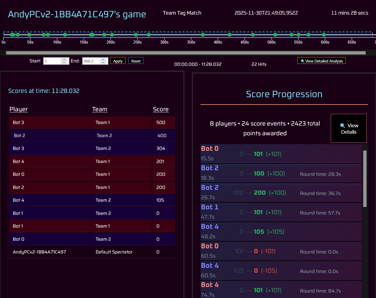
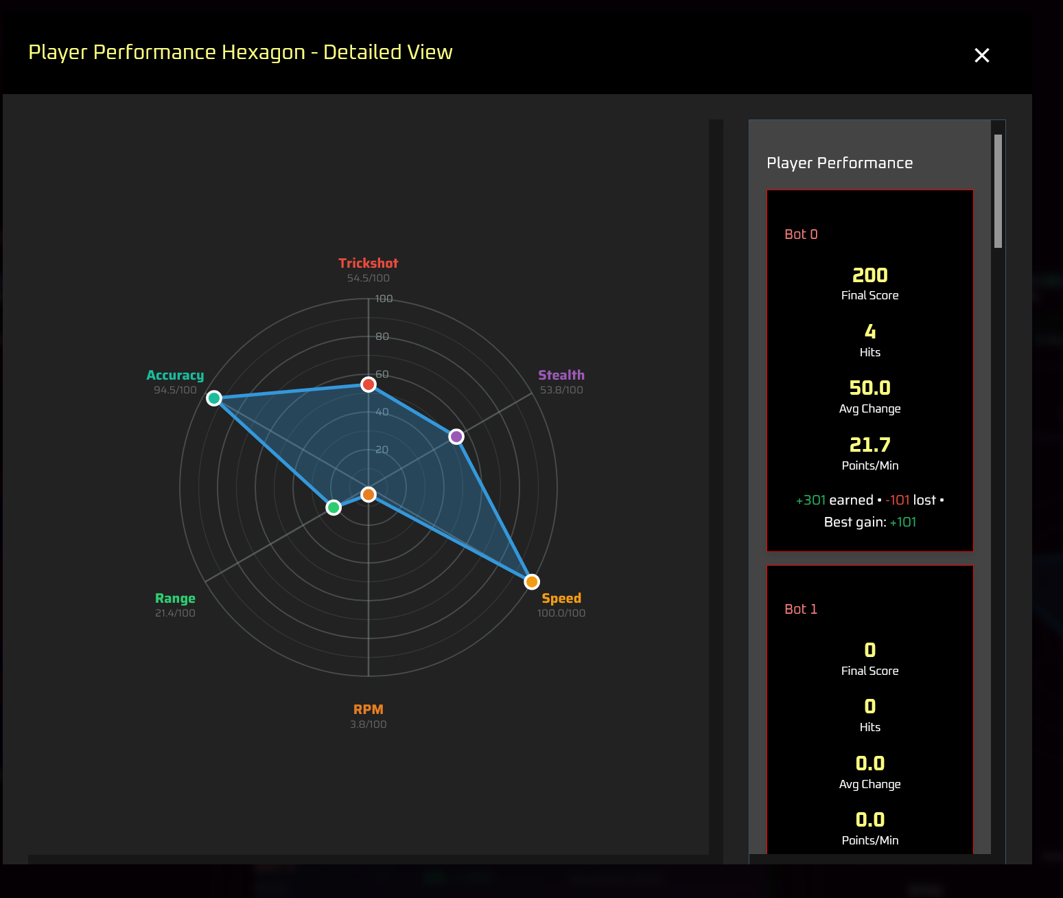
The page itself was initially planned to be a grid layout, with "calculated metrics" on the bottom of the page containing numeric data. We tried different grid layouts, seeking something with the hit timeline at the top (like it is in the current form), at the center a list of score info (either the score progression currently, or a leaderboard like what's shown in the top-left, or a player vs player chart analysis of hits), and to the left, right, and bottom, secondary visuals such as pie charts or graphs. We ended up settling on the hit timeline along the top of the page, and an even 3x2 grid layout, which provides ample room to display plenty of information for visuals, and allows the option to scroll data if necessary. We also combined the metrics data shown at the bottom, into the player performance hexagon at the top right, as both displayed the same information.
One challenge with the visualizations, is scrolling, both from a technical and UX standpoint. Part of the reason the player metrics was moved was because when on the bottom of the page, on a standard 16:9 monitor it was easy to miss it. Additional changes were made to full-screen visualizations (described below), all with the goal of minimizing scrolling the user would have to do, and passively showing to the user (such as with visual clipping or the scrollbar being visible) that the region is scrollable with more data to view.
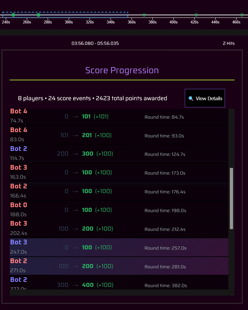
We implemented full-screen visualizations to allow more interactivity with the website. The fullscreen visualizations are intended to provide more details about the visual the user had just clicked on. The exact data contained in these windows has changed as development progressed- most notably, some data on the right of the visualizations were moved around to other fullscreen views, to better provide unique data on each fullscreen visual, and in a format that did not require significant scrolling by the user.
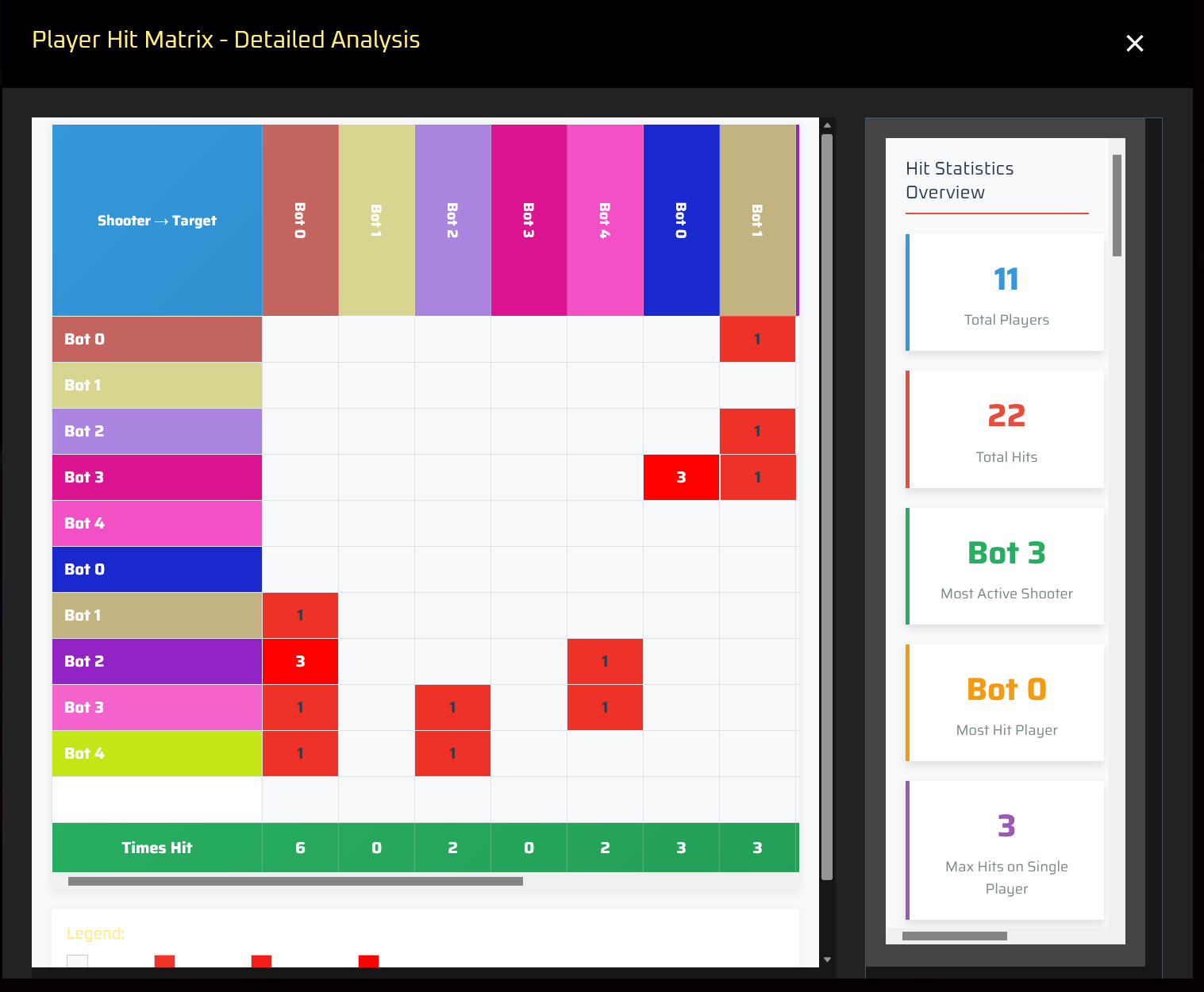
One visual in particular which we removed entirely, was a histogram in the full-screen visual of the target distribution pie chart, as the data present was more or less the same data shown already in the pie chart. It was replaced by a work-in-progress hit matrix, showing a grid of players tagging and being tagged, and how many times in each cell. Clicking a cell shows information about each hit between the two players.
As a final step before the course submission, a lot of the CSS and styling of the website was changed, in an effort to condense space, and conform to the dark theming of The Laser Games.
LaserGraph is not complete. While the course assignment may be submitted, there is still work to do for developing the website for The Laser Games. Some tweaks include finishing the hit matrix, and adding a sixth visualization to fill the empty bottom-right grid spot, as well as implementing per-team and per-player filtering. Furthermore, we would like the page to support printing on paper, as a sort of easter egg to how real-life laser tag prints scorecards.
Longer-term changes include integration with the Steamworks backend, to potentially allow players to upload their game stats files directly from Steam Cloud, in addition to the local filesystem. This would be expanded into a more complete API for exposing match stats via a web service, as well a providing means of privacy filtering for such.
In the end, LaserGraph would aim for detailed stats about matches, players, and the entire game. We hope it forms the foundation for community supported stats and visualizations, as a component of The Laser Games's core game design.