Visualization Gallery
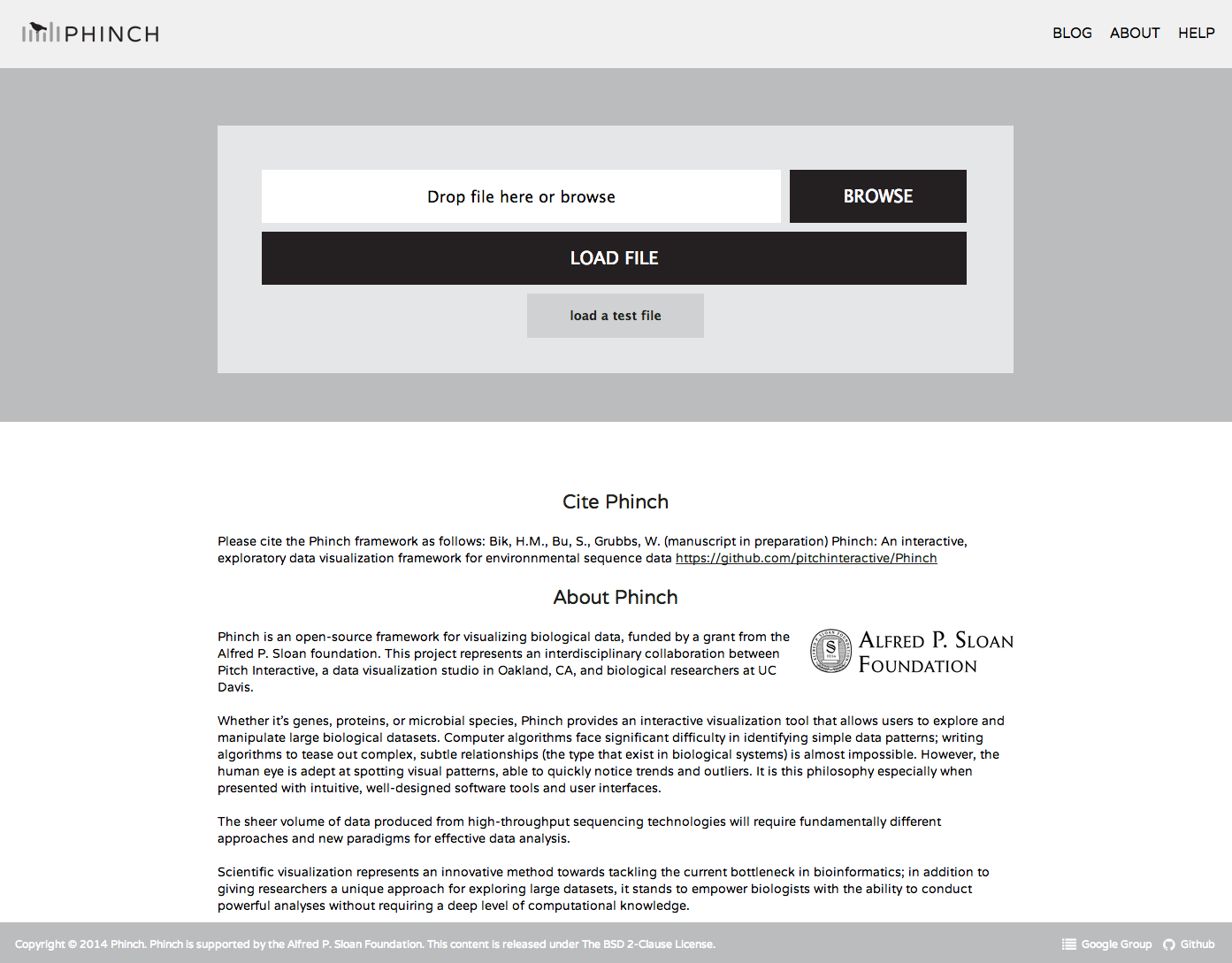
###Phinch homepage - http://phinch.org
Here you can upload your .biom file (prepared according to these instructions)
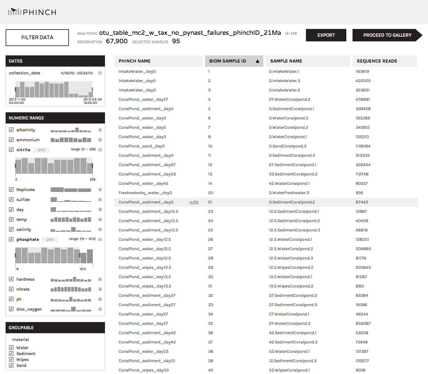
After clicking "Load File" (or importing our test data by clicking "Load a test file"), you'll be taken to the parser window. The parser will automatically detect your sample names (including phinchID names for populating graph axes) and all accompanying sample/environmental metadata embedded in the BIOM file. Clicking on the column headers (Phinch Name, BIOM Sample ID, Sample Name, Sequence Reads) will allow you to sort columns in ascending or descending order. The left column can be used to filter out samples according to specific metadata criteria (e.g. selecting a specific numerical range of temperatures, or only including samples collected from "Sediment"). The right-hand list of samples will be updated in real time as you modify the selection of metadata parameters; only those that fit the selected criteria will be displayed.
Click "Proceed to Gallery" to be taken to the visualization options.
We currently have five visualizations implemented. Each of these can be used to explore and interact with different aspects of your data and metadata.
Within each visual, users have the option to download Phinch files (log files and modified BIOM files), Export screenshots of visualizations (as publication-ready vector graphics), and Share visuals with collaborators (using a link-sharing function that stores user datasets and visualizations on our servers).

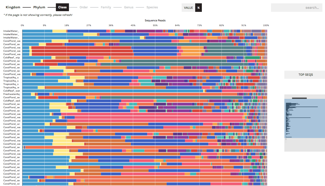
The Taxonomy Bar Chart can be used to display the community compositions (or gene ontologies, or other observation data) present across samples. In the following screenshots we are displaying 16S rRNA data (bacteria/archaea) sampled from experimental aquariums at UC Davis.
Users can toggle between displaying absolute sequence abundances (by clicking the "Value" button) or normalized/proportional abundances (by clicking the "%" button). The progress bar allows users to explore taxonomy bar charts at higher or lower levels (e.g. Phylum vs. Order)
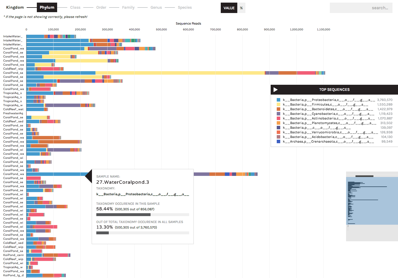
A search button in the upper right allows users to locate specific taxa of interest (or gene ontologies, etc.). Users can start typing in the search box and the results list will auto-complete a list of matching taxa that are present in your dataset. Hovering over a taxon in the list will highlight it within the bar chart, and users have the option to remove any taxa from bar charts (for example, known lab contaminants) by clicking the "hide" link that appears to the right of a search term.
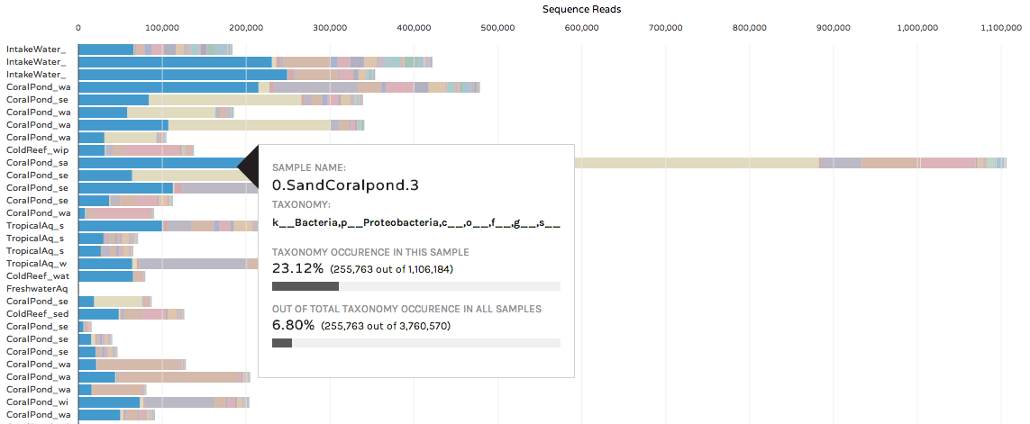
Hovering over a colored bar will return a pop-up box with information about taxonomy, and the occurrence of a taxon in that sample and across the entire dataset:
Users can also hide samples, or rearrange the order of bars by hovering over the phinchID name on the left hand side:

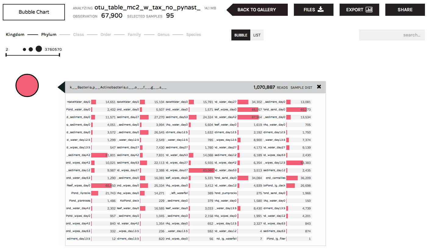
The bubble chart summarizes observation data (taxonomy, gene ontologies, etc.) according to abundance in a dataset. Larger bubbles are more abundant, and smaller bubbles are less abundant in a dataset.
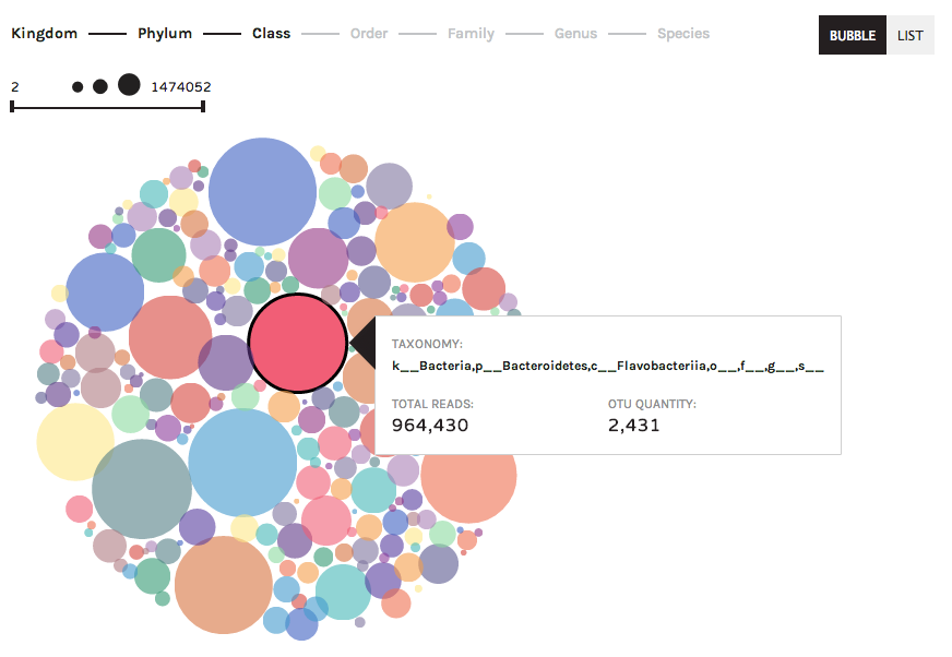
Clicking on a bubble will give users information about the distribution of a taxon (or gene ontology, etc.) across samples:
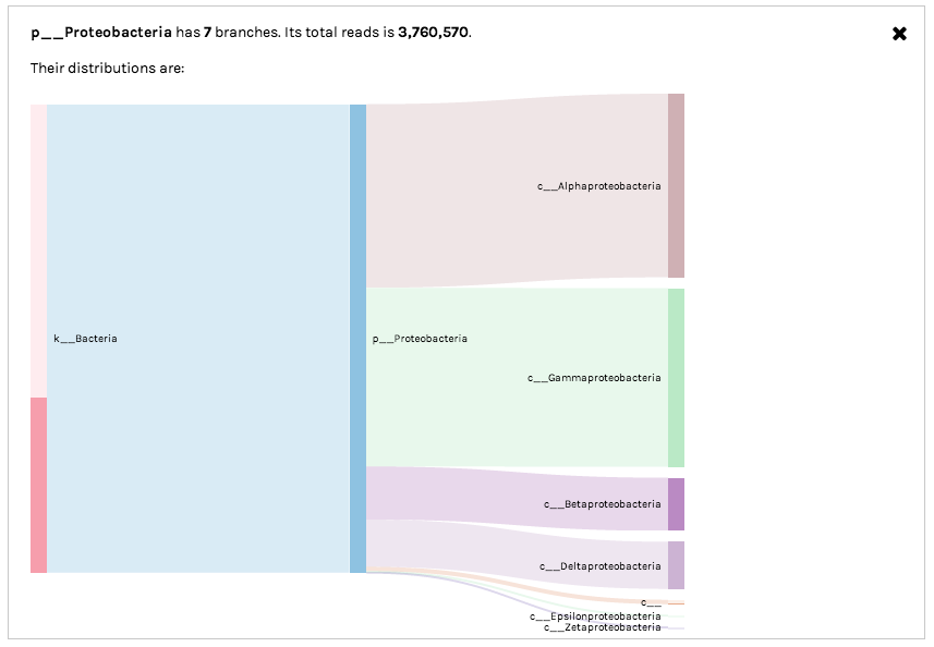
Sankey diagrams are useful for observing the "flow" of data points across observation hierarchies (taxonomic levels or hierarchical gene ontologies). For example, the following screenshot shows how 16S rRNA OTUs assigned to Class Gammaproteobacteria are broken down into lower taxonomic levels (representation of different bacterial Orders):
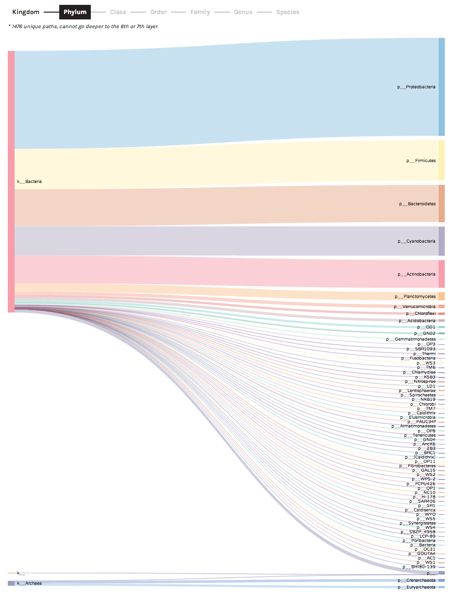
Clicking on a bar in the Sankey diagram will isolate a specific observation hierarchy. For example, Sankey diagrams can be used to explore "unclassified" data partitions. In the following example, we can see that 16S rRNA OTUs with no taxonomic assignment at the Order level (middle bar denoted by o__) actually are derived from a variety of higher-level bacterial groups (Classes including Gammaproteobacteria and Alphaproteobacteria). In this case, the unclassified OTUs most likely represent novel environmental diversity amongst sampled microbes.
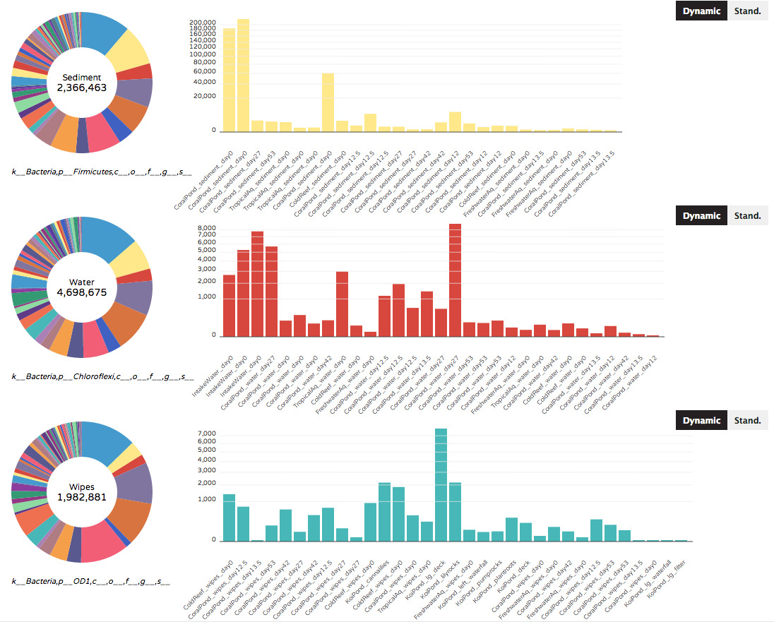
The Donut Partition summarizes community composition (taxonomy or gene ontologies) for non-numerical "groupable" sample metadata. Clicking on a colored bar within each donut will show the distribution of a taxon (or gene ontology) across samples within that metadata category. The same or different taxa can be selected for each donut. Graph axes can vary across donuts (dynamic according to taxon/gene abundances), or can be set to a single standardized axis used across all donuts.
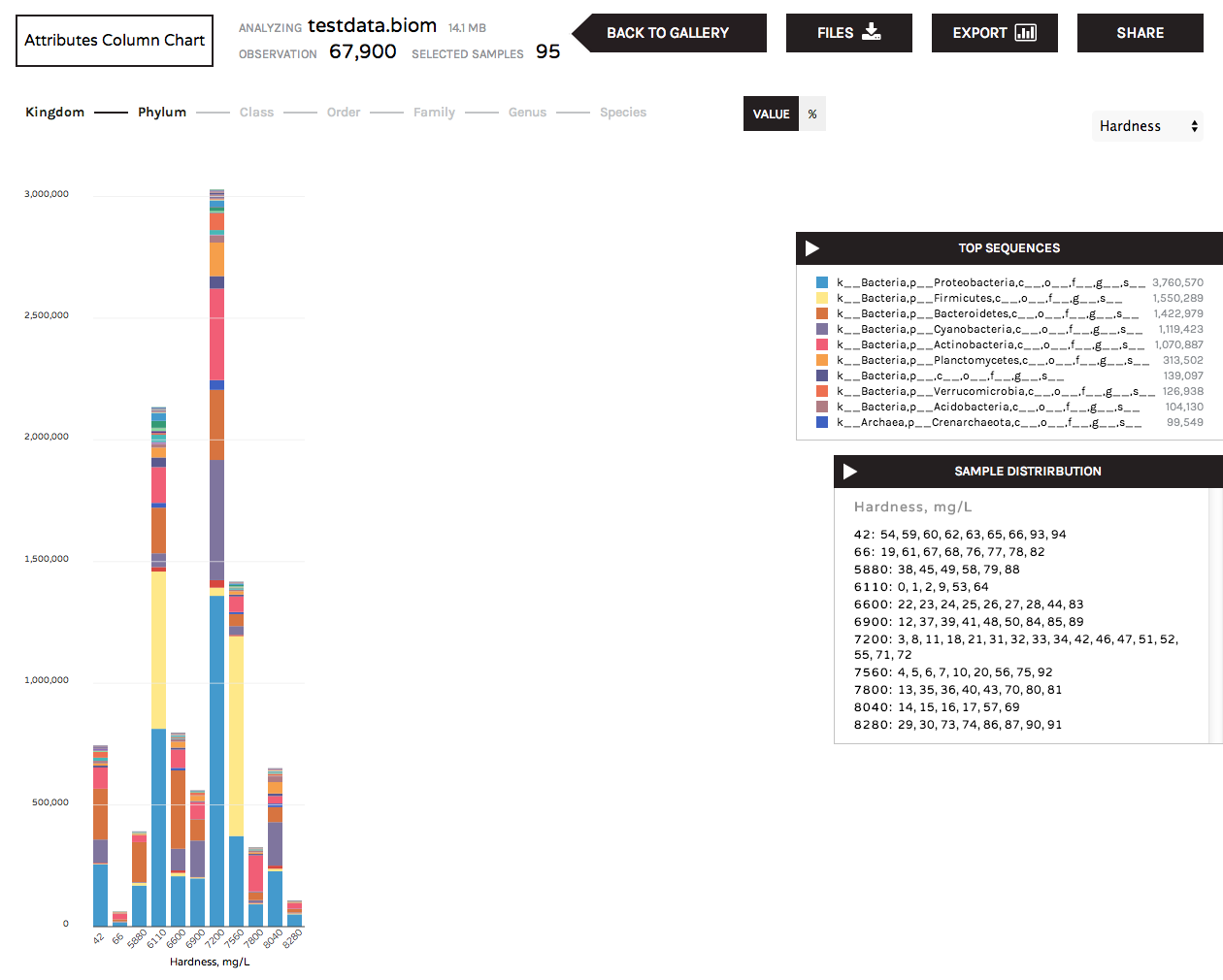
The Attributes Column Chart summarizes community composition (taxonomy or gene ontologies) for numerical categories of sample metadata. For example, pH readings, temperature or biogeochemical readings such as nitrite, ammonium, or salinity. The "sample distributions" box lists the samples that are grouped under the numerical values represented by each bar.