In this repository, I created a visualization dashboard website using visualizations created in a past assignment (see my GitHub repository: python-api-challenge).
Navigating Through The Repository
The structure of the repository is simple:
- In the main repo page, you can find the html files for each web page, as well as the css file for the styling.
- In data processing you can find the jupyter notebook and files for the conversion from csv to html.
- In resources you can find the images used on the web page.
- In screenshots you can find screenshots regarding the web page, and different screen sizes.
Webpage: Contents
- A landing page
This page contains an explanation of the project, as well as links to each visualizations page. There also is a sidebar containing preview images of each plot, and clicking an image takes the user to that visualization.
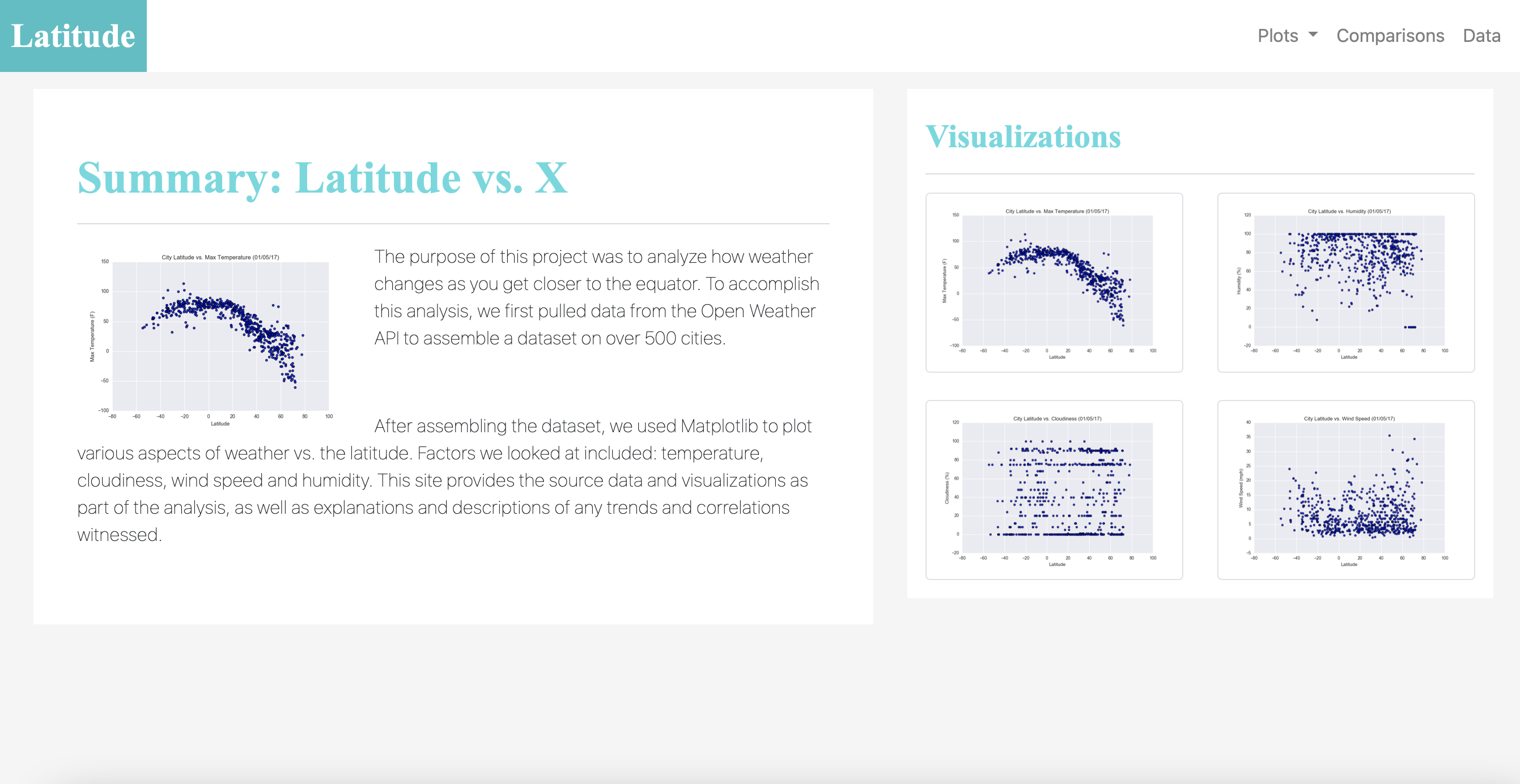
- Four visualization pages
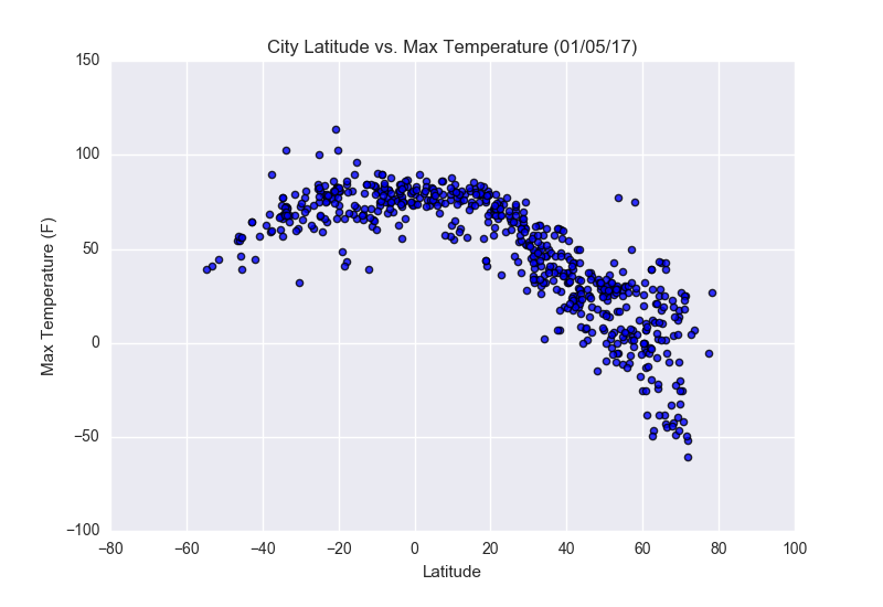
Each of these pages includes a descriptive title and heading tag, preceding the plot/visualization itself for the selected comparison. With each image, there is a paragraph describing the plot and its significance.

- A comparison page
It contains all of the visualizations on the same page so they can be all seen easily, and thus, compared.
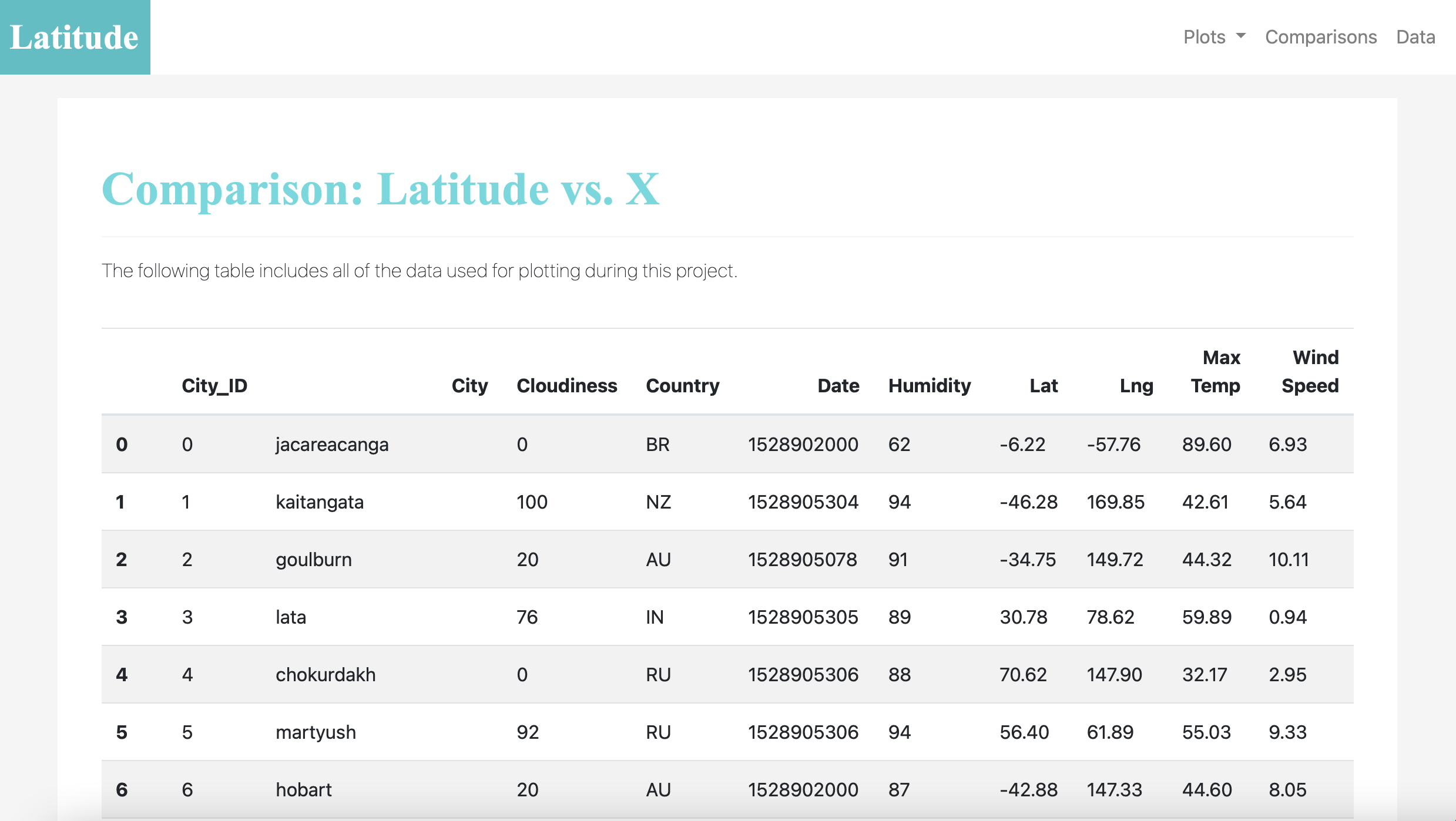
- A data page
This page displays a responsive table containing the data used in the visualizations.
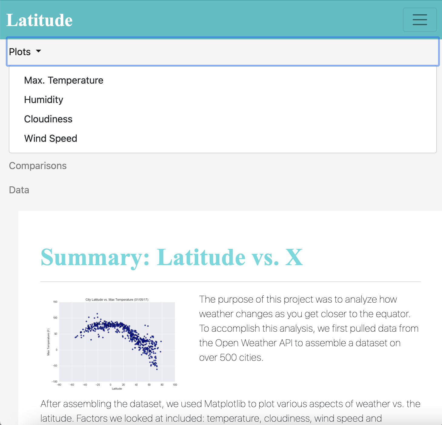
Webpage: Properties
Size is responsive to the size of the screen: navigation bar, grids and tables all adjust to different screen sizes. Bootstrap was used for styling, as well as specifically for the navbar, thumbnail and responsive table.
Visit my Latitude Dashboard: https://verocastillo.github.io/web-design-challenge/