Releases: tobitege/Flowery.NET
v1.9.2
📋 What's Changed
Changed
- Bumped Avalonia package references across the library, gallery, desktop, browser, capture, and test projects to
11.3.12, includingAvalonia.Skia,Avalonia.Desktop,Avalonia.Browser,Avalonia.Diagnostics,Avalonia.Fonts.Inter,Avalonia.Headless,Avalonia.Headless.XUnit, andAvalonia.Themes.Fluent. - Bumped
System.Text.Jsonto10.0.3. - Updated test infrastructure packages:
Microsoft.NET.Test.Sdkto18.3.0andcoverlet.collectorto8.0.0.
📦 Library
| Asset | Description |
|---|---|
Flowery.NET.1.9.2.nupkg |
NuGet package (also on nuget.org) |
Flowery.NET-lib.zip |
Compiled DLL and PDB |
🌸 Gallery Demo App
Self-contained executables - no .NET installation required!
| Platform | Download |
|---|---|
| Windows x64 | Flowery.Gallery-Windows-x64.zip |
What's Changed
- Bump Avalonia.Desktop from 11.3.11 to 11.3.12 by @dependabot[bot] in #13
- Bump Avalonia, Avalonia.Headless and Avalonia.Headless.XUnit by @dependabot[bot] in #15
- Bump coverlet.collector from 6.0.4 to 8.0.0 by @dependabot[bot] in #16
- Bump System.Text.Json from 10.0.2 to 10.0.3 by @dependabot[bot] in #17
- Bump Microsoft.NET.Test.Sdk from 18.0.1 to 18.3.0 by @dependabot[bot] in #18
- Bump Avalonia.Browser from 11.3.11 to 11.3.12 by @dependabot[bot] in #20
- Bump Avalonia and Avalonia.Diagnostics by @dependabot[bot] in #21
- Bump Avalonia and Avalonia.Fonts.Inter by @dependabot[bot] in #22
- Bump Avalonia and Avalonia.Skia by @dependabot[bot] in #23
- Bump Avalonia and Avalonia.Themes.Fluent by @dependabot[bot] in #24
Full Changelog: v1.9.1...v1.9.2
Contributors
Assets 5
v1.9.1
📋 What's Changed
Changed
- Theme Controls: Exposed
IsCurrentThemeDarkas a read-only pass-through toDaisyThemeManager.IsCurrentThemeDark. - Bump Avalonia NuGet refs to 11.3.11 from 11.3.10.
- Centralize version metadata in Directory.Build.targets. Keeping it in lib project for workflows, though.
📦 Library
| Asset | Description |
|---|---|
Flowery.NET.1.9.1.nupkg |
NuGet package (also on nuget.org) |
Flowery.NET-lib.zip |
Compiled DLL and PDB |
🌸 Gallery Demo App
Self-contained executables - no .NET installation required!
| Platform | Download |
|---|---|
| Windows x64 | Flowery.Gallery-Windows-x64.zip |
Full Changelog: v1.9.0...v1.9.1
v1.9.0
📋 What's Changed
New
- DaisyClock: New multi-mode time control with Clock, Timer, and Stopwatch modes; supports segmented/flip/text display styles, labels, 12h/24h formatting, and lap support.
- DaisyPasswordBox: New themed password input with reveal toggle, label modes (including floating), helper text, validation states, and icon slots.
- DaisySlideToConfirm: New drag-to-confirm interaction control with variant colors, depth styles, auto-reset behavior, and completion events.
- DaisyIconText: New reusable icon+text composition control with placement, size, spacing, and variant support.
- DaisyPatternedCard: New decorative card with pattern backgrounds and ornaments, backed by new pattern assets and rendering helpers.
- DaisyProductThemeDropdown: New dropdown for product-specific palettes with runtime theme registration via
DaisyThemeManager. - Added foundational helper utilities for lifecycle wiring, alarms/timers, slide transitions/effects, path/color helpers, and pattern loading/tiling.
Changed
- DaisyThemeManager / Theming: Extended to support runtime theme registration and palette factories, including a large generated product palette catalog.
- DaisyLoading: Expanded with business and retro Win95 animation families, increasing overall variant coverage.
- DaisyStatusIndicator: Refactored into partial classes and expanded with glyph-driven variants (battery, traffic lights, wifi/cellular signal) plus richer motion/effect styles.
- DaisyCarousel: Refactored to internal slide container architecture with improved navigation, slideshow modes, and transition options.
- DaisyDrawer: Added responsive/overlay behavior tuning, swipe interactions, and improved
SplitViewsync compatibility. - DaisyPagination: Added generated page ranges (
TotalPages,MaxVisiblePages, centering), optional nav/jump buttons, ellipsis logic, wheel navigation, and press-and-hold repeat. - DaisyExpandableCard: Added batteries-included content mode, configurable animation duration, and improved expansion shaping behavior.
- DaisyButtonGroup, DaisyDivider, DaisyIndicator, DaisyJoin, DaisySteps, DaisyTabs, and DaisyCountdown received substantial feature parity, tokenization, and behavior updates.
Gallery App
- Added and expanded demos across Actions, Cards, Data Display, Data Input, Divider, Feedback, Layout, and Navigation example pages.
- Added gallery coverage for newly ported controls and expanded Status/Loading/interactive scenarios.
- Updated gallery sidebar/category metadata and added refreshed visual assets (including new banner artwork).
Localization
- Synced and expanded localization keys across all supported languages in both library and gallery resources (
ar,de,en,es,fr,he,it,ja,ko,tr,uk,zh-CN).
Documentation
- Updated theming and localization guides (
THEMING.md,LOCALIZATION.md). - Updated LLM-facing docs for control behavior/token changes and added new docs for
DaisyClock.
📦 Library
| Asset | Description |
|---|---|
Flowery.NET.1.9.0.nupkg |
NuGet package (also on nuget.org) |
Flowery.NET-lib.zip |
Compiled DLL and PDB |
🌸 Gallery Demo App
Self-contained executables - no .NET installation required!
| Platform | Download |
|---|---|
| Windows x64 | Flowery.Gallery-Windows-x64.zip |
What's Changed
- Bump Avalonia.Desktop from 11.3.10 to 11.3.11 by @dependabot[bot] in #8
- Bump Avalonia, Avalonia.Headless and Avalonia.Headless.XUnit by @dependabot[bot] in #10
- Bump System.Text.Json from 10.0.1 to 10.0.2 by @dependabot[bot] in #11
- v1.9.0 feature bump by @tobitege in #12
New Contributors
Full Changelog: v1.8.0...v1.9.0
Contributors
Assets 5
Gallery 1.8.0-gallery.1
Gallery Demo App Update
What's Changed
Minor Gallery visual fixes in Showcase examples
This is a Gallery-only release containing updates to the demo application.
The underlying Flowery.NET library version remains at 1.8.0.
Downloads
Self-contained executables - no .NET installation required!
| Platform | Download |
|---|---|
| Windows x64 | Flowery.Gallery-Windows-x64.zip |
| Linux x64 | Flowery.Gallery-Linux-x64.tar.gz |
| macOS Intel | Flowery.Gallery-macOS-x64.tar.gz |
| macOS Apple Silicon | Flowery.Gallery-macOS-arm64.tar.gz |
For the NuGet package, see the latest library release: v1.8.0
Full Changelog: v1.8.0...v1.8.0-gallery.1
v1.8.0
📋 What's Changed
New
This is planned to be last v1.x release and will be kept stable.
Further development will go into upcoming alpha branch.
At least that's the plan. Happy holidays 2025!
Changed
- Used NuGet packages versions updated, e.g. for Avalonia UI.
Fixed
- DaisyPopover / DaisyDropdown / DaisySelect: Fixed shutdown-time binding warnings caused by
Popup.MinWidthbindings to triggerBounds.Widthduring teardown.
📦 Library
| Asset | Description |
|---|---|
Flowery.NET.1.8.0.nupkg |
NuGet package (also on nuget.org) |
Flowery.NET-lib.zip |
Compiled DLL and PDB |
🌸 Gallery Demo App
Self-contained executables - no .NET installation required!
| Platform | Download |
|---|---|
| Windows x64 | Flowery.Gallery-Windows-x64.zip |
| Linux x64 | Flowery.Gallery-Linux-x64.tar.gz |
| macOS Intel | Flowery.Gallery-macOS-x64.tar.gz |
| macOS Apple Silicon | Flowery.Gallery-macOS-arm64.tar.gz |
What's Changed
- Bump System.Text.Json from 8.0.5 to 10.0.1 by @dependabot[bot] in #7
- Bump Avalonia, Avalonia.Headless and Avalonia.Headless.XUnit by @dependabot[bot] in #6
- Bump Avalonia.Desktop from 11.3.9 to 11.3.10 by @dependabot[bot] in #4
New Contributors
- @dependabot[bot] made their first contribution in #7
Full Changelog: v1.7.2...v1.8.0
Contributors
Assets 8
v1.7.2
📋 What's Changed
Fixed
- Gallery App: Improved Avatar examples so content scales with the avatar (removed hardcoded icon sizes); placeholder and avatar-group demos now participate in global size scaling.
- Gallery App: Card Stack demo now hides navigation buttons when there is no previous/next card.
- Gallery App: Fixed clipping in
Carddemo on Android. - Gallery App: Fixed
Contribution Graphsizing to work on narrow Android screens. - DaisyAvatar: Avatar content now scales correctly with global size tiers (FontSize mapped via design tokens)
- DaisyCollapse: Now participates in global size tiers (added
Sizeproperty + theme uses design tokens for sizing) - DaisyButtonGroup / DaisyJoin / DaisyDock: Fixed FluentTheme hover state overriding joined segment borders (borders/dividers “disappearing”) by targeting
ContentPresenter#PART_ContentPresenterin scoped styles - DaisyList: Fixed row hover divider contrast and embedded icon-button hover feedback to prevent flicker/inconsistent hover states
- DaisyNumberFlow: Fixed Browser/WASM button-hold repeat causing flickering/skipped digits by preventing repeat from outpacing the animation and normalizing animation step timing
New
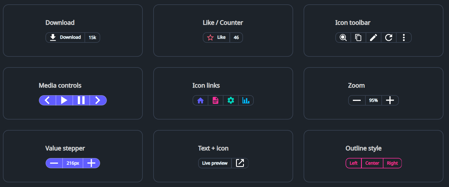
- DaisyButtonGroup: New segmented button-group container for joined buttons and non-clickable parts (counters/labels), with size/variant/shape options and optional auto-selection.
📦 Library
| Asset | Description |
|---|---|
Flowery.NET.1.7.2.nupkg |
NuGet package (also on nuget.org) |
Flowery.NET-lib.zip |
Compiled DLL and PDB |
🌸 Gallery Demo App
Self-contained executables - no .NET installation required!
| Platform | Download |
|---|---|
| Windows x64 | Flowery.Gallery-Windows-x64.zip |
| Linux x64 | Flowery.Gallery-Linux-x64.tar.gz |
| macOS Intel | Flowery.Gallery-macOS-x64.tar.gz |
| macOS Apple Silicon | Flowery.Gallery-macOS-arm64.tar.gz |
Full Changelog: v1.7.1...v1.7.2
v1.7.1
📋 What's Changed
Fixed
- Binding Errors: Fixed runtime binding errors when using converters with structural types
DaisyInput/DaisyMaskInput: FixedMarginbinding toStartIconthat incorrectly usedObjectConverters.IsNotNull(returnsbool) with aConverterParameterexpectingThicknessoutputScaleExtension: FixedPadding/Marginbindings toScaledValuefailing becausedoublecannot auto-convert toThickness
- Gallery App: Global Size selection is now remembered across restarts (persisted like Theme/Language); renamed
ThemeSettings.cstoGallerySettings.cs - DaisyToast: Fixed default transparent toast container background which could make toast content unreadable depending on what's behind it
New
- DaisyNumberFlow: New high-quality numeric display with individual digit scrolling animations
- Smooth, granular animation: only changed digits are animated
- Fully locale-aware: supports all standard .NET format strings (C2, P0, N2, etc.)
- Configurable easing and duration
- WASM-compatible manual interpolation for consistent performance
- FloweryConverters: Added new converter utilities in
Flowery.ServicesNullToThicknessConverter: Returns aThicknessfromConverterParameterwhen value is not null, zero otherwiseDoubleToThicknessConverter: Converts adoubleto a uniformThickness
Enhanced
- ScaleExtension: Now automatically detects when the target property type is
Thickness(Padding, Margin, etc.) and appliesDoubleToThicknessConverterinternally
Design Tokens
- Font Size Tiers: Added comprehensive typography scale to
DaisyTokens.axamlDaisySize{Size}SecondaryFontSize: For hint text, helper text, captions (~0.8x of primary)DaisySize{Size}TertiaryFontSize: For very small captions, counters (~0.7x of primary)DaisySize{Size}HeaderFontSize: For section titles, headings (~1.4x of primary)
- FlowerySizeManager.ResponsiveFont: New attached property for responsive font sizing
- Tiers:
Primary,Secondary,Tertiary,Header - Usage:
<TextBlock controls:FlowerySizeManager.ResponsiveFont="Primary" /> - Automatically subscribes to
SizeChangedevent and updates font size programmatically
- Tiers:
Gallery App
- Responsive Example Descriptions: All example section descriptions now scale with the global size selector using
ResponsiveFontattached property
Documentation
- FlowerySizeManager.md: New dedicated documentation for global size management
- API reference, attached properties (
IgnoreGlobalSize,ResponsiveFont) - Custom control integration patterns
- Comparison with FloweryScaleManager
- API reference, attached properties (
- SizingScaling.md: Added "Responsive Font for TextBlocks" section
- Documents the
ResponsiveFontattached property - Explains why DynamicResource doesn't work for this use case
- Documents the
- DesignTokens.md: Updated font size documentation with attached property usage
Refactored
- Localization: Centralized supported languages list to eliminate code duplication
FloweryLocalization.SupportedLanguages: Public static list of all language codesFloweryLocalization.LanguageDisplayNames: Public dictionary of native display namesSidebarLanguage.CreateAll(): Factory method using centralized data- Gallery app now consumes library's list instead of hardcoding languages
- Updated LOCALIZATION.md with new API documentation
📦 Library
| Asset | Description |
|---|---|
Flowery.NET.1.7.1.nupkg |
NuGet package (also on nuget.org) |
Flowery.NET-lib.zip |
Compiled DLL and PDB |
🌸 Gallery Demo App
Self-contained executables - no .NET installation required!
| Platform | Download |
|---|---|
| Windows x64 | Flowery.Gallery-Windows-x64.zip |
| Linux x64 | Flowery.Gallery-Linux-x64.tar.gz |
| macOS Intel | Flowery.Gallery-macOS-x64.tar.gz |
| macOS Apple Silicon | Flowery.Gallery-macOS-arm64.tar.gz |
Full Changelog: v1.7.0...v1.7.1
v1.7.0
📋 What's Changed
New
- DaisyContributionGraph: New GitHub-style contribution heatmap control (7×53 grid) with month/day labels, tooltips, and legend
- Added
HighlightMonthStartBordersoption to accent the 1st of each month with a secondary border
- Added
- DaisyOtpInput: New multi-slot verification-code/OTP input
- Features animated focus transitions and auto-advance support
- Supports custom separators and grouping
- DaisyPopover: New Popup-based popover control for rich hover/click content
- DaisyDropdown: New menu-style dropdown (Popup + DaisyMenu) for action menus
- DaisyCopyButton: New copy-to-clipboard button with temporary success state
- DaisyTagPicker: New multi-select chip/tag picker
- DaisyAnimatedNumber: New animated numeric display control (slide transition on value changes)
- DaisyExpandableCard: New card control that expands to reveal a secondary content area with smooth width animation
- TypewriterBehavior: New behavior for sequential character reveal animations
- ScrollRevealBehavior: New behavior for viewport-aware reveal animations
- New controls inspired by SmoothUI
Enhanced
- DaisyTagPicker: Refactored to a templated control matching "Animated Tags" UI
- Separates selected tags into a distinct, bordered area with "remove" icons
- Keeps available tags in a separate list with "add" icons
- Added
Titleproperty for the selected tags section
- DaisyInput: Implemented high-fidelity "Floating" label interaction (
LabelPosition="Floating")- Features an "identity clone" start state (matches watermark size/position) with instant style snap and delayed smooth float animation
- Added
:hastextpseudo-class for state tracking - Added dedicated Design Tokens for floating input heights to ensure consistent vertical headroom
- DaisyProgress: Added smooth width transitions for value updates
- WaveTextBehavior: Added true per-character ripple effect using
IsPerCharacter="True"andStaggerDelaysupport - RevealBehavior: Added
ManualTriggerOnlyproperty to prevent auto-triggering (essential for ScrollReveal integration)
Gallery App
- Added/updated examples for Contribution Graph, OTP Input, Tag Picker, Copy Button, Popover, Dropdown Menu, and Animated Number
- Interactive Demos: Added new live examples for Floating Labels, Animated Progress (slider-driven), and Per-Character Wave text effects
- Contribution Graph example includes a toggle to enable/disable month-start border highlighting
- Added a SmoothUI “Phototab” recipe example built from
DaisyTabs - Showcase (Eye Candy): Added new high-fidelity interaction demos:
- Expandable Cards: Interactive card grid that expands to detail view
- Power-Off Slide: Smooth slide-to-confirm interaction pattern
- Typewriter Text: Sequential text reveal animation
- Scroll Reveal: Elements that animate into view as they enter the scroll viewport
- Figma Comment: Interactive expandable comment bubble recipe
- Card Stack: Stacked card interface with depth effects and navigation
Design Tokens
- Added new
DaisyInputFloating*Heighttokens toDaisyTokens.axamlfor floating label headroom - Updated
DesignTokens.mddocumentation with new height references
📦 Library
| Asset | Description |
|---|---|
Flowery.NET.1.7.0.nupkg |
NuGet package (also on nuget.org) |
Flowery.NET-lib.zip |
Compiled DLL and PDB |
🌸 Gallery Demo App
Self-contained executables - no .NET installation required!
| Platform | Download |
|---|---|
| Windows x64 | Flowery.Gallery-Windows-x64.zip |
| Linux x64 | Flowery.Gallery-Linux-x64.tar.gz |
| macOS Intel | Flowery.Gallery-macOS-x64.tar.gz |
| macOS Apple Silicon | Flowery.Gallery-macOS-arm64.tar.gz |
Full Changelog: v1.6.0...v1.7.0
v1.6.0
📋 What's Changed
New
- ScaleExtension: New markup extension for responsive scaling with minimal XAML (
Flowery.Services)- Semantic presets:
FontTitle,FontBody,SpacingMedium,CardWidth, etc. (24 built-in presets) - Automatic window size detection - no more verbose
$parent[Window]bindings - Usage:
<TextBlock FontSize="{services:Scale FontTitle}"/>instead of long converter bindings - Supports custom values:
{services:Scale 24,12}for base 24, min 12
- Semantic presets:
- FloweryScaleConfig: Configuration for scale presets
- Override preset values at app startup:
FloweryScaleConfig.SetPresetValues(FloweryScalePreset.CardWidth, 450) - Adjust reference dimensions (default: 1920×1080 HD)
- Adjust minimum scale factor (default: 0.5)
- Override preset values at app startup:
- FloweryScaleConverter: Proportional scaling converter for advanced scenarios
- Real-time continuous scaling as window resizes (unlike discrete breakpoints)
- Configurable
ReferenceWidth,ReferenceHeight,MinScaleFactorproperties
- DaisyButton: Added
IconLeft,IconRight, andIconSpacingproperties- Place icons alongside button text without manual StackPanel wrappers
- Icons auto-hide when null, auto-show when set
IconSpacingcontrols gap between icons and content (default: 6px)- Usage:
<controls:DaisyButton Content="Add"><controls:DaisyButton.IconLeft><PathIcon .../></controls:DaisyButton.IconLeft></controls:DaisyButton>
- LocalizeExtensionBase: Abstract base class for localization markup extensions
- Apps inherit and plug in their localization source via
GetLocalizedString()andSubscribeToCultureChanged() - Eliminates boilerplate code duplication across projects
- Flowery.NET and Gallery now use this base class
- Apps inherit and plug in their localization source via
- FloweryLocalization.CustomResolver: New extensibility point for app-specific localization
- Apps can set
FloweryLocalization.CustomResolver = MyAppLocalization.GetStringto provide translations for library controls - Enables
FloweryComponentSidebarto display localized sidebar item names from the consuming app - Library's internal keys (
Size_*,Theme_*,Accessibility_*) remain unaffected
- Apps can set
- FlowerySizeManager: New FlowerySizeManager service for app-wide size control (ExtraSmall to ExtraLarge)
- DaisySizeDropdown: Standalone control with localized size names (12 languages)
- New
SizeOptionsproperty for full customization SizePreviewInfo.IsVisibleto hide unwanted sizesSizePreviewInfo.DisplayNameOverridefor custom labels (overrides localized text)- Example: Show only "Compact", "Normal", "Large" instead of all 5 sizes
- New
- IgnoreGlobalSize attached property for size demonstration exemptions
- GlobalSizing.md documentation with usage examples
- Gallery applies global size on startup and category navigation
- FloweryScaleConverter.md: Comprehensive documentation covering both ScaleExtension and FloweryScaleConverter
- LocalizeExtensionBase.md: Documentation for creating app-specific LocalizeExtension classes
- FloweryScaleManager: Opt-in automatic font scaling for Daisy controls (
Flowery.Services)- Set
services:FloweryScaleManager.EnableScaling="True"on any container to enable - All child Daisy controls (DaisyInput, DaisyButton, DaisySelect, DaisyBadge, etc.) auto-scale their fonts
- Non-breaking: controls behave normally unless EnableScaling is explicitly enabled
IScalableControlinterface for custom control scaling supportOverrideScaleFactor: Optional manual zoom override (bypasses window-size calculation)
- Set
- Hebrew Localization: Added Hebrew (he) as the 12th supported language across both library and Gallery
Gallery App
- Scaling Examples: New showcase page demonstrating
ScaleExtensionwith real-world customer details form- Address, Contact, Payment, Customer Group, Activity, and Notes cards
- All elements scale proportionally as window resizes
- Auto Scaling panel includes Max Scale, optional manual Zoom slider (5% steps), and desktop-only Resolution presets
- Available Scale Presets reference section with live examples
- Sidebar Localization: All sidebar category and item names now display localized text instead of keys
- Uses
CustomResolverto provide Gallery-specific translations toFloweryComponentSidebar
- Uses
Changed
- LocalizeExtension (Flowery.NET): Now inherits from
LocalizeExtensionBase, reducing code duplication - LOCALIZATION.md: Updated to document
LocalizeExtensionBasepattern andCustomResolverfor app localization - Carousel hides left navigation button at 1st, right button on last slide
- Design Tokens: Rebalanced Global Size scaling to be text-focused
- Heights now scale modestly (ExtraLarge: 80→48px, Large: 64→48px, Medium: 48→40px)
- Button/Input/Tab/Menu padding reduced proportionally to font size growth
- Result: larger sizes now feel like "bigger text" rather than "bloated boxes with excessive whitespace"
Fixed
- DaisyBadge: Auto Scaling now also scales Height and Padding to prevent clipped text at high zoom
- DaisyStatusIndicator: Added Auto Scaling support (scales dot size within EnableScaling regions)
- Gallery (Desktop): Switching away (alt-tab) and back no longer snaps the Scaling demo page scroll to the top
📦 Library
| Asset | Description |
|---|---|
Flowery.NET.1.6.0.nupkg |
NuGet package (also on nuget.org) |
Flowery.NET-lib.zip |
Compiled DLL and PDB |
🌸 Gallery Demo App
Self-contained executables - no .NET installation required!
| Platform | Download |
|---|---|
| Windows x64 | Flowery.Gallery-Windows-x64.zip |
| Linux x64 | Flowery.Gallery-Linux-x64.tar.gz |
| macOS Intel | Flowery.Gallery-macOS-x64.tar.gz |
| macOS Apple Silicon | Flowery.Gallery-macOS-arm64.tar.gz |
Full Changelog: v1.5.1...v1.6.0
v1.5.1
📋 What's Changed
New
- FloweryResponsive: New responsive layout helper moved from Gallery to library (
Flowery.Services)- Attached properties:
IsEnabled,BaseMaxWidth,ResponsiveMaxWidth,CurrentBreakpoint FloweryBreakpointsstatic class with predefined breakpoints (ExtraSmall 430px, Small 640px, Medium 768px, Large 1024px, ExtraLarge 1280px, TwoXL 1536px)- Helper methods:
GetBreakpointName(),IsAtLeast(),IsBelow() - Documentation added to llms-static/ and categorized as Helper on the docs site
- Attached properties:
- FloweryComponentSidebar: Added
SidebarThemeSelectorItemmarker class for theme dropdown rendering - Run scripts added specifically for Android and Desktop for faster iterations
Changed
- BREAKING: Renamed
DaisyComponentSidebartoFloweryComponentSidebar(no original DaisyUI equivalent)- Update XAML:
<controls:DaisyComponentSidebar>→<controls:FloweryComponentSidebar> - Theme file renamed from
DaisyComponentSidebar.axamltoFloweryComponentSidebar.axaml
- Update XAML:
- BREAKING:
FloweryComponentSidebarno longer initializes with default categories- Callers must now set
CategoriesandAvailableLanguagesproperties explicitly - Refactored to be a generic, reusable control without hardcoded Gallery-specific data
- Added
OnCategoriesChangedhandler to support external category assignment
- Callers must now set
- Gallery: All 12 example views now use
FloweryResponsivehelper for responsive layout behavior- Carousel, ChatBubble, Collapse, Diff, Tables now adapt to screen size
- Tables wrapped in
ScrollViewerfor horizontal scrolling on narrow screens
- FloweryComponentSidebar: Enhanced documentation with language/translation support section
Gallery App
- Created
GallerySidebarData.cswith all showcase categories, items, and languages - Created
GalleryThemeSelectorItemandGalleryLanguageSelectorItemclasses - Updated
MainView.axaml.csto initialize sidebar with Gallery-specific data - Moved theme selector from header to sidebar (above language selector)
- Android version works much better now due to improved responsive layout with content-aware sidebar and title-bar collapsing
UI/UX Improvements
- Added theme dropdown template to sidebar theme file
- Adjusted margins to prevent dropdown cutoff in sidebar
- Unified font sizes to 12px across sidebar components
- Improved hamburger button styling (
Size="Small",Variant="Ghost", 18×18 icon) - Added smarter responsive breakpoint logic based on content width
Fixed
- FloweryComponentSidebar: Fixed hamburger button not showing on narrow windows
- Added
OnLoadedhandler to apply responsive layout on initial load - Refactored collapse logic to be content-aware, not pixel-based:
- Collapse if content area would be < 400px
- Collapse if sidebar takes > 35% of screen width
- Works on all platforms: desktop resize, mobile orientation, foldables
- Added
📦 Library
| Asset | Description |
|---|---|
Flowery.NET.1.5.1.nupkg |
NuGet package (also on nuget.org) |
Flowery.NET-lib.zip |
Compiled DLL and PDB |
🌸 Gallery Demo App
Self-contained executables - no .NET installation required!
| Platform | Download |
|---|---|
| Windows x64 | Flowery.Gallery-Windows-x64.zip |
| Linux x64 | Flowery.Gallery-Linux-x64.tar.gz |
| macOS Intel | Flowery.Gallery-macOS-x64.tar.gz |
| macOS Apple Silicon | Flowery.Gallery-macOS-arm64.tar.gz |
Full Changelog: v1.5.0...v1.5.1