- Date Created: 25th Feb 2024
- Last Modification Date: 27th Feb 2024
- Project URL: https://godine.netlify.app/
- GitLab URL: https://git.cs.dal.ca/pabbu/csci-5709-grp-02
- Krishna Vaibhav Yadlapalli - Designer and Developer
- Tejas Pabbu - Scrum Master and Designer
- Venkata Sreenivas Prasad Kasibhatla - Copywriter and Documents Manager
- Jahnavi Gajjala - Copywriter and Documents Manager
- Priyatam Somagattu - Designer and Developer
- Praveen Kumar Reddy Burla - Developer
- Mirrored developed project repository from main branch in Gitlab to Github's main branch through Mirroring repositories feature in GitLab.
- Imported the mirrored project on Github to Netlify.
- Configured the Site Build Settings on Netlify.
- Triggered the Deployment and the site is live in the above mentioned link.
- React - Web Framework used.
- npm - Dependency Package Manager.
- Bootstrap - Styling Framework used with React.
- Node - Backend server developed using.
- Home Page
- Search Bar and Navigation
- Filter For Seacrh Result
- NavBar wiht HandburgerMenu
- Footer
- FAQ
-
*Lines 55 - 164*
const latestrestarants = latestRestaurants?.map((restaurant) => {
    return (
      <div className="cards home-c" onClick={() => restaurantid(restaurant._id)}>
        <div className="" >
          <img
            className="img-bottom"
            alt="Card image"
            src={restaurant.photos[0]}
          />
        </div>
        <div className="p-3">
          <div className="d-flex">
            <h5 className="card-title m-0">{restaurant.restaurantName}</h5>
          </div>
          <p className="">
            <b>Address : </b>
            {restaurant.restaurantAddress}
          </p>
          <div className="d-flex m-0 p-0">
            <p className="">
              <b>Cusine : </b> {restaurant.cuisine}{" "}
            </p>
          </div>
        </div>
      </div>
    );
  });
  const responsive = {
    superLargeDesktop: {
      // the naming can be any, depends on you.
      breakpoint: { max: 4000, min: 3000 },
      items: 5,
    },
    desktop: {
      breakpoint: { max: 3000, min: 1024 },
      items: 3,
      slidesToSlide: 3,
      partialVisibilityGutter: 40, // optional, default to 1.
    },
    tablet: {
      breakpoint: { max: 1024, min: 464 },
      items: 2,
      slidesToSlide: 2,
      partialVisibilityGutter: 30, // optional, default to 1.
    },
    mobile: {
      breakpoint: { max: 464, min: 0 },
      items: 1,
      slidesToSlide: 1,
      partialVisibilityGutter: 30, // optional, default to 1.
    },
  };
  return (
    <Carousel
      additionalTransfrom={0}
      arrows
      autoPlaySpeed={1000}
      centerMode={true}
      className=""
      containerClass="container-with-dots"
      dotListClass=""
      draggable
      focusOnSelect={false}
      infinite
      itemClass=""
      keyBoardControl
      minimumTouchDrag={80}
      pauseOnHover
      renderArrowsWhenDisabled={false}
      renderButtonGroupOutside={false}
      renderDotsOutside={false}
      responsive={{
        desktop: {
          breakpoint: {
            max: 3000,
            min: 1024,
          },
          items: 3,
          partialVisibilityGutter: 40,
        },
        mobile: {
          breakpoint: {
            max: 464,
            min: 0,
          },
          items: 1,
          partialVisibilityGutter: 30,
        },
        tablet: {
          breakpoint: {
            max: 1024,
            min: 464,
          },
          items: 2,
          partialVisibilityGutter: 30,
        },
      }}
      rewind={false}
      rewindWithAnimation={false}
      rtl={false}
      shouldResetAutoplay
      showDots={false}
      sliderClass=""
      slidesToSlide={1}
      swipeable
    >
      {latestrestarants}
      <div></div>
    </Carousel>
  );
The code above was created by adapting the code from React-Multi-Carousel article which is from NPMjs.com official site as we wanted to explore a creative way to display restaurant cards in our website . Below is the original code shown:
import Carousel from "react-multi-carousel";
import "react-multi-carousel/lib/styles.css";

const responsive = {
  desktop: {
    breakpoint: { max: 3000, min: 1024 },
    items: 3,
    slidesToSlide: 3 // optional, default to 1.
  },
  tablet: {
    breakpoint: { max: 1024, min: 464 },
    items: 2,
    slidesToSlide: 2 // optional, default to 1.
  },
  mobile: {
    breakpoint: { max: 464, min: 0 },
    items: 1,
    slidesToSlide: 1 // optional, default to 1.
  }
};
<Carousel
  swipeable={false}
  draggable={false}
  showDots={true}
  responsive={responsive}
  ssr={true} // means to render carousel on server-side.
  infinite={true}
  autoPlay={this.props.deviceType !== "mobile" ? true : false}
  autoPlaySpeed={1000}
  keyBoardControl={true}
  customTransition="all .5"
  transitionDuration={500}
  containerClass="carousel-container"
  removeArrowOnDeviceType={["tablet", "mobile"]}
  deviceType={this.props.deviceType}
  dotListClass="custom-dot-list-style"
  itemClass="carousel-item-padding-40-px"
>
  <div>Item 1</div>
  <div>Item 2</div>
  <div>Item 3</div>
  <div>Item 4</div>
</Carousel>;
How code was Implemented ?
- The carousel feature was implemented using the React-Multi-Carousel library. This library was chosen after researching various options available for carousel components. The code snippet provided by the library's documentation was integrated into the project, allowing for the creation of a responsive and interactive carousel for displaying images or content.
Why code was used ?
- The decision to use React-Multi-Carousel was based on its comprehensive functionality and ease of use. After evaluating several carousel solutions, this library stood out for its robust features and positive community feedback. Utilizing a pre-built carousel component helped streamline development efforts and ensured a reliable and feature-rich user experience for displaying images or other content in a visually appealing manner.
How Code was modified ?
- The code from React-Multi-Carousel was customized to suit the specific requirements of the project. Modifications included adjusting the carousel's appearance, such as changing the number of visible items, adjusting the transition effects, and integrating custom styling to match the project's design. Additionally, event handlers and callbacks were implemented to handle user interactions, such as clicking or swiping through the carousel items. These modifications ensured seamless integration of the carousel feature into the project's frontend, enhancing the overall user experience.
*Lines 33 - 49,110-165*
  <Navbar className='navbar' bg="transparent" variant="dark" expand="lg">
            <Navbar.Brand href="/">
                <img className="mx-3" src={logo} alt="Logo" height={50}/>
               GoDine
            </Navbar.Brand>
            <Navbar.Toggle aria-controls="basic-navbar-nav" />
            <Navbar.Collapse className='justify-content-end' id="basic-navbar-nav ">
                <Nav className="m-4 h6 text-center ">
                    <Nav.Link onClick={() => redirect()} className="tw">Home</Nav.Link>
                    <Nav.Link onClick={() => redirect('3')} className="tw">Reserve</Nav.Link>
                    <Nav.Link onClick={() => redirect('1')} className="tw">Profile</Nav.Link>
                    <Nav.Link onClick={() => redirect('4')} className="tw" >Contact</Nav.Link>
                    <Nav.Link onClick={() => redirect('2')} className="tw">WishList</Nav.Link>
                    <Nav.Link onClick={() => redirect('5')} className="tw">FAQ</Nav.Link>
                </Nav>
            </Navbar.Collapse>
        </Navbar>
The code above was created by adapting the code from Navbars article from the official documentation of React-Bootstrap . Below is the original code shown:
import Container from 'react-bootstrap/Container';
import Nav from 'react-bootstrap/Nav';
import Navbar from 'react-bootstrap/Navbar';
import NavDropdown from 'react-bootstrap/NavDropdown';

function BasicExample() {
  return (
    <Navbar expand="lg" className="bg-body-tertiary">
      <Container>
        <Navbar.Brand href="#home">React-Bootstrap</Navbar.Brand>
        <Navbar.Toggle aria-controls="basic-navbar-nav" />
        <Navbar.Collapse id="basic-navbar-nav">
          <Nav className="me-auto">
            <Nav.Link href="#home">Home</Nav.Link>
            <Nav.Link href="#link">Link</Nav.Link>
            <NavDropdown title="Dropdown" id="basic-nav-dropdown">
              <NavDropdown.Item href="#action/3.1">Action</NavDropdown.Item>
              <NavDropdown.Item href="#action/3.2">
                Another action
              </NavDropdown.Item>
              <NavDropdown.Item href="#action/3.3">Something</NavDropdown.Item>
              <NavDropdown.Divider />
              <NavDropdown.Item href="#action/3.4">
                Separated link
              </NavDropdown.Item>
            </NavDropdown>
          </Nav>
        </Navbar.Collapse>
      </Container>
    </Navbar>
  );
}

export default BasicExample;
How code was Implemented ?
- The code snippet from Navbars documentation was utilized to gain insights into building a search filter in React. This involved understanding how to implement a search functionality based on existing user data within the web page. By referencing the provided code, I learned how to structure and integrate a search feature into my project.
Why code was used ?
- The decision to use the code from Navbars documentation was influenced by the clear and organized presentation of information. The author provided detailed explanations and examples, making it easy for beginners to grasp the concepts. By leveraging this code, we were able to lay the foundation for implementing the search functionality in React for my project.
How Code was modified ?
- The Navbars component was customized to include dynamic navigation functionality, allowing users to redirect to different sections of the website based on clicked links. Each Nav.Link was assigned an onClick function to trigger specific redirects, such as navigating to the homepage, reservation page, user profile, contact page, wishlist, or FAQ section. Custom styling and classes were applied to ensure visual coherence and alignment with the project's design theme. These modifications enhanced the usability and aesthetic appeal of the Navbar within the project's user interface.
*Lines 8 - 60*
  <div class="accordion accordion-flush pcontainer faq container" id="accordionFlushExample">
            <h1 className='text-center'> Frequently Asked Questions </h1>
            <div class="accordion-item">
                <h2 class="accordion-header" id="flush-headingOne">
                    <button class="accordion-button collapsed" type="button" data-bs-toggle="collapse" data-bs-target="#flush-collapseOne" aria-expanded="false" aria-controls="flush-collapseOne">
                        How can I make a reservation at your restaurant?
                    </button>
                </h2>
                <div id="flush-collapseOne" class="accordion-collapse collapse" aria-labelledby="flush-headingOne" data-bs-parent="#accordionFlushExample">
                    <div class="accordion-body">You can make a reservation online through our website or by calling us at (phone number). We recommend booking in advance to secure your preferred date and time.</div>
                </div>
            </div>
            <div class="accordion-item">
                <h2 class="accordion-header" id="flush-headingTwo">
                    <button class="accordion-button collapsed" type="button" data-bs-toggle="collapse" data-bs-target="#flush-collapseTwo" aria-expanded="false" aria-controls="flush-collapseTwo">
                        What is your cancellation policy?
                    </button>
                </h2>
                <div id="flush-collapseTwo" class="accordion-collapse collapse" aria-labelledby="flush-headingTwo" data-bs-parent="#accordionFlushExample">
                    <div class="accordion-body">We understand that plans can change. If you need to cancel or modify your reservation, please do so at least 24 hours before your scheduled time. You can cancel or change your reservation online through our website or by calling us at (phone number). If you fail to show up or cancel within 24 hours, you may be charged a cancellation fee of (amount).</div>
                </div>
            </div>
            <div class="accordion-item">
                <h2 class="accordion-header" id="flush-headingThree">
                    <button class="accordion-button collapsed" type="button" data-bs-toggle="collapse" data-bs-target="#flush-collapseThree" aria-expanded="false" aria-controls="flush-collapseThree">
                        Do you accept walk-ins?
                    </button>
                </h2>
                <div id="flush-collapseThree" class="accordion-collapse collapse" aria-labelledby="flush-headingThree" data-bs-parent="#accordionFlushExample">
                    <div class="accordion-body">We welcome walk-ins, but we cannot guarantee availability. We suggest making a reservation online through our website or by calling us at (phone number) to ensure your table.</div>
                </div>
            </div>
            <div class="accordion-item">
                <h2 class="accordion-header" id="flush-headingFour">
                    <button class="accordion-button collapsed" type="button" data-bs-toggle="collapse" data-bs-target="#flush-collapseFour" aria-expanded="false" aria-controls="flush-collapseFour">
                        Do you have a dress code?
                    </button>
                </h2>
                <div id="flush-collapseFour" class="accordion-collapse collapse" aria-labelledby="flush-headingFour" data-bs-parent="#accordionFlushExample">
                    <div class="accordion-body">We do not have a formal dress code, but we appreciate our guests dressing smart casual. Please avoid wearing flip-flops, shorts, tank tops, or hats.</div>
                </div>
            </div>
            <div class="accordion-item">
                <h2 class="accordion-header" id="flush-headingFive">
                    <button class="accordion-button collapsed" type="button" data-bs-toggle="collapse" data-bs-target="#flush-collapseFive" aria-expanded="false" aria-controls="flush-collapseFive">
                        How can I make a reservation at your restaurant?
                    </button>
                </h2>
                <div id="flush-collapseFive" class="accordion-collapse collapse" aria-labelledby="flush-headingFive" data-bs-parent="#accordionFlushExample">
                    <div class="accordion-body">You can make a reservation online through our website 1 or by calling us at (phone number). We recommend booking in advance to secure your preferred date and time.</div>
                </div>
            </div>
        </div>
The code above was created by adapting the code from Accordion article in official documentation of Bootstrap. Below is the original code shown:
<div class="accordion accordion-flush" id="accordionFlushExample">
  <div class="accordion-item">
    <h2 class="accordion-header" id="flush-headingOne">
      <button class="accordion-button collapsed" type="button" data-bs-toggle="collapse" data-bs-target="#flush-collapseOne" aria-expanded="false" aria-controls="flush-collapseOne">
        Accordion Item #1
      </button>
    </h2>
    <div id="flush-collapseOne" class="accordion-collapse collapse" aria-labelledby="flush-headingOne" data-bs-parent="#accordionFlushExample">
      <div class="accordion-body">Placeholder content for this accordion, which is intended to demonstrate the <code>.accordion-flush</code> class. This is the first item's accordion body.</div>
    </div>
  </div>
  <div class="accordion-item">
    <h2 class="accordion-header" id="flush-headingTwo">
      <button class="accordion-button collapsed" type="button" data-bs-toggle="collapse" data-bs-target="#flush-collapseTwo" aria-expanded="false" aria-controls="flush-collapseTwo">
        Accordion Item #2
      </button>
    </h2>
    <div id="flush-collapseTwo" class="accordion-collapse collapse" aria-labelledby="flush-headingTwo" data-bs-parent="#accordionFlushExample">
      <div class="accordion-body">Placeholder content for this accordion, which is intended to demonstrate the <code>.accordion-flush</code> class. This is the second item's accordion body. Let's imagine this being filled with some actual content.</div>
    </div>
  </div>
  <div class="accordion-item">
    <h2 class="accordion-header" id="flush-headingThree">
      <button class="accordion-button collapsed" type="button" data-bs-toggle="collapse" data-bs-target="#flush-collapseThree" aria-expanded="false" aria-controls="flush-collapseThree">
        Accordion Item #3
      </button>
    </h2>
    <div id="flush-collapseThree" class="accordion-collapse collapse" aria-labelledby="flush-headingThree" data-bs-parent="#accordionFlushExample">
      <div class="accordion-body">Placeholder content for this accordion, which is intended to demonstrate the <code>.accordion-flush</code> class. This is the third item's accordion body. Nothing more exciting happening here in terms of content, but just filling up the space to make it look, at least at first glance, a bit more representative of how this would look in a real-world application.</div>
    </div>
  </div>
</div>
How code was Implemented ?
- The Accordion feature was implemented using HTML and Bootstrap's accordion component. This involved structuring the accordion container and defining accordion items with collapsible sections for displaying frequently asked questions (FAQs) and their corresponding answers. Each accordion item contains a question button and a collapsible answer section.
Why code was used ?
- The decision to use the provided HTML and Bootstrap Accordion code was influenced by its simplicity and effectiveness in organizing and displaying FAQs. The code structure facilitated the creation of an accordion-style interface for presenting a list of questions and answers in a compact and user-friendly manner.
How Code was modified ?
- Modifications were made to the original Accordion code to tailor it to the specific requirements of the project. This included customizing the content of each accordion item to display relevant FAQs and their respective answers. Additionally, styling adjustments were applied to ensure visual consistency and alignment with the project's design theme. These modifications enhanced the usability and accessibility of the accordion component within the project's user interface.
*Lines 33 - 49*
  <Navbar className='navbar' bg="transparent" variant="dark" expand="lg">
            <Navbar.Brand href="/">
                <img className="mx-3" src={logo} alt="Logo" height={50}/>
               GoDine
            </Navbar.Brand>
            <Navbar.Toggle aria-controls="basic-navbar-nav" />
            <Navbar.Collapse className='justify-content-end' id="basic-navbar-nav ">
                <Nav className="m-4 h6 text-center ">
                    <Nav.Link onClick={() => redirect()} className="tw">Home</Nav.Link>
                    <Nav.Link onClick={() => redirect('3')} className="tw">Reserve</Nav.Link>
                    <Nav.Link onClick={() => redirect('1')} className="tw">Profile</Nav.Link>
                    <Nav.Link onClick={() => redirect('4')} className="tw" >Contact</Nav.Link>
                    <Nav.Link onClick={() => redirect('2')} className="tw">WishList</Nav.Link>
                    <Nav.Link onClick={() => redirect('5')} className="tw">FAQ</Nav.Link>
                </Nav>
            </Navbar.Collapse>
        </Navbar>
The code above was created by adapting the code from Navbars article in official documentation of React Bootstrap. Below is the code shown:
import Container from 'react-bootstrap/Container';
import Nav from 'react-bootstrap/Nav';
import Navbar from 'react-bootstrap/Navbar';
import NavDropdown from 'react-bootstrap/NavDropdown';

function BasicExample() {
  return (
    <Navbar expand="lg" className="bg-body-tertiary">
      <Container>
        <Navbar.Brand href="#home">React-Bootstrap</Navbar.Brand>
        <Navbar.Toggle aria-controls="basic-navbar-nav" />
        <Navbar.Collapse id="basic-navbar-nav">
          <Nav className="me-auto">
            <Nav.Link href="#home">Home</Nav.Link>
            <Nav.Link href="#link">Link</Nav.Link>
            <NavDropdown title="Dropdown" id="basic-nav-dropdown">
              <NavDropdown.Item href="#action/3.1">Action</NavDropdown.Item>
              <NavDropdown.Item href="#action/3.2">
                Another action
              </NavDropdown.Item>
              <NavDropdown.Item href="#action/3.3">Something</NavDropdown.Item>
              <NavDropdown.Divider />
              <NavDropdown.Item href="#action/3.4">
                Separated link
              </NavDropdown.Item>
            </NavDropdown>
          </Nav>
        </Navbar.Collapse>
      </Container>
    </Navbar>
  );
}

export default BasicExample;
How code was Implemented ?
- The Navbars component was implemented using React and the React-Bootstrap library. The provided code snippet utilized React-Bootstrap's Navbar component to create a navigation bar for the website. It included features such as a brand logo, navigation links, and a responsive collapsible menu for smaller screens.
Why code was used ?
- The decision to use the React-Bootstrap Navbars component was based on its simplicity and functionality. By leveraging this component, we were able to quickly create a professional-looking navigation bar with minimal effort. The code provided clear documentation and examples, making it easy to understand and implement within my project.
How Code was modified ?
- Modifications were made to the Navbars component code to customize it according to the project's requirements. This included adjusting the brand logo and text, adding navigation links with onClick functions to handle redirection to different sections of the website, and styling the Navbar to ensure visual consistency and alignment with the project's design theme. These modifications enhanced the usability and aesthetic appeal of the Navbar within the project's user interface.
*Lines 262 - 276*
 <div className="pcontainer ">
            <main>
                <div className="wrapper">
                    <div ref={taebRef} className="taeb-switch left text-center">
                        <div className={`taeb ${activeTab === "user" ? "active" : ""}`} taeb-direction="left" onClick={() => handleTabChange("user")}>
                            User
                        </div>
                        <div className={`taeb ${activeTab === "restaurant" ? "active" : ""}`} taeb-direction="right" onClick={() => handleTabChange("restaurant")}>
                            Restaurant Owner
                        </div>
                    </div>
                    {activeTab === "user" ? renderUserForm() : renderRestaurantForm()}
                </div>
            </main>
    </div>
The code above was created by adapting the code from Animated-Tab-Switch article posted by Huseyin Elmas on Codepen.io Website. Below is the code shown:
 <main>
  <h1 class="text-center">Tab Switch</h1>

  <div class="wrapper">
    <div class="taeb-switch left text-center">
      <div class="taeb active" taeb-direction="left">List</div>
      <!---->
      <div class="taeb" taeb-direction="right">Map</div>
    </div>
  </div>
</main>
How code was Implemented ?
- The animated tab switch feature was implemented using HTML, CSS, and JavaScript. By studying the provided code snippet from Animated-Tab-Switch, We gained insights into creating a tab switcher with animated transitions between tabs. Through analyzing the HTML structure, CSS styling, and JavaScript functions, I learned how to structure and manipulate elements to achieve the desired tab switching behavior.
Why code was used ?
- The decision to use the provided code snippet for the Animated-Tab-Switch switcher was based on its simplicity and effectiveness in creating a visually appealing user interface element. The code demonstrated clear documentation and examples, making it easy to understand and integrate into the project. Additionally, the animated transitions between tabs added a dynamic touch to the user experience.
How Code was modified ?
- Modifications were made to the original code to customize it according to the project's requirements. This included updating the tab labels and adjusting the rendering logic to display different forms based on the selected tab. JavaScript functions were implemented to handle tab switching and form rendering dynamically. Styling adjustments were applied to ensure visual consistency and alignment with the project's design theme, enhancing the overall user experience of the Animated-Tab-Switch component.
*Lines 6 - 73*
 .taeb-switch {
    position: relative;
  }

  .taeb-switch:after {
    content: "";
    position: absolute;
    width: 50%;
    top: 0;
    transition: left cubic-bezier(.88, -.35, .565, 1.35) .4s;
    border-radius: 27.5px;
    box-shadow: 0 2px 15px 0 rgba(0, 0, 0, .1);
    background-color: #3d90ef;
    height: 100%;
    z-index: 0;
  }

  .taeb-switch.left:after {
    left: 0;
  }

  .taeb-switch.right:after {
    left: 50%;
  }

  .taeb-switch .taeb {
    display: inline-block;
    width: 50%;
    padding: 12px 0;
    z-index: 1;
    position: relative;
    cursor: pointer;
    transition: color 200ms;
    font-size: 16px;
    font-weight: bold;
    line-height: normal;
    user-select: none;
  }

  .taeb-switch .taeb.active {
    color: #ffffff;
  }


  main {
    width: 100%;
  }

  .wrapper {
    border-radius: 37px;
    background-color: #f4f4f4;
    padding: 8px;
    width: 100%;
    max-width: 316px;
    margin-left: auto;
    margin-right: auto;
  }


.contact-form::placeholder{
    color: #000;
}

.contact-form{
    color: #000 !important;
}
The code above was created by adapting the code from Animated-Tab-Switch article posted by Huseyin Elmas on Codepen.io Website. Below is the code shown:
/* taeb-switch styles */
.taeb-switch {
  position: relative;
}

.taeb-switch:after {
  content: "";
  position: absolute;
  width: 50%;
  top: 0;
  transition: left cubic-bezier(.88, -.35, .565, 1.35) .4s;
  border-radius: 27.5px;
  box-shadow: 0 2px 15px 0 rgba(0, 0, 0, .1);
  background-color: #3d90ef;
  height: 100%;
  z-index: 0;
}

.taeb-switch.left:after {
  left: 0;
}

.taeb-switch.right:after {
  left: 50%;
}

.taeb-switch .taeb {
  display: inline-block;
  width: 50%;
  padding: 12px 0;
  z-index: 1;
  position: relative;
  cursor: pointer;
  transition: color 200ms;
  font-size: 16px;
  font-weight: bold;
  line-height: normal;
  user-select: none;
}

.taeb-switch .taeb.active {
  color: #ffffff;
}

/* other styles */
html {
  box-sizing: border-box;
}

*,
*:after,
*:before {
  box-sizing: inherit;
}

* {
  outline: 0;
}

html,
body {
  min-height: 100%;
  height: 100%;
}

body {
  margin: 0;
  background-color: #ffffff;
  color: #3d90ef;
  font-family: 'Montserrat', sans-serif;
  font-size: 14px;
  display: flex;
  align-items: center;
  justify-content: center;
}

.text-center {
  text-align: center;
}

h1 {
  font-size: 38px;
  font-weight: bold;
  display: block;
  width: 100%;
  line-height: normal;
  margin-top: 0;
  margin-bottom: 40px;
}

main {
  width: 100%;
}

.wrapper {
  border-radius: 37px;
  background-color: #f4f4f4;
  padding: 8px;
  width: 100%;
  max-width: 316px;
  margin-left: auto;
  margin-right: auto;
}
How code was Implemented ?
- The animated tab switch feature was implemented using HTML, CSS, and JavaScript. By studying the provided code snippet from Animated-Tab-Switch, We gained insights into creating a tab switcher with animated transitions between tabs. Through analyzing the HTML structure, CSS styling, and JavaScript functions, I learned how to structure and manipulate elements to achieve the desired tab switching behavior.
Why code was used ?
- The decision to use the provided code snippet for the Animated-Tab-Switch switcher was based on its simplicity and effectiveness in creating a visually appealing user interface element. The code demonstrated clear documentation and examples, making it easy to understand and integrate into the project. Additionally, the animated transitions between tabs added a dynamic touch to the user experience.
How Code was modified ?
- Modifications were made to the CSS code for the contact form to customize it for the Animated-Tab-Switch feature. Adjustments included refining the tab switcher's positioning and styling for proper functionality. Changes to the animation timing and easing enhanced the visual appeal of the tab switcher. The initial position of the sliding indicator was defined based on the active tab, ensuring intuitive interaction. Furthermore, styling refinements were applied to the individual tabs and the active tab to maintain visual consistency and improve user experience.
*Lines 100 - 178*
    <div className="card border border-3 border-warning rounded-lg shadow-lg type">
                <div className="card-body d-flex flex-row">
                    <div>
                        <h5 className="card-title">Buffet</h5>
                        <p className="card-text">Enjoy a wide variety of dishes. With no limitaitons</p>
                    </div>
                </div>
            </div>
        </div>
        <div className="col-md-3 mb-3">
            <div className="card border border-3 border-warning rounded-lg shadow-lg type">
                <div className="card-body d-flex flex-row">
                    <div>
                        <h5 className="card-title">Pure Veg</h5>
                        <p className="card-text">Experience the best vegetarian cuisine.</p>
                    </div>
                </div>
            </div>
        </div>
        <div className="col-md-3 mb-3">
            <div className="card border border-3 border-warning rounded-lg shadow-lg type">
                <div className="card-body d-flex flex-row">
                    <div>
                        <h5 className="card-title">Must Visit</h5>
                        <p className="card-text">Discover the must-visit restaurants in our city.</p>
                    </div>
                </div>
            </div>
        </div>
        <div className="col-md-3 mb-3">
            <div className="card border border-3 border-warning rounded-lg shadow-lg type">
                <div className="card-body d-flex flex-row">
                    <div>
                        <h5 className="card-title">Happy Hours</h5>
                        <p className="card-text">Enjoy special discounts and offers.</p>
                    </div>
                </div>
            </div>
        </div>
        <div className="col-md-3 mb-3">
            <div className="card border border-3 border-warning rounded-lg shadow-lg type">
                <div className="card-body d-flex flex-row">
                    <div>
                        <h5 className="card-title">New Restaurants</h5>
                        <p className="card-text">Explore the latest additions of restaurant.</p>
                    </div>
                </div>
            </div>
        </div>
        <div className="col-md-3 mb-3">
            <div className="card border border-3 border-warning rounded-lg shadow-lg type">
                <div className="card-body d-flex flex-row">
                    <div>
                        <h5 className="card-title">Meat Fest</h5>
                        <p className="card-text">Experience with a variety of meats.</p>
                    </div>
                </div>
            </div>
        </div>
        <div className="col-md-3 mb-3">
            <div className="card border border-3 border-warning rounded-lg shadow-lg type">
                <div className="card-body d-flex flex-row">
                    <div>
                        <h5 className="card-title">Sea Food</h5>
                        <p className="card-text">Treat yourself to seafood from the ocean.</p>
                    </div>
                </div>
            </div>
        </div>
        <div className="col-md-3 mb-3">
            <div className="card border border-3 border-warning rounded-lg shadow-lg type">
                <div className="card-body d-flex flex-row">
                    <div>
                        <h5 className="card-title">Vegan</h5>
                        <p className="card-text">Discover the benefits of a plant-based diet.</p>
                    </div>
                </div>
            </div>
        </div>
The code above was created by adapting the code from Cards article posted by Huseyin Elmas on Codepen.io Website. Below is the code shown:
 <div class="card" style="width: 18rem;">
  <img src="..." class="card-img-top" alt="...">
  <div class="card-body">
    <h5 class="card-title">Card title</h5>
    <p class="card-text">Some quick example text to build on the card title and make up the bulk of the card's content.</p>
    <a href="#" class="btn btn-primary">Go somewhere</a>
  </div>
How code was Implemented ?
- The card component was constructed using HTML and Bootstrap's card class. This involved referencing Bootstrap's documentation and examples to understand the structure and usage of the Cards component. Through studying the provided code snippet, I learned how to utilize Bootstrap's grid system and card elements to create visually appealing cards for showcasing restaurant features.
Why code was used ?
- The decision to employ Cards stemmed from its simplicity and flexibility in crafting visually appealing cards. By utilizing this component, we not only achieved consistent styling and layout but also gained valuable insights into leveraging Bootstrap's framework for frontend development. The provided code offered clear documentation and practical examples, facilitating a deeper understanding of responsive design principles and card layout techniques.
How Code was modified ?
- Modifications were made to the original HTML and CSS code to customize the Cards layout and styling according to the project's requirements. This included updating the card titles and descriptions to accurately represent the restaurant features they encapsulate. Additionally, adjustments were implemented to enhance the overall user experience, including refining the card structure and applying shadow effects for depth and dimension.
*Lines 209 - 257*
  <form onSubmit={handleRestaurantFormSubmit}>
                <h2 className="text-center py-3">Restaurant Owner Form</h2>
                <div className="form-group text-center">
                    <input
                        type="text"
                        className={`form-control contact-form my-4 ${restaurantFormErrors.restaurantName ? "is-invalid" : ""}`}
                        placeholder="Restaurant Name"
                        name="restaurantName"
                        value={restaurantFormValues.restaurantName}
                        onChange={handleRestaurantFormChange}
                    />
                    {restaurantFormErrors.restaurantName && <div className="invalid-feedback">{restaurantFormErrors.restaurantName}</div>}
                </div>
                <div className="form-group text-center">
                    <input
                        type="email"
                        className={`form-control contact-form my-4 ${restaurantFormErrors.email ? "is-invalid" : ""}`}
                        placeholder="Email"
                        name="email"
                        value={restaurantFormValues.email}
                        onChange={handleRestaurantFormChange}
                    />
                    {restaurantFormErrors.email && <div className="invalid-feedback">{restaurantFormErrors.email}</div>}
                </div>
                <div className="form-group text-center">
                    <input
                        type="text"
                        className={`form-control contact-form my-4 ${restaurantFormErrors.phone ? "is-invalid" : ""}`}
                        placeholder="Phone"
                        name="phone"
                        value={restaurantFormValues.phone}
                        onChange={handleRestaurantFormChange}
                    />
                    {restaurantFormErrors.phone && <div className="invalid-feedback">{restaurantFormErrors.phone}</div>}
                </div>
                <div className="form-group text-center">
                    <textarea
                        className={`form-control contact-form my-4 ${restaurantFormErrors.message ? "is-invalid" : ""}`}
                        placeholder="Message"
                        name="message"
                        value={restaurantFormValues.message}
                        onChange={handleRestaurantFormChange}
                    />
                    {restaurantFormErrors.message && <div className="invalid-feedback">{restaurantFormErrors.message}</div>}
                </div>
                <div className="text-center">
                    <button type="submit" className="btn btn-primary">Submit</button>
                </div>
            </form>
The code above was created by adapting the code from Forms article posted by Huseyin Elmas on Codepen.io Website. Below is the code shown:
 <form>
  <div class="mb-3">
    <label for="exampleInputEmail1" class="form-label">Email address</label>
    <input type="email" class="form-control" id="exampleInputEmail1" aria-describedby="emailHelp">
    <div id="emailHelp" class="form-text">We'll never share your email with anyone else.</div>
  </div>
  <div class="mb-3">
    <label for="exampleInputPassword1" class="form-label">Password</label>
    <input type="password" class="form-control" id="exampleInputPassword1">
  </div>
  <div class="mb-3 form-check">
    <input type="checkbox" class="form-check-input" id="exampleCheck1">
    <label class="form-check-label" for="exampleCheck1">Check me out</label>
  </div>
  <button type="submit" class="btn btn-primary">Submit</button>
</form>
How code was Implemented ?
- TThe form component was developed using HTML and Bootstrap's form classes. I referenced Bootstrap's documentation and examples to understand the structure and usage of form components. By studying the provided code snippet, I learned how to utilize Bootstrap's Forms elements to create a responsive and user-friendly restaurant owner form.
Why code was used ?
- The decision to utilize Bootstrap's Forms components was driven by their ease of use and compatibility with modern web development practices. By leveraging Bootstrap's form classes, we were able to streamline the creation of form elements with consistent styling and validation. The provided code offered clear documentation and practical examples, facilitating a deeper understanding of form layout techniques and input validation.
How Code was modified ?
- Modifications were made to the original HTML code to customize the Form layout and validation according to the project's requirements. This included updating form inputs with placeholder text and configuring input validation classes to provide feedback to users. Additionally, adjustments were implemented to enhance the overall user experience, including refining the form structure and styling to align with the project's design theme.
-
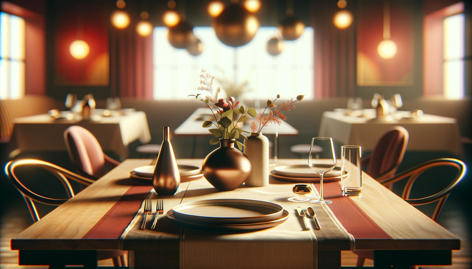
Background image in the header ChatGPT 4
-
Prompt: generate background images for a website that is used to make reservations at a restaurant and the image should be in 16:9 ratio and generate max possible resolution and this image should make a elegant first impression
-
Site Url - https://godine-group2.netlify.app/
-
Note: The AI chat url cannot be provided because "Sharing conversations with images is not yet supported" by the chatGPT4
-
-
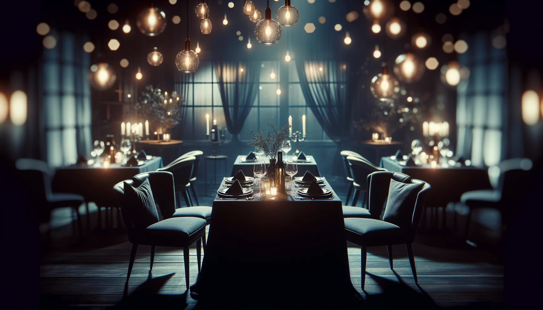
Image used in the carousel in the Homepage ChatGPT 4
-
Prompt: decrease the details of the image as the users just scan the website rather look into every detail make image so the it is catchy to the user eye
-
Site Url - https://godine-group2.netlify.app/
-
Note: The AI chat url cannot be provided because "Sharing conversations with images is not yet supported" by the chatGPT4
-
-
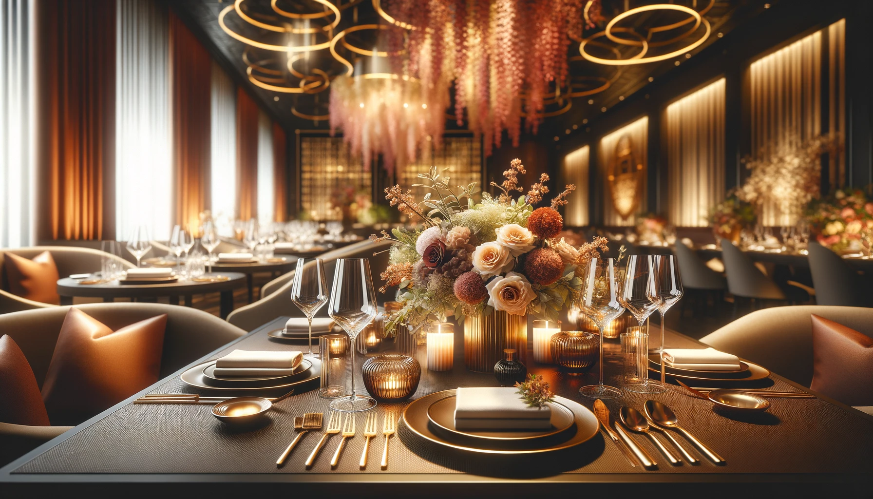
Image used in the carousel in the Homepage ChatGPT 4
-
Prompt: generate some image with dark colour pallet or any pallet so that white text can be visible
-
Site Url - https://godine-group2.netlify.app/
-
Note: The AI chat url cannot be provided because "Sharing conversations with images is not yet supported" by the chatGPT4
-
-
-
Image used in the carousel in the Homepage ChatGPT 4
-
Prompt: generate logo with minimalistic look for restaurant reservation booking website with not more than 3 colors.
-
Site Url - https://godine-group2.netlify.app/
-
Note: The AI chat url cannot be provided because "Sharing conversations with images is not yet supported" by the chatGPT4
-
-
The development of components in this project was greatly facilitated by the comprehensive documentation provided by React-Bootstrap. We acknowledge the React-Bootstrap team for their dedication to offering clear explanations, practical examples, and robust component libraries, which significantly expedited the process of designing and implementing various UI elements.
-
We extend our gratitude to the Bootstrap team for their invaluable contributions to web development. The Bootstrap documentation served as an indispensable resource, offering insights into responsive design principles, layout techniques, and component customization. By leveraging Bootstrap's extensive documentation, we were able to create visually appealing and user-friendly interfaces that enhance the overall user experience of our project.
-
We express our appreciation to ChatGPT-4 for its assistance in generating images for our project. ChatGPT-4's capabilities proved invaluable in automating the image generation process, allowing us to efficiently create visual assets that complemented our project's design and functionality.