The purpose of this analysis is to provide insight into data and trends for PyBer Ride Share company. The focus of this analysis will be on how the total number of rides, total number of drivers, and fare rates differ across city types (Rural, Suburban, Urban). This analysis will be used to present out to the CEO and Executive team to help provide insights and allow for data driven decision making.
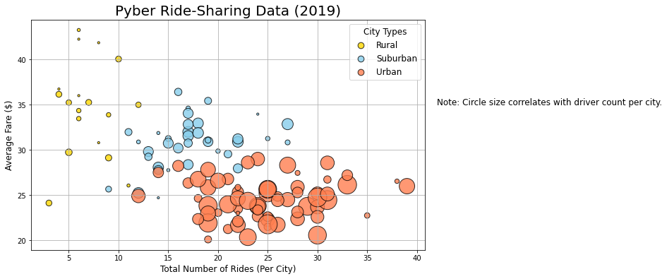
As can be seen in the bubble chart below, urban cities tend to have the most rides and the highest number of drivers. Suburban areas tend to have less rides and drivers than urban areas and rural areas typically have the least drivers and number of rides. However, the average fare in rural areas tends to be higher than the average fare in Urban areas. Given there are significantly less drivers in Rural areas, the demand for their services is higher and drivers can therefore charge more. In addition, there are generally less transportation options in rural areas (i.e. limited public transportation) which would increase the demand for ride share even more, allowing drivers to charge more per ride.
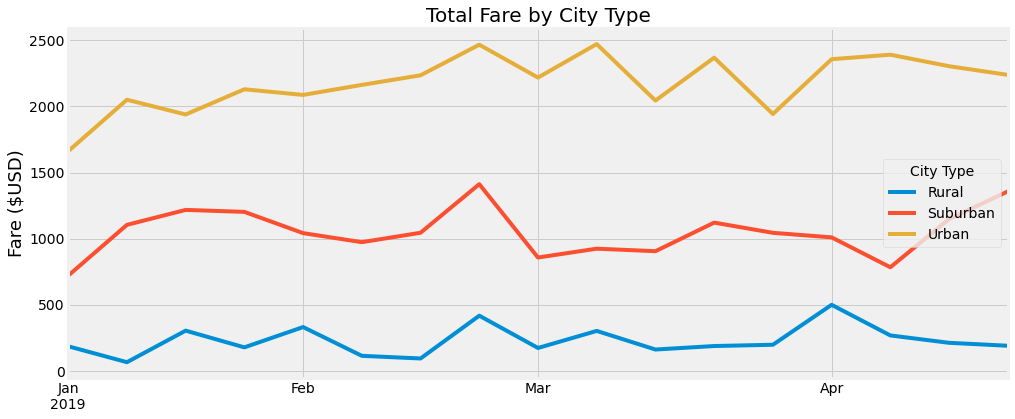
The below line chart shows the total fare by city type trending per week from January to April of 2019. Urban cities consistently have the highest trending fare total. This would align to the information above that indicates urban cities have the most rides and most drivers. There is a consistent spike in total fares near the end of February across all three city types. It is possible this spike could be driven by an event or holiday. Further data and analysis would be needed to validate what the driver is of the various spikes in total fares seen across the different city types.
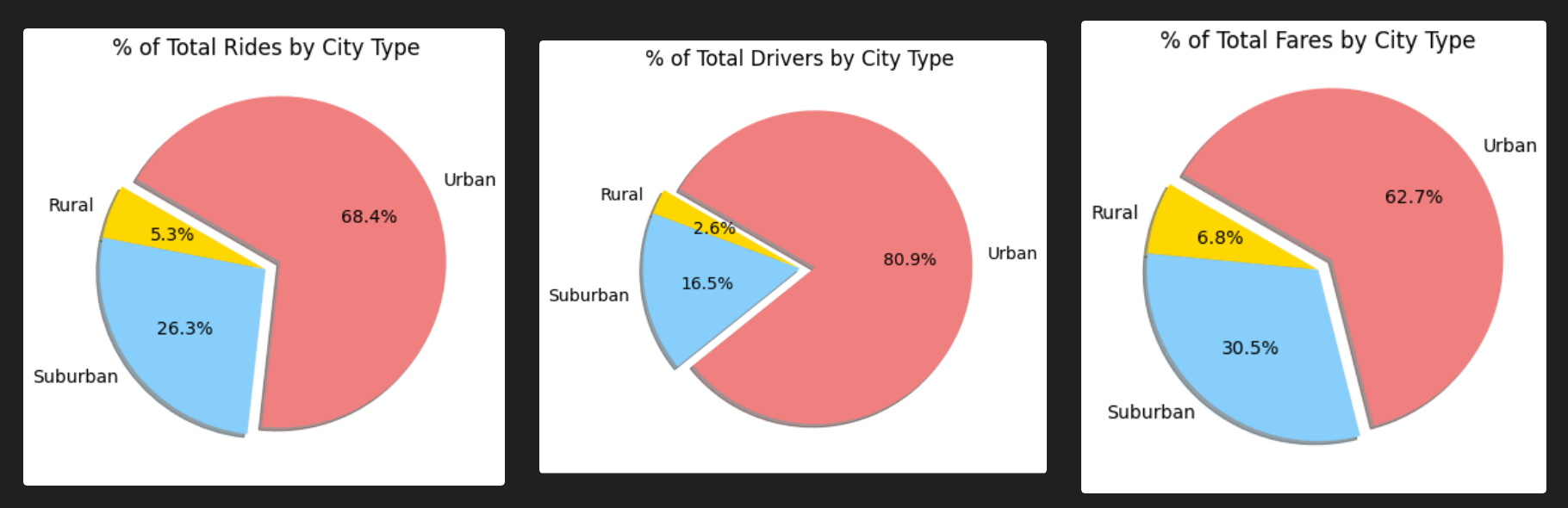
Based on the below pie charts, the urban market appears to be saturated, while there could be opportunities in both the rural and suburban markets. There are proportionally more demand for rides in rural and suburban areas than there are drivers. This is what is causing the increase in fare price. As more drivers enter those markets the price will decrease.
Three recommendations for addressing disparities among the city data can be found below.
- This analysis could further benefit from having additional data on rider demographics. This data could help provide insight on which groups are using the ride share services the most. Not only could this help provide clarity on what is causing some of the spikes in the Total Fare by City Type line graph, but it could also be used to support a targeted marketing campaign around those peak times.
- Other data that this analysis could benefit from is a major holidays and events calendar. Overlaying an event calendar on the Total Fare by City Type line chart could help provide insight into what is causing some of the spikes in total fares. This could include all major holidays, sporting events, etc. It could also help explain why not all spikes are seen across all city types. For example, the spike at the end of February is consistent across Rural, Suburban and Urban cities, but at the beginning of April there was a spike that only impacted Urban and Rural demand.
- Expanding the trending data to include a minimum of a year, ideally multiple years, would also provide additional insight. Looking at only four months of data makes it challenging to draw conclusions with confidence. Seeing year over year trending would allow for consistent trends to be identified. These are the types of trends that allow for data driver decision making. I would not recommend making a business strategy change or investing in a marketing plan based on only four months of data.