The purpose of this analysis was to analyze Citi bike data in NYC to see if there were any identifiable trends that can be used for launching a citi bike location in another city. I used Pandas to convert my data into different data types so it would be easier to use in Tableau. I was then able to upload my new csv file into Tableau and create visualizations to help display my data.
I specifically analyzed data surrounding gender of the riders, average trip duration, time of the day rides were most popular, and the days of the week where ridership was most popular
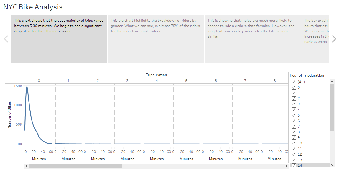
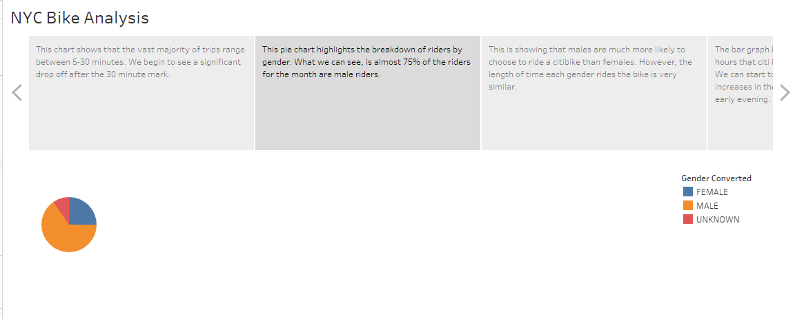
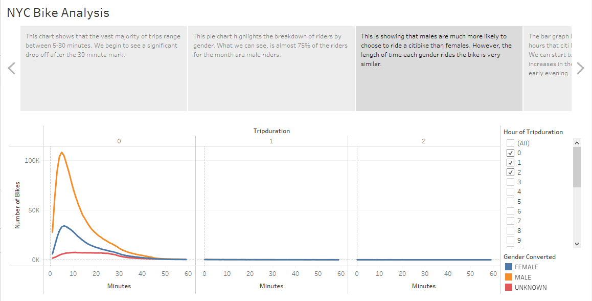
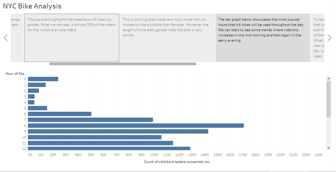
Results: Please see the following images that highlight the results of my analysis:
4.


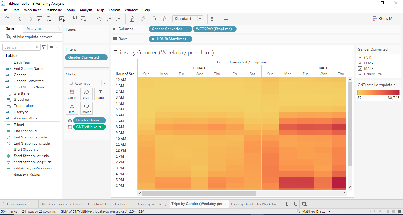
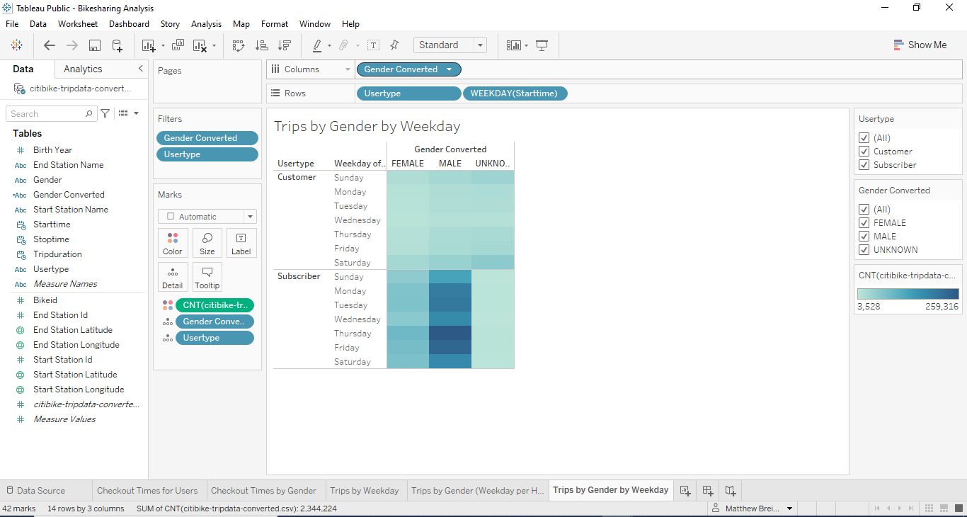
Overall, our analysis has proven that men are more likely than women to ride a citibike. We have also found that the average ride time will range from about 5-30 minutes. Ridership is more popular during the standard commuting hours in the morning and the afternoon. This data was consistent for both men and women, but again reinforced the idea that men are more likely to ride a citi bike. I was also able to find that ridership was increased on the weekends throughout the standard working hours, this is likely due to more people having free time to ride on the weekends compared to the middle of the week. A signifcant data point that became aparent as well, was the fact that most riders would be willing to sign up for a subscription service. This was consistent across genders and days of the week.
Two other datapoints that I would be interested in creating visualizations is 1. Age of the riders and 2. Average distance travelled in miles.
For the age analysis, we can create a bar graph similar to the hours of the day and then an additional heat map to show the # of rides per day per week
For the average distance travelled in miles, we could analyze the starting and ending locations and find the total distance between the two. We could display this in a linechart similar to the average trip duration visualization we created.