
- To get familiar with visualization libraries & tools: matplotlib, Seaborn and Tableau.
- Use summary statistics and visualization as a first exploratory analysis on dataset.
- Explain why your dashboard functionalities are the best for getting meaningful data insights.
A GitHub repository, preferably named: ih_datamadpt0420_project_m2, including:
-
data_analysis_report.ipynbfile that holds the results of Challenge 1 + Bonus Challenge. -
Tableau Public Dashboardincluding your dashboard proposal (Challenge 2). -
README.mdfile explaining the job done, your main conclusions and the link to your Tableau Public Dashboard.
- Rows: Contains information about 4055 unique diamonds (4055 rows).
- Columns: 7 relevant attributes or characteristics for diamonds. ['carat'], ['depth'], ['table'], ['price'], ['x'], ['y'], ['z']

IMPORTANT NOTE: Although numbers and statistics on their own can provide a lot of useful and relevant information, probably any appropriate data exploration effort should start with getting familiar with the fundamentals of the business or topic on which data will be analyzed.
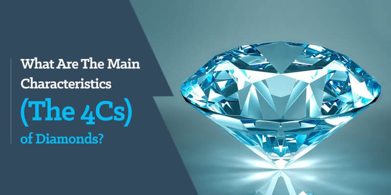
The 4Cs are a big factor when it comes to evaluating a diamond. Having a good understanding of the 4Cs will make the exploratory job easier.
The individual characteristics of a diamond can play more or less of a role depending on the diamond’s specific shape, so knowing the shape should play a big role in terms of knowing how to evaluate a diamond. (This attribute or characteristic it's not included on our dataset columns.)

The relevant categorical variables we do have, are:

If you want to get technical, a carat is divisible by 100 points. If a diamond is 0.50ct, it may be referred to as 50 points. Diamonds over the 1 carat weight use carat and decimals. For example, a 1.25ct diamond would be “one point 25 carats.”

- Proportions = measurements and angles relative to each other.
- Symmetry = alignment of the facets (triangular “cuts”) relative to each other.
- Polish = smoothness of the outer surface
Diamonds are graded on a scale from Excellent to Poor (Excellent, Very Good, Good, Fair, Poor). The closer a diamond is to Excellent, the rarer it is.


The scale to grade these clarity characteristics goes from Flawless to Imperfect.
Diamonds are graded under 10x magnification. So a diamond that is “Slightly Included” may still have NO visible inclusions to the naked eye, giving it greater value.
Dashboards are powerful tools for communicating important information at-a-glance. The goal for this challenge was to build a data dashboard using our diamonds dataset. You can access the Public Tableau Dashboard using this Link
The main objective is to build a dashboard to help understand the relationship between diamonds attributes (features) or group of attributes, and its prices.
- The most evident relationship we can extract from the summary statistics is between the Carat weight, and the mass/volume associated variables, x,y,z with the Price.
- But, carat size on its own it's not enough! The most relevant information to properly asses the diamonds qualities are associated with the categorical ordinal variables Cut, Color and Clarity.
- Although the summary statistics provided by the Pandas exploration can be infinite and precise, this example shows that building a visualization dashboard can be a powerful alternative and/or complement to help digest and communicate all the data.
- The relationships between the categorical variables were easier to understand, connect and communicate by using the dashboard.
- Scarcity is the key word to understand the importance of each variable and its ultimate relationship with the diamonds prices. The dashboard helps to easily identify the uniqueness and scarcity of each attribute and the order in which they provide more value. (Clarity > Color > Cut.)
- The value of the diamonds relies on the balance of the attributes each one possesses, the multiple combinations add a level of complexity to summarize the data.
If you have any suggestions, questions, or want to contact me, please write to manuelaquinop@gmail.com