- Next.js를 활용해 커먼그라운드의 'Eat' 페이지를 클론한 프로젝트
- 원본 사이트 : https://www.common-ground.co.kr/eat.html
- 개발 인원 : 1인 (김혜진)
- 개발 기간 : 22.1.29 ~ 2.1 (4일)
- 구현한 화면
- Next.js 13에서 업데이트 된 내용을 연습해보기 위해 선정
- 폴더 기반 라우팅
- Server Component와 Client Componet의 구분
- data fetching 방법 : getStaticProps -> fetch(URL, { cache : 'force-cache' }
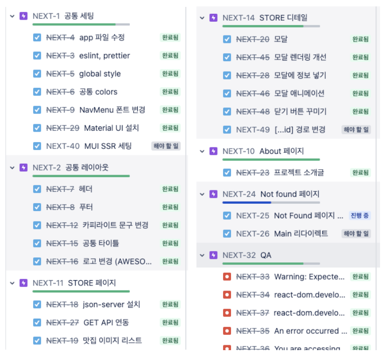
- Jira를 통해 할 일을 정리했습니다.
git clone https://github.com/hyejin30/next-store-site
yarn install

// 개발 모드
yarn dev

// 빌드
yarn build
yarn start

// json-server 실행
json-server ./db.json -p 9000
- PC 기준으로 작업했으며, 태블릿/휴대폰은 고려하지 않았습니다.
- 대응 가능하도록 추후 반응형으로 작업할 예정입니다.
- 서버 사이드 렌더링을 위해 next.js를 사용했으며
- 서버 상태 관리를 위해 react-query
- 더미 데이터를 불러오기 위해 json-server를 사용했습니다.
- next.js, typescript
- 상태 관리 : react-query
- css : Material-UI, styled-components
- 기타 : json-server
- 사용자의 요청으로 데이터가 변하는 사이트가 아니므로
빌드 시 모든 page를 렌더링하되 추후 다시 빌드하지 않으면 데이터 변경이 없는 SSG 방식을 선택했습니다. - 댓글이 달리는 형태가 아니므로 revalidate 옵션은 넣지 않았습니다.
// app/store/page.tsx

async function getStores() {
  const res = await fetch('http://localhost:9000/stores', { cache: 'force-cache' });
  const stores = await res.json();
  return stores;
}

async function StorePage() {
  const stores = await getStores();
  return <Store stores={stores} />;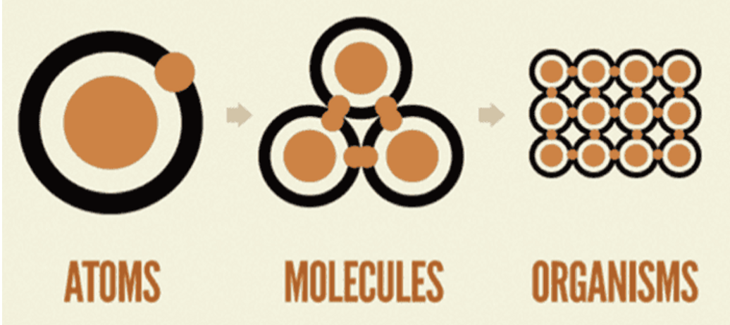
}공통 컴포넌트를 만들 때 아토믹 디자인 패턴 및 Next 13의 layout 페이지를 고려했습니다.
[아토믹 디자인 패턴] (참고글)
- 쪼갤 수 없는 단위를 atom으로 하여, atom을 조합해 molecule, organism 등을 만들어 가는 방식
[Next 13 Layout]
<Layout>컴포넌트 -> layout.tsx 페이지를 만드는 방식으로 변경되었습니다.- app 폴더에 layout.tsx를 만든 뒤 아래 공통 컴포넌트를 삽입했습니다.
- [전체] Layout : 좌우 padding 적용
- [내부] WrapperLayout : column 방향으로 item 배치 + max-width 1140px 적용
- [콘텐츠] ContentsLayout : 현재 페이지로 제목 삽입 + min-height 514px 적용
// app/layout.tsx

<Layout>
  <Header />
  <PageTitle>{pathname}</PageTitle>
  <WrapperLayout>
    <ContentsLayout pathname={pathname}>{children}</ContentsLayout>
  </WrapperLayout>
  <Footer />
</Layout>- 기존 pages 폴더는 404 페이지만 남겼으며
- store, about 폴더를 app 폴더 하위에 추가했습니다.
- 폴더명이 곧 페이지 경로가 됩니다.
app
  ㄴstore // http://localhost:3000/store
    ㄴcomponents
    ㄴpage.tsx;
  ㄴabout
    ㄴcomponents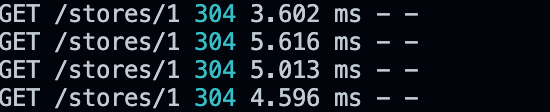
ㄴpage.tsx/stores/:id GET API 호출 시
react-query를 이용해 데이터를 캐싱하여 중복 호출을 방지했습니다.
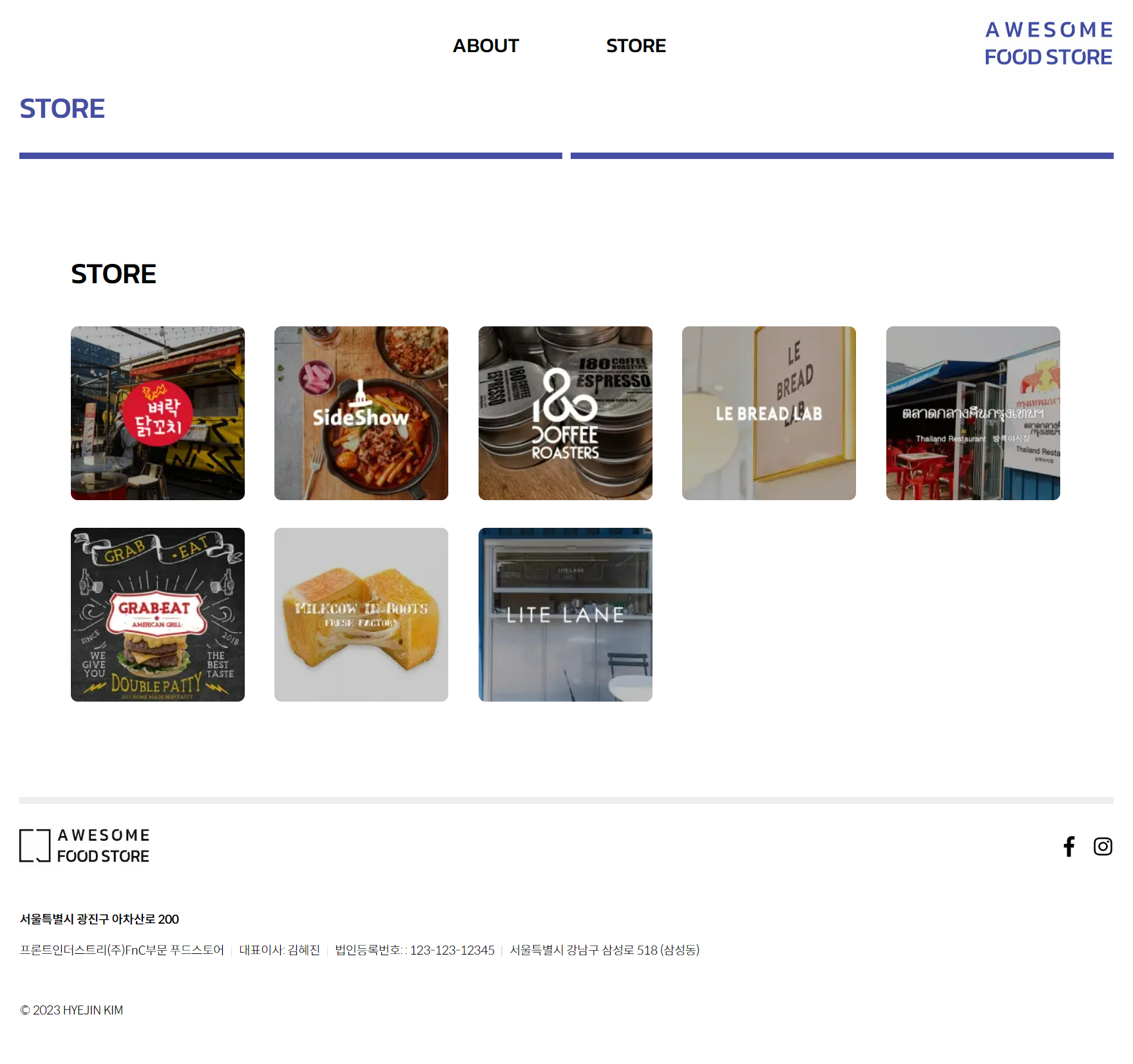
맛집 썸네일 목록
- MUI
Grid컴포넌트로 구현했으며 해상도에 따라 썸네일들의 배치가 변경됩니다. - 썸네일 클릭 시, 모달 내의 StoreDetail이 변경되도록 했습니다.
<>
  <Cards>
    {stores?.map((store, idx) => (
      <StoreThumb key={`store-thumb-${idx}`} id={store.id} src={store.thumb} onClick={handleThumbClick} />
    ))}
  </Cards>
  <Modal isOpen={showModal} onClose={toggleModal}>
    {getSuccess && <StoreDetail data={storeDetail} />}
  </Modal>
</>
모달 컴포넌트 애니메이션
- Dimmed에 fade-in 애니메이션을 적용했으며
- Container에 아래에서 위로 올라오는 open 애니메이션을 적용했습니다.
// components/molecule/Modal/index.tsx

@keyframes fadeIn {
  from {
    opacity: 0;
  }
  to {
    opacity: 1;
  }
}

@keyframes open {
  from {
    top: 53%;
    opacity: 0;
  }
  to {
    top: 50%;
    opacity: 1;
  }
}- StoreImage: next/image를 사용한 컴포넌트로, layout shift 방지 (이미지 위치 미리 잡아줌)
- 소개 문구 : MUI Typography를 사용했으며, \n 엔터가 반영되도록 whiteSpace: 'pre-wrap' 적용
- 맛집 홈페이지 URL 조건부 렌더링
<Container>
  <Inner>
    <StoreImage fill alt="store image" src={image} />
  </Inner>
  <Inner>
    <StoreInfo>
      <Description>
        <Typography variant="h4">{name}</Typography>
        <Typography component="p" sx={{ lineHeight: 2, whiteSpace: 'pre-wrap' }}>
          {description}
        </Typography>
      </Description>
      {url && (
        <a href={url}>
          <Typography component="p" sx={{ fontWeight: 700 }}>
            {url}
          </Typography>
        </a>
      )}
    </StoreInfo>
  </Inner>
</Container>