A beautiful, animated React dark mode toggle component with zero dependencies. Features smooth animations and customizable styling.
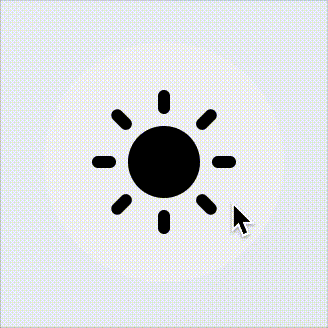
A smooth, animated toggle between light and dark modes
- 🎨 Beautiful animations - Smooth transitions with elastic easing
- 🎯 Zero dependencies - Only requires React and ReactDOM
- 🔧 Highly customizable - Colors, sizes, and behavior
- 📱 Responsive - Works on all screen sizes
- ♿ Accessible - Proper ARIA labels and keyboard support
- 🌙 Shadow DOM - Isolated styles that won't conflict with your app
- 💾 LocalStorage - Automatically persists theme preference
- ⚡ TypeScript - Full TypeScript support with proper types
- 📦 Tiny footprint - Ships at 4.59 KB (1.79 KB gzipped)
npm install @gozenc/react-dark-mode-toggleyarn add @gozenc/react-dark-mode-toggleimport { DarkModeToggle } from "@gozenc/react-dark-mode-toggle";
function App() {
return (
<div>
<h1>My App</h1>
<DarkModeToggle />
</div>
);
}import { DarkModeToggle } from "@gozenc/react-dark-mode-toggle";
function App() {
const handleModeChange = (mode: "light" | "dark") => {
console.log("Theme changed to:", mode);
};
return <DarkModeToggle onModeChange={handleModeChange} />;
}import { DarkModeToggle } from "@gozenc/react-dark-mode-toggle";
function App() {
return (
<DarkModeToggle
size={32}
colors={{
backgroundColor: "#e3f2fd",
backgroundColorDark: "#1565c0",
color: "#1976d2",
colorDark: "#bbdefb",
}}
/>
);
}| Prop | Type | Default | Description |
|---|---|---|---|
size |
number | string |
24 |
Size of the toggle in pixels |
padding |
number | string |
calc(size / 4) |
Internal padding of the toggle |
onClick |
(event: MouseEvent) => void |
- | Custom click handler |
onModeChange |
(mode: 'light' | 'dark') => void |
- | Called when theme changes |
preventDefault |
boolean |
false |
Prevent default theme switching behavior |
localStorageKey |
string |
'color-theme' |
Key used for localStorage persistence |
colors |
ColorConfig |
- | Custom color configuration |
className |
string |
- | CSS class for the component |
wrapperClassName |
string |
- | CSS class for the outer container |
darkClassName |
string |
'dark' |
CSS class to toggle for dark mode |
rootElement |
HTMLElement |
document.documentElement |
Root element to toggle dark class |
interface ColorConfig {
  backgroundColor?: string; // Light mode background
  backgroundColorDark?: string; // Dark mode background
  color?: string; // Light mode icon color
  colorDark?: string; // Dark mode icon color
  colorHover?: string; // Light mode hover color
  colorHoverDark?: string; // Dark mode hover color
}The component automatically:
- Detects current theme by checking for a
darkclass ondocument.documentElement - Toggles the theme by adding/removing the
darkclass - Persists preference in localStorage
- Triggers callbacks when the theme changes
The component expects your CSS to respond to the dark class on the root element:
/* Light mode styles */
body {
  background-color: #ffffff;
  color: #000000;
}

/* Dark mode styles */
.dark body {
  background-color: #1a1a1a;
  color: #ffffff;
}- Modern browsers with Shadow DOM support
- React 17.0.0 or higher
- Graceful degradation for older browsers
To run the development environment:
# Clone the repository
git clone https://github.com/gozenc/react-dark-mode-toggle.git
cd react-dark-mode-toggle

# Install dependencies
npm install

# Start development server
npm run devTest the built package locally before publishing:
npm run test:browserOpens test-dist.html which:
- ✅ Loads the built
dist/index.jsdirectly - ✅ Shows bundle size and gzipped size
- ✅ Tests different component configurations
- ✅ Uses React from CDN (simulates real usage)
- ✅ Verifies no react-jsx-runtime is included
npm run test:localComprehensive test that:
- ✅ Builds the package (
npm run build) - ✅ Packs it like npm would (
npm pack) - ✅ Extracts and verifies all required files
- ✅ Checks bundle size and content
- ✅ Confirms react-jsx-runtime is excluded
- ✅ Validates package structure for publishing
npm run testBasic test that verifies:
- ✅
dist/index.jsexists - ✅
dist/index.d.tsexists - ✅ Package.json configuration
-
Build the optimized package:
npm run build
-
Test in browser (visual verification):
npm run test:browser
-
Full package validation:
npm run test:local
-
If all tests pass, you're ready to publish!
After optimization:
- Bundle size: 4.56 KB
- Gzipped size: 1.76 KB
- No react-jsx-runtime: ✅ Excluded from bundle
- All tests passing: ✅
Contributions are welcome! Please feel free to submit a Pull Request.
MIT © gozenc
- Initial release
- Beautiful animated toggle component
- Full TypeScript support
- Zero dependencies
- Customizable colors and sizes
- LocalStorage persistence
- Accessibility features