


Slate - a Laravel Blade UI Kit is a set of anonymous blade components built using TailwindCSS v4 with built-in dark mode support for your next Laravel project. Perfect for Laravel UI development with beautiful, accessible components.
- 🎨 57 Components - Complete component library
- 🎯 Zero PHP Color Logic - All colors controlled via CSS variables
- 🌙 Dark Mode - Built-in dark mode support with automatic variable switching
- ♿ Accessible - WCAG 2.1 AA compliant with proper ARIA attributes
- 🚀 Tailwind CSS v4 - Using latest Tailwind with CSS variables
- 📦 Anonymous Components - Pure Blade templates, no PHP classes
- 🎨 Self-Contained - Everything in the package, minimal client configuration
- ⚡ Alpine.js - Interactive components using Alpine.js (standard in Laravel)
- 🎨 Semantic Colors - success, warning, info, error, danger color system
- PHP 8.1+
- Laravel 10.0+ or 11.0+ or 12.0+
- Tailwind CSS v4
- Alpine.js (for interactive components - usually included in Laravel apps)
composer require electrik/slatephp artisan slate:installThis command will:
- Copy
slate.csstoresources/css/slate.css - Add
@import './slate.css';to yourapp.css(after@import 'tailwindcss';) - Add
@sourcedirective to scan Slate components
Note: The installation command automatically configures your app.css file. No manual Tailwind config changes needed when using Tailwind CSS v4!
npm run buildThat's it! Slate uses CSS variables and Tailwind v4's @theme system, so no tailwind.config.js changes are required.
<x-slate::button>Click me</x-slate::button><x-slate::button variant="success">Save</x-slate::button>
<x-slate::button variant="warning">Warning</x-slate::button>
<x-slate::button variant="error">Error</x-slate::button>
<x-slate::button variant="danger">Delete</x-slate::button>
<x-slate::button variant="outline">Cancel</x-slate::button>
<x-slate::button variant="ghost">Ghost Button</x-slate::button><x-slate::label for="email">Email</x-slate::label>
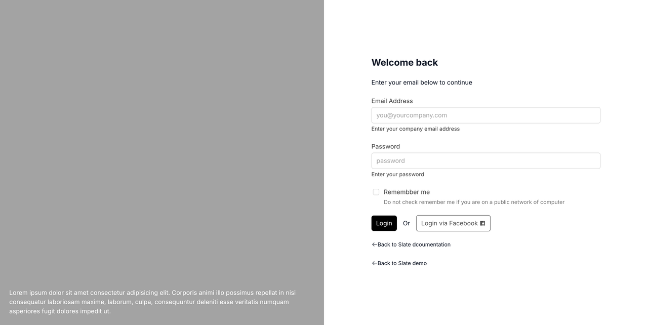
<x-slate::input type="email" id="email" name="email" placeholder="Enter your email" />Slate includes 57 components:
- Button, Input, Card, Label, Badge
- Textarea, Select, Checkbox, Radio Group, Switch, Slider, Input Group, Input OTP, Field
- Alert, Dialog, Alert Dialog, Drawer, Sheet, Popover, Tooltip, Hover Card, Sonner (Toast)
- Dropdown Menu, Context Menu, Navigation Menu, Menubar, Breadcrumb, Tabs, Sidebar, Pagination
- Table, Avatar, Separator, Skeleton, Empty, Aspect Ratio
- Accordion, Collapsible, Command, Combobox, Calendar, Progress, Scroll Area, Resizable, Carousel, Chart
- Toggle, Toggle Group, Button Group, Item, Kbd, Spinner
Slate uses semantic color naming with foreground/background pairs:
Base Colors:
background/foreground- Page background and textborder,input,ring- UI element colors
Semantic Colors:
primary/primary-foreground- Main brand colorsecondary/secondary-foreground- Secondary actionssuccess/success-foreground- Success stateswarning/warning-foreground- Warning statesinfo/info-foreground- Informational stateserror/error-foreground- Error statesdanger/danger-foreground- Destructive actionsmuted/muted-foreground- Subtle backgrounds/textaccent/accent-foreground- Hover states, highlightscard/card-foreground- Card backgroundspopover/popover-foreground- Popover backgrounds
Override CSS variables in resources/css/slate.css:
:root {
  --color-primary: 142 76% 36%; /* Custom green */
  --color-primary-foreground: 355 100% 97%;
  --color-success: 142 71% 45%; /* Custom success color */
  --color-success-foreground: 0 0% 98%;
}

.dark {
  --color-primary: 142 70% 45%; /* Dark mode variant */
  --color-primary-foreground: 0 0% 9%;
}
Dark mode is automatically handled via the .dark class:
<html class="dark">
  <!-- Dark mode enabled -->
</html>
Toggle dark mode with Alpine.js:
<div x-data="{ dark: false }">
  <button @click="dark = !dark; document.documentElement.classList.toggle('dark', dark)">
    Toggle Dark Mode
  </button>
</div>Slate components are tested using:
- Unit Tests - Blade component rendering with different props/variants
- Integration Tests - Components in real Laravel views and forms
- Visual Regression Tests
- Accessibility Tests - WCAG 2.1 AA compliance using axe-core/Pa11y
Full documentation is available at: https://slate.electrik.dev
Note: Documentation is in a separate repository (slate-docs) and uses Jigsaw for static site generation.
Slate is designed to be self-contained. All styles and components live in the package, and the slate:install command handles configuration automatically.
Edit resources/css/slate.css (copied during installation) to customize colors, spacing, and other design tokens.
To customize component markup:
php artisan vendor:publish --tag=slate-viewsViews will be published to resources/views/vendor/slate/components/
Note: Published views won't receive automatic updates. Use this only if you need to modify component structure.
Contributions are welcome! Please see our Contributing Guide for details.
This package is open-sourced software licensed under the MIT license.
- Built with Laravel and Tailwind CSS
- Interactive components powered by Alpine.js
Made with ❤️ by Electrik