


React component for sparkline charts based on <canvas>


npm install react-sparkline-canvas --save
import Sparkline from 'react-sparkline-canvas';Basic example
<Sparkline
  data={[1,2,3,3,4,7,5,8,6,2,5,7,6]}
  width={200}
  height={200}
/>
Advanced example
<Sparkline
  data={[0,1,0,0,-5,6,0,0,3,4,1,5,4,4,-1, -8, 12]}
  type={'step'}
  width={800}
  height={400}
  padding={40}
  lineWidth={3}
  className={'somecss'}
  strokeColor={{
    '20': '#ff355b',
    '30': '#ffc835',
    '45': '#32647d',
    '50': '#41828c',
    '85': '#22822c',
  }}
  gradDirection={'column'}
  showMinMax={false}
/>| Prop | Default | PropType | Description |
|---|---|---|---|
| data | - | array |
Values to plot, e.g. [1,2,3,4,5] |
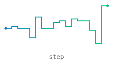
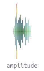
| type | line |
string |
line, step, amplitude, reflected |
| width | 200 |
number |
Required |
| height | 60 |
number |
Required |
| padding | 20 |
number |
Canvas padding |
| className | null |
string |
CSS class name applied to canvas wrapper |
| lineWidth | 3 |
number |
Thickness of the sparkline |
| strokeColor | #000000 |
`string | object |
| gradDirection | column |
string |
Gradient direction: column or row |
| showMinMax | true |
bool |
Shows min/max value dot marker when true |
The following props only work for amplitude sparkline type:
| Prop | Default | PropType | Description |
|---|---|---|---|
| baseline | true |
bool |
Displays a baseline in the vertical middle when true |
| baselineColor | #cccccc |
string |
line, step, amplitude, reflected |
| type | strokeColor | Responsive Plot | Constraints |
|---|---|---|---|
line |
Solid or Gradient | Width and Height | |
step |
Solid or Gradient | Width and Height | |
amplitude |
Solid or Gradient | Height only | Plots only positive numbers, negatives and zeros are plotted as blank |
reflected |
Solid (2 colors) | Height only | Plots only positive numbers, negatives and zeros are plotted as blank |
Pass a CSS color value as string to strokeColor prop.
Examples:
<Sparkline strokeColor={'#ff0000'} />

<Sparkline strokeColor={'red'} />

<Sparkline strokeColor={'rgba(255,0,0,.5)'} />Pass an object to strokeColor prop, each property represents a color stop.
{
  stop: 'color',
  stop: 'color',
  stop: 'color'
}
stop is a value between 0 and 100 that represents the position between start and end in a gradient.
color is a CSS color value to display at the stop position.
Gradient direction prop
| gradDirection | Description |
|---|---|
column |
Top to bottom |
row |
Left to right |
Examples:
<Sparkline
  strokeColor={{
    '20': '#ff355b',
    '30': '#ffc835',
    '45': '#32647d',
    '50': '#41828c',
    '85': '#22822c',
  }}
/>

<Sparkline
  strokeColor={{
    '0': '#007AC9',
    '100': '#00c972',
  }}
  gradDirection={'row'}
/>Pass an array to strokeColor prop, the first element represents main color and second one represents reflection color.
[mainColor, reflectionColor]Example:
<Sparkline strokeColor={['#8c8c8c', '#e6e6e6']} />