Redesign profile menu #155
Conversation
|
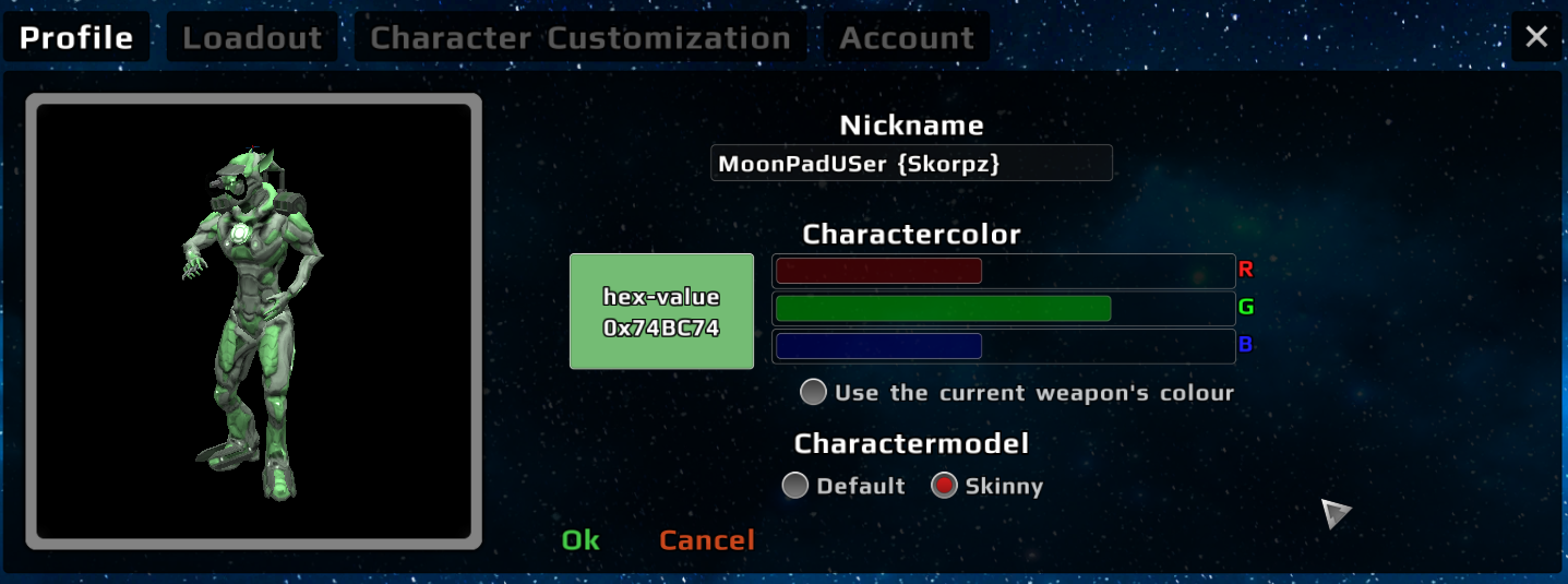
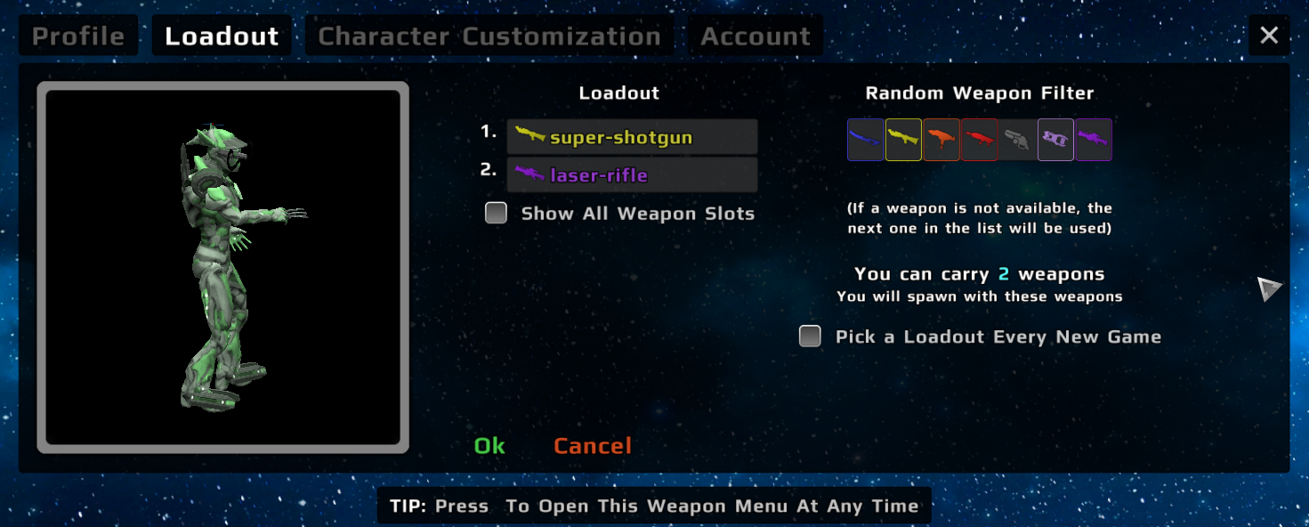
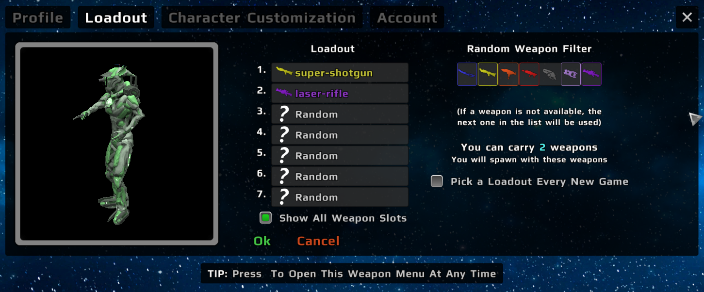
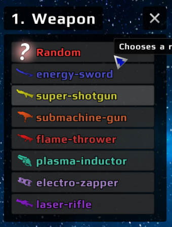
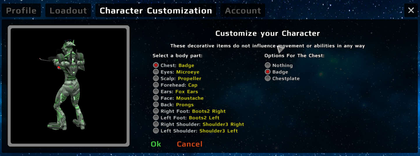
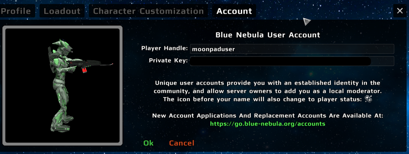
Profile tab: I think having "male" and "female" as the model options makes more sense than "Default" and "Skinny", both because that is probably a more common thing to choose in games and also because the models were probably made to look like male and female bodies. Also, I don't think Charactercolor and Charactermodel should be one word. Loadout tab: I like having all the weapons visible at the same time because that makes it easier and faster to change. Now you have to do an extra click to change weapons and you can't see all available weapon options at once. Another thing is that the "Show All Weapon Slots" checkbox moves when you click it. Account tab: I like the new look of this one, the way the input fields are aligned. But what happened with the checkboxes to use the account online/offline? |
|
@robalni |
|
Profile tab: I don't think there is any real risk to offend people. Another solution could be to just have one model because they are pretty similar to each other anyway and having different models has no gameplay purpose. Loadout tab: Yes, I can see how it could be easier for a beginner to understand how it works. I still prefer the old one but I don't know how much of that is just that I'm used to it. The checkbox is not important, just a nitpick. Account tab: Ok, just wanted to make sure they were useless :) |
|
@robalni |
This redesign mainly focuses on reworking the loadout menu: