#Spatial Data in R ##Sydney Institute of Marine Science 10th August 2015
This work is published under a Creative Commons Attribution-NonCommercial-NoDerivatives 4.0 International License.
![]()
##Hello World. Initial Steps
###Set up a project directory

###A fun intro

This exercise is from James Cheshire, a very cool analyst from University College London. His site is spatial.ly. His Population Lines image now hangs in my loungeroom!

This graphic uses ggplot (which we'll get to later...) to simply plot the routes that south England residents too and from work each day.
###Mapping Journeys to Work in the UK
library(plyr)
library(ggplot2)
library(maptools)

##read in the data- it is a really big dataset! It will take some time to read in
input<-read.table("Data/wu03ew_v1.csv", sep=",", header=T)

##select only the origin, destination and total kms from the data
input<- input[,1:3]
names(input)<- c("origin", "destination","total")

##download and input the population centroids from
centroids <- read.csv("Data/msoa_popweightedcentroids.csv")
or.xy <- merge(input, centroids, by.x="origin", by.y="Code")

names(or.xy) <- c("origin", "destination", "trips", "o_name", "oX", "oY")
dest.xy <- merge(or.xy, centroids, by.x="destination", by.y="Code")
names(dest.xy) <- c("origin", "destination", "trips", "o_name", "oX", "oY","d_name", "dX", "dY")

##plotting in ggplot2
xquiet <- scale_x_continuous("", breaks=NULL)
yquiet <-scale_y_continuous("", breaks=NULL)
quiet <-list(xquiet, yquiet)

ggplot(dest.xy[which(dest.xy$trips>10),], aes(oX, oY))+
geom_segment(aes(x=oX, y=oY,xend=dX, yend=dY, alpha=trips), col="white")+
scale_alpha_continuous(range = c(0.03, 0.3))+
theme(panel.background = element_rect(fill='black',colour='black'))+quiet+coord_equal()
###Some preliminaries
#####Installing rgdal on a Mac The Easy Way In R run: install.packages(‘rgdal’,repos=”http://www.stats.ox.ac.uk/pub/RWin“)
The Hard Way If the easy way doesn't work. Download and install GDAL 1.8 Complete and PROJ framework v4.7.0-2 from: http://www.kyngchaos.com/software/frameworks%29
Download the latest version of rgdal from CRAN. Currently 0.7-1 Run Terminal.app, and in the same directory as rgdal_0.7-1.tar.gz run:
R CMD INSTALL --configure-args='--with-gdal-config=/Library/Frameworks/GDAL.framework/Programs/gdal-config --with-proj-include=/Library/Frameworks/PROJ.framework/Headers --with-proj-lib=/Library/Frameworks/PROJ.framework/unix/lib' rgdal_0.7-1.tar.gz
####Git and GitHub GitHub is a platform for hosting and collaborating on projects. You don’t have to worry about losing data on your hard drive or managing a project across multiple computers — sync from anywhere. Most importantly, GitHub is a collaborative and asynchronous workflow for building software better, together.
-
Sign Up here. https://github.com/join
-
To create a new repository -Click the icon next to your username, top-right. -Name your repository hello-world. -Write a short description. -Select Initialize this repository with a README.

-
Navigate to LucasCo/HASpatial. There you will find the the course materials that we will be working from.
-
Fork the repo into your own GitHub account.
###A brief primer on R classes
Remember that:
x <- sum(c(2, 5, 7, 1))
x
## [1] 15
x is an object in R. It has a class, which represents the way the data in x is stored.
class(x)## [1] "numeric"
we can see that the class of x is numeric.
Classes determine what actions functions are going to have on the object. These functions, for example, include print, summary, plot etc. If no method is avialable for a specific class then it will try and default to known generic methods.
When R was first being created, there were no real functions. They were introduced in 1992 in a form called 'S3' classes, or 'old-style classes'.
Think back to the classic data set shipped with R, `mtcars'.
data(mtcars)
class(mtcars)
## [1] "data.frame"
typeof(mtcars)## [1] "list"
names(mtcars)## [1] "mpg" "cyl" "disp" "hp" "drat" "wt" "qsec" "vs" "am" "gear" "carb"
mtcars is a data.frame that is stored as a list (this is why things like lapply will work on data.frames).
Old style classes are generally lists with attributes and not defined formally. In 1998 new style S4 style classes were introduced. The main definition between old and new style classes that that the new S4 classes have clear, formal, definitions that can specify the type and storage structure for each of the components, called slots.
An understanding of these classes is important, as most spatial data in R uses new style, S4 classes.
###R and spatial
Different spatial classes in R inherit their attributes from other classes.

library(sp)getClass("Spatial")## Error in eval(expr, envir, enclos): could not find function "getClass"
m <- matrix(c(0, 0, 1, 1), ncol = 2, dimnames = list(NULL, c("min", "max")))
print(m)
## min max
## [1,] 0 1
## [2,] 0 1
crs <- CRS(projargs = as.character(NA))
print(crs)## CRS arguments: NA
S <- Spatial(bbox = m, proj4string = crs)
S## An object of class "Spatial"
## Slot "bbox":
##      min max
## [1,]   0   1
## [2,]   0   1
##
## Slot "proj4string":
## CRS arguments: NA
- We first creat a bounding box by making a 2 x 3 matrix.
- Create a CRS object (a specific object defined in the package
sp). Give it no arguments. - Create our first
Spatialobject, calling itS. We can see it has abboxand a CRS (called a proj4string).
####2. Spatial Points

Let's start using some real data!
The data below is from the OpenFlights project. OpenFlights is a tool that lets you map your flights around the world, search and filter them in all sorts of interesting ways, calculate statistics automatically, and share your flights and trips with friends and the entire world (if you wish). It's also the name of the open-source project to build the tool.
They have put their data (and code) on a public GitHub repo. Download and load into R directly.
library(RCurl)
URL <- "https://raw.githubusercontent.com/jpatokal/openflights/master/data/airports.dat"
x <- getURL(URL)

airports <- read.csv(textConnection(x), header = F)colnames(airports) <- c("ID", "name", "city", "country", "IATA_FAA", "ICAO", "lat", "lon", "altitude", "timezone", "DST",
"TimeZone")
head(airports)## ID name city country IATA_FAA ICAO lat lon altitude timezone DST
## 1 1 Goroka Goroka Papua New Guinea GKA AYGA -6.081689 145.3919 5282 10 U
## 2 2 Madang Madang Papua New Guinea MAG AYMD -5.207083 145.7887 20 10 U
## 3 3 Mount Hagen Mount Hagen Papua New Guinea HGU AYMH -5.826789 144.2959 5388 10 U
## 4 4 Nadzab Nadzab Papua New Guinea LAE AYNZ -6.569828 146.7262 239 10 U
## 5 5 Port Moresby Jacksons Intl Port Moresby Papua New Guinea POM AYPY -9.443383 147.2200 146 10 U
## 6 6 Wewak Intl Wewak Papua New Guinea WWK AYWK -3.583828 143.6692 19 10 U
## TimeZone
## 1 Pacific/Port_Moresby
## 2 Pacific/Port_Moresby
## 3 Pacific/Port_Moresby
## 4 Pacific/Port_Moresby
## 5 Pacific/Port_Moresby
## 6 Pacific/Port_Moresby
The only difference between the Spatial and SpatialPoints class is the addition of the coords slot.
air_coords <- cbind(airports$lon, airports$lat)
air_CRS <- CRS("+proj=longlat +ellps=WHS84")

airports_sp <- SpatialPoints(air_coords, air_CRS)
summary(airports_sp)
## Object of class SpatialPoints
## Coordinates:
##                min       max
## coords.x1 -179.877 179.95100
## coords.x2  -90.000  82.51778
## Is projected: FALSE
## proj4string : [+proj=longlat +ellps=WHS84]
## Number of points: 8107
####Methods
#####Bounding Box
Note that we did not specify a Bounding Box even though it is an integral component of the Spatial class. A bounding box is automatically assigned by taking the minimum and maximum latitude and longitude of the data.
bbox(airports_sp)## min max
## coords.x1 -179.877 179.95100
## coords.x2 -90.000 82.51778
#####Projection and datum
All spatial objects have a generic method proj4string. This sets the coordinate reference of the associated spatial data. Proj4 strings are a compact, but lightly quirky looking, way of specifying location references. Using the Proj4 syntax, the complete parameters to specify a CRS can be given. For example the PROJ4 string we usually use in Sydney is +proj=utm +zone=56 +south +ellps=GRS80 +units=m +no_defs. Here we essentially state that the CRS we are using is UTM (a projected CRS) in Zone 56. Most commonly we can start with an unprojected CRS (simply the longitute and latitude) using the CRS in the code above +proj=longlat +ellps=WHS84.
Proj4 strings can be assigned and re-assigned. NOTE that re-assigning a CRS does does NOT transform it. Simply saying the proj=utm will not convert the coordinates from long/lat into UTM.
proj4string(airports_sp) <- CRS(as.character(NA))
summary(airports_sp)
## Object of class SpatialPoints
## Coordinates:
## min max
## coords.x1 -179.877 179.95100
## coords.x2 -90.000 82.51778
## Is projected: NA
## proj4string : [NA]
## Number of points: 8107
proj4string(airports_sp) <- air_CRS#####Subsetting Subsetting SpatialPoints can be accomplished in the same manner as most other subsetting in R - using logical vectors.
airports_oz <- which(airports$country=='Australia')
head(airports_oz)
## [1] 1928 2047 2101 2194 2214 2313
oz_coords <- coordinates(airports_sp)[airports_oz,]
head(oz_coords)
## coords.x1 coords.x2
## [1,] 151.488 -32.7033
## [2,] 149.611 -32.5625
## [3,] 148.755 -20.2760
## [4,] 150.832 -32.0372
## [5,] 151.342 -32.7875
## [6,] 128.307 -17.5453
You can also use the subsetting methods directly on the SpatialPoints.
summary(airports_sp[airports_oz,])## Object of class SpatialPoints
## Coordinates:
## min max
## coords.x1 -153.01667 159.0770
## coords.x2 -42.83611 28.3835
## Is projected: FALSE
## proj4string : [+proj=longlat +ellps=WHS84]
## Number of points: 263
####3. SpatialPointsDataFrame

Often we need to associate attribute data to simple point locations. The SpatialPointsDataFrame is the container for this sort of data. You can see from the diagram above that the SpatialPointsDataFrame object extends the SpatialPoints class, and inherits the bbox, proj4string and coords objects.
getClass('SpatialPointsDataFrame')So far we have downloaded a data.frame, where 2 columns were latitude and longitude, and constructed a simple SpatialPoints object from it.
A SpatialPointsDataFrame simply connects the SpatialPoints with the rest of the attribute data.
A key consideration here is that the row.names of both the matrix of coordinates and the data need to match.
airports_spdf <- SpatialPointsDataFrame(coords=air_coords, data=airports, proj4string=airCRS)
summary(airports_spdf)
We can shorten this by simply joining a SpatialPoints objects with the data.
airports_spdf <- SpatialPointsDataFrame(airports_sp, airports)####4. Lines, Lines, Lines!

Lines are tricky. In the old S language they were simply represented by a series of numbers seperated by an NA that represented the end of the line. In R the most basic representation of a line is the Line object, essentially a matrix of 2-D coordinates. Many of these Line objects form the Lines slot of a Lines object. Other spatial data like a CRS and the bounding box are included in SpatialLines objects.
getClass('line')
getClass('lines')
getClass('SpatialLines')library('maps')
library('maptools')
oz <- map('world', 'Australia', plot=FALSE)
oz_crs <- CRS('+proj=longlat +ellps=WGS84')
oz <- map2SpatialLines(oz, proj4string=oz_crs)
str(oz, max.level=2)A common way of accessing (and if you're game, manipulating) sp objects is via the list style functions sapply or lapply.
For example to find the length of the Lines slot, or how many Line objects it contains we can use the following
len <- sapply(slot(oz, 'lines'), function(x) length(slot(x, 'Lines')))Lets plot it for funsies. See if you can do it. Hint: just use the plot() function.

Lets use the area around Auckland as an example of working with polygon data.
auc_crs <- CRS('+proj=longlat +ellps=WGS84')
auc_shore <- MapGen2SL('Data/auckland_mapgen.dat', auc_crs)
summary(auc_shore)
Lets have a closer look at the Auckland lines data and see if any of the lines join up. i.e Do the begining and end coordinates match.
First lets just check if all the lines objects have only one line in them.
nz_lines <- slot(auc_shore, 'lines')
table(sapply(nz_lines, function(x) length(slot(x, 'lines'))))
So all the lines objects in the Auckland dataset consists of only one line. That makes things easier. Let see how many have beginning and end coordinates that match. Don't worry if you don't follow this code.
This is a bit in-depth and you really wouldn't do this in real life, but lets construct some polygon data from our New Zealand lines data.
auc_islands <- sapply(nz_lines, function(x){
	crds <- slot(slot(x, 'Lines')[[1]], 'coords')
	identical(crds[1,], crds[nrow(crds),])
})

table(auc_islands)
So we have a bunch of lines that are essentially islands. These can be made into proper polygons.
First look at the structure of the hierarchical nature of polygons. They're much the same as SpatialLines.
getClass("Polygon")
getClass("Polygons")
getClass("SpatialPolygons")
If we take only those lines in the Auckland data set that are closed lines we get
auc_shore <- auc_shore[auc_islands]
list_of_lines <- slot(auc_shore, 'lines')


islands_sp <- SpatialPolygons(lapply(list_of_lines, function(x) {
    Polygons(list(Polygon(slot(slot(x, "Lines")[[1]], "coords"))),
      ID=slot(x, "ID"))
  }), proj4string=CRS("+proj=longlat +ellps=WGS84"))

summary(islands_sp)
getClass('SpatialPolygons')
slot(islands_sp, "plotOrder")
The key points know for Polygon data (and indeed for most Spatial data in R) is:
- data: This holds the data.frame
- polygons: This holds the coordinates of the polygons
- plotOrder: The order that the coordinates should be drawn
- bbox: The coordinates of the bounding box (edges of the shape file)
- proj4string: A character string describing the projection system
##Visualising Spatial Data
####Let's start basic.
##basic intro
data(meuse)
str(meuse)
coordinates(meuse) <- c('x', 'y')
str(meuse)
plot(meuse)

data(meuse.riv)
plot(meuse.riv)

meuse_lst <-list(Polygons(list(Polygon(meuse.riv)), "meuse.riv"))
meuse_sp <- SpatialPolygons(meuse_lst)


plot(meuse_sp, axes=F)
plot(meuse, add=T, pch=16, cex=0.5)
Try adding axes by using the axes=T argument.
Note that R has reserved the space that would have been taken up by the axes, even though they aren't plotted. Using the par command we can change many graphical parameters. It's good practice to save the default par arguments.
##par arguements
oldpar = par(no.readonly = TRUE)
layout(matrix(c(1,2),1,2))
plot(meuse, axes = TRUE, cex = 0.6)
title("Sample locations")

par(mar=c(0,0,0,0)+.1)
plot(meuse, axes = FALSE, cex = 0.6)
box()
par(oldpar)
##Excercises
- In the data folder you'll find a list of all airports in the world. Read in that data, subset to all airports in Canada. Create a SpatialPointsDataFrame of this data and create a nice plot of all Canadian airports. note In the Data folder you will find a Shapefile of the Canadian coastline. We haven't covered this yet, but you can input, and plot this shapefile using the following code:
can_border <- readOGR(dsn='Data', layer='Canada')
can_border <- spTransform(can_border, CRS('+proj=longlat +ellps=WGS84'))
####rgdal and importing other spatial data types
The GDAL (Geospatial Data Abstraction Library) is a library for reading and writing raster geospatial data formats, and is released under the permissive X/MIT style free software license by the Open Source Geospatial Foundation. As a library, it presents a single abstract data model to the calling application for all supported formats. It may also be built with a variety of useful command-line utilities for data translation and processing.
Calls to the GDAL framework are made using the r package rgdal. You should now have this on your computer. Hopefully it didn't cause too much trouble!
The main reason this package is so important for working scientists and analysts, is that it allows the import and export of the common ESRI data, shapefiles.
install.packages('rgdal')
library('rgdal')
Reef Life Survey
RLS consists of a network of trained, committed recreational SCUBA divers, and an Advisory Committee made up of managers and scientists with direct needs for the data collected, and recreational diver representatives.
The RLS diver network undertakes scientific assessment of reef habitats using visual census methods, through a combination of targeted survey expeditions organised at priority locations under the direction of the Advisory Committee, and through the regular survey diving activity of trained divers in their local waters.
Here is a subset of there data available from the Integrated Marine Observing System, accessed here https://imos.aodn.org.au/imos123/home.
Lets read it in and then map their Sydney sites. I have exported raw data and converted to an ESRI Shapefile for use in most GIS.
The key component of reading in Shapefile data is to use the readOGR function. Note that several other methods exists, but the readOGR, from the rgdal package is most reliable and useful.
rls <- readOGR(dsn='Data', layer='rls_sites_sydney')
summary(rls)
plot(rls)
lets also bring in a Sydney Harbour shoreline layer, also as an ESRI Shapefile.
syd <- readOGR(dsn='Data', layer='SH_est_poly_utm')The Sydney shoreline files are simply in Longitude and Latitude (using the WGS84 representation of the Earth). Lets change this CRS to represent a local projection commonly used here in New South Wales. It is simply the Universal Transverse Mercator.
The Universal Transverse Mercator (UTM) conformal projection uses a 2-dimensional Cartesian coordinate system to give locations on the surface of the Earth. Like the traditional method of latitude and longitude, it is a horizontal position representation, i.e. it is used to identify locations on the Earth independently of vertical position. However, it differs from that method in several respects.
The UTM system divides the Earth between 80°S and 84°N latitude into 60 zones, each 6° of longitude in width. Zone 1 covers longitude 180° to 174° W; zone numbering increases eastward to zone 60 that covers longitude 174 to 180 East.
The spTransorm function within rgdal can project our lat/lon CRS into the correct UTM zone. Here in Sydney, the UTM zone is 56.
syd <- spTransform(syd, CRS('+proj=utm +zone=56 +south +ellps=WGS84 +units=m +no_defs'))note the rls data is already projected, and this projection is brought into R from the dbf file of the ESRI data suite.
Lets plot this out nicely.
plot(syd, axes=F)
plot(rls, pch=16, col='violetred',add=T)
title('Reef Life Survey Sites - Sydney Area', line=0.5)

##add scale bar and
library(GISTools)
map.scale(xc= 325000, yc= 6250000, len=2000, ndivs=2, units='m')
north.arrow(xb= 325000, yb= 6258000, len=100)
##Two common spatial manipulations
####Point in Polygon Operations
The figure produced above has points that fall outside the actual Harbour. We can do a Point in Polygon operation to remove these points.
over(rls, as(syd, "SpatialPolygons")) #which sites are 'over' the polygon. Creates
!is.na(over(rls, as(syd, "SpatialPolygons")))
inside_harb <- is.na(over(rls, as(syd, "SpatialPolygons")))

rls_harb <- rls[!inside_harb, ]
summary(rls_harb)
plot(syd)
plot(rls_harb, col='violetred', add=T, pch=18)
title('Reef Life Survey Sites - Sydney Harbour only', line=0.5)
map.scale(xc= 325000, yc= 6250000, len=2000, ndivs=2, units='kms')
north.arrow(xb= 325000, yb= 6258000, len=100)
####Spatial Polygon Dissolves
Sometimes there is a need to dissolve smaller polygons into larger ones. Think, for example, about having a Spatial Polygon dataset of Postal codes that you need to aggregate up into states. We'll work with a dataset that notes the participation in school sport across areas of the greater London metro area. Pretend there is a need to aggregate this shapefile simply into the area of greater London.
london_sport <- readOGR(dsn="Data", layer="london_sport")
proj4string(london_sport) <- CRS("+init=epsg:27700")
london_sport$london <- rep(1, length(london_sport))
london <- unionSpatialPolygons(london_sport, IDs=london_sport$london)
plot(london)
###Exercise Two
- There are a bunch of cool spatial methods that can improve the efficiency of your work.
One of them is random spatial sampling. Say you need to randomly position sampling sites across an area. The most basic way of choosing these sites might make use of
spsample. Use the help file onspsampleto pick, and then map, 40 Fish traps to be deployed into Sydney Harbour every year. Your boss wants a single map, with colour coded symbols denoting which of the three years the fish traps will be deployed i.e. three colours on the map.
###Publication ready mapping
We wouldn't really use the base plotting function for anything other than basic maps. We tend to use the very powerful ggplot2 package by Hadley Wickham.
Lets work with the London Sport Participation dataset to start.
##To get the shapefiles into a
##format that can be plotted we have to use the fortify() function.
##he “polygons” slot contains the geometry of the polygons in the form
##of the XY coordinates used to draw the polygon outline. While ggplot is good,
##there is still no way for it to work out what is going on there. i.e. we need to convert
##this geometry into a `normal` data.frame.

sport.f <- fortify(london_sport, region = "ons_label")
head(sport.f)

##need to merge back in the attribute data
sport.f <- merge(sport.f, london_sport@data, by.x = "id", by.y = "ons_label")
head(sport.f)


Map <- ggplot(sport.f, aes(long, lat, group = group, fill = Partic_Per)) +
	geom_polygon() +
    coord_equal() +
    labs(x = "Easting (m)", y = "Northing (m)", fill = "% Sport Partic.") +
    ggtitle("London Sports Participation")
Map

##and if we wanted black and white for publication

Map + scale_fill_gradient(low = "white", high = "black")
Remember faceting? Well that can be done with maps as well using ggplot. We need to use a function called melt and reshape to get the data in the right form though.
###faceting maps - courtesy of James Cheshire and spatial.ly
library(reshape2)
london.data <- read.csv("Data/census-historic-population-borough.csv")
head(london.data)

london.data.melt <- melt(london.data, id = c("Area.Code", "Area.Name"))
london.data.melt[1:50,]

##remember what sport.f id was! How cool, now we can merge these data.
head(sport.f)
plot.data <- merge(sport.f, london.data.melt, by.x = "id", by.y = "Area.Code")

##order so plots are sensible i.e. in time order
plot.data <- plot.data[order(plot.data$order), ]

##now simply facet them in the usual ggplot way!
ggplot(data = plot.data, aes(x = long, y = lat, fill = value, group = group)) +
    geom_polygon() + geom_path(colour = "grey", lwd = 0.1) + coord_equal() +
    facet_wrap(~variable)
Now go back to the start of the workbook, and try and make sense of the London Commute map code.
Exercises Three
- In the data folder there is a file called
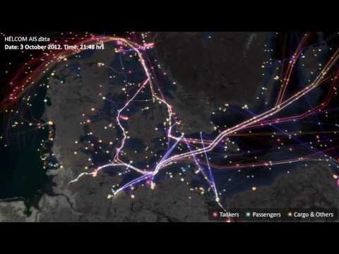
cts_srr_04_2015_pt. This is the Automatic Identification System data for all ships entering Australian waters for the month of April this year. Also in the folder, you will find a rectangular shapefile that covers the south east coast of Australia. Subset the AIS data to the South East coast of Australia. Plot this data in a nice graph (preferably using GGPLOT2). See if you can find the outline of Australia somewhere on the internet (obviously as a shapefile) and plot this too.
Check if you can see the data - your working directory should be this file's location, and your data should be in Data/
file.exists("Data/Cairns_Mangroves_30m.tif")
file.exists("Data/SST_feb_2013.img")
file.exists("Data/SST_feb_mean.img")
You should also have a folder Output/ for when we export results
Install the packages we're going to need - raster for raster objects, dismo is SDM, rgdal to read and write various spatial data
install.packages(c('raster', 'dismo','rgdal', 'gstat'))Check that you can load them
library(raster)
library(dismo)
library(rgdal)Now we're ready to go, but firstly, what is a raster? Well, simply, it is a grid of coordinates for which we can define a value at certain coordinate locations, and we display the corresponding grid elements according to those values. The raster data is essentially a matrix, but a raster is special in that we define what shape and how big each grid element is, and usually where the grid should sit in some known space (i.e. a geographic projected coordinate system).

Make a raster object, and query it
x <- raster(ncol = 10, nrow = 10) # let's make a small raster
nrow(x) # number of pixels
ncol(x) # number of pixels
ncell(x) # total number of pixels
plot(x) # doesn't plot because the raster is empty
hasValues(x) # can check whether your raster has data
values(x) <- 1 # give the raster a pixel value - in this case 1
plot(x) # entire raster has a pixel value of 1
Make a random number raster so we can see what's happening a little easier
values(x) <- runif(ncell(x)) # each pixel is assigned a random number
plot(x) # raster now has pixels with random numbers
values(x) <- runif(ncell(x))
plot(x)
x[1,1] # we can query rasters (and subset the maaxtrix values) using standard R indexing
x[1,]
x[,1]
Use this to interactively query the raster - press esc to exit
click(x)What's special about a raster object?
str(x) # note the CRS and extent, plus plenty of other slots
crs(x) # check what coordinate system it is in, the default in the PROJ.4 format
xmax(x) # check extent
xmin(x)
ymax(x)
ymin(x)
extent(x) # easier to use extent
res(x)  # resolution
xres(x) # just pixel width
yres(x) # just pixel height- make a raster with a smiley face
- extract some vector and matrix data from the raster
- subset the raster into a smaller chunk (tricker - see
?"raster-package")
Import the Cairns mangrove data and have a look at it
mangrove <- raster("Data/Cairns_Mangroves_30m.tif")
crs(mangrove) # get projection
plot(mangrove, col = topo.colors("2")) # note two pixel values, 0 (not mangrove) and 1 (mangrove)
NAvalue(mangrove) <- 0 # make a single binary dataset with mangroves having a raster value 1
plot(mangrove, col = "mediumseagreen")
The legend is a little odd - we can change to a categorical legend by doign this - but we'll stick to the default continous bar generally so as to reduce clutter in the code
cols <- c("white","red")
plot(mangrove, col=cols, legend=F)
legend(x='bottomleft', legend=c("no mangrove", "mangrove"), fill=cols)
Simple processing
agg.mangrove <- aggregate(mangrove, fact=10) # aggregate/resample cells (10 times bigger)

par(mfrow=c(2,2))
plot(mangrove, col = "mediumseagreen")
plot(agg.mangrove, col = "firebrick")
plot(agg.mangrove, col = "firebrick")
plot(mangrove, col = "mediumseagreen", add=TRUE) # add information to current plot
Create a simple buffer
buf.mangrove <- buffer(agg.mangrove, width=1000) # add a buffer
par(mfrow=c(1,1))
plot(buf.mangrove, col = "peachpuff")
plot(mangrove, col = "mediumseagreen", add = T) # note add= argument
Convert raster to point data, and then import point data as raster
pts.mangrove <- rasterToPoints(mangrove)
str(pts.mangrove)

par(mfrow=c(2,2))
plot(mangrove)
plot(rasterFromXYZ(pts.mangrove)) # huh?

NAvalue(mangrove) <- -999
pts.mangrove <- rasterToPoints(mangrove)
plot(rasterFromXYZ(pts.mangrove))

NAvalue(mangrove) <- 0 # set it back to 0
par(mfrow=c(1,1))
Export your data - lets try the aggregated raster
KML(agg.mangrove, "Output/agg.mangrove.kml", overwrite = TRUE)
writeRaster(agg.mangrove, "Output/agg.mangrove.tif", format = "GTiff")
Hang on, what about multiband rasters? The raster package handles them in the same way, just the nbands() attribute is >1 - think about an array instead of a matrix
multiband <- raster("Data/multiband.tif")
nbands(multiband)
nrow(multiband)
ncol(multiband)
ncell(multiband)
What about making our own multiband raster?
for (i in 1:4) { assign(x=paste0("band",i), value=raster(ncol=10,nrow=10))}
values(band1) <- runif(100); values(band2) <- runif(100); values(band3) <- runif(100); values(band4) <- runif(100)
multiband.stack <- stack(list(band1,band2,band3,band4))
nlayers(multiband.stack)
plot(multiband.stack)
Plotting an RGB image?
plotRGB(multiband.stack, r=1, g=2, b=3)
range(multiband.stack)
plotRGB(multiband.stack, r=1, g=2, b=3, scale=1) # let it know what the max value is for display
plotRGB(multiband.stack, r=3, g=2, b=1, scale=1)
plotRGB(multiband.stack, r=2, g=3, b=4, scale=1)
Other handy processing functions
?crop
?merge
?trim
?interpolate
?reclassify
?rasterToPolygons
Some handy analysis functions
?zonal # zonal statistics
?focal # moving windows
?calc # raster calculator
?distance # distance calculations
?sampleRandom
?sampleRegular
?sampleStratified
We won't go into detail on coordinate and projection systems today, but very briefly, remembering CRS() objects from the earlier sessions
crs(mangrove)
proj4string(mangrove)

latlong <- "+init=epsg:4326"
CRS(latlong)
eastnorth <- "+init=epsg:3857"
CRS(eastnorth)

latlongs.mangrove <- rasterToPoints(mangrove, spatial=T)
latlongs.mangrove
projected.pts.mangrove <- spTransform(latlongs.mangrove, CRS(eastnorth))
projected.pts.mangrove- import the raster "Landsat_TIR.tif" - it's a TIR (thermal infrared) image from the Landsat 8 satellite captured over a cropping area
- suppose we modelled the TIR values via linear regression to calculate the real on ground temperature, and beta0 was 0.5 and beta1 was 0.1 (i.e. y = 0.1x + 0.5) - make a map of temperature (hint:
?calc, and you'll need to write a function) - give the plot a title and axis labels, and colours that make sense for temperature
- make a matching raster (in extent and number of pixels, for the easiest solution) with zone codes (for each pixel), then calulate the mean/sd temperature in those zones (hint:
?valuesand?zonal)
Now let's take a bit of a whirlwind tour of the types of analyses we can do, and hopefully discover a bit deeper understanding of raster analysis in R.
Load up some SST data - Feb 2013 for the globe (as an aside, check this link for more great ocean global data sets: http://oceancolor.gsfc.nasa.gov/cms/)
sst.feb <- raster("Data/SST_feb_2013.img")
plot(sst.feb)
Crop it to the pacific so we can compare our mangrove data
pacific.extent <- extent(mangrove) + 80 # take advantage of the way R handles vector arithmatic!
pacific.extent # check it
sst.feb.crop <- crop(sst.feb, pacific.extent) # crop to the pacific
plot (sst.feb.crop)
Load up the long term mean SST data for Feb
sst.feb.mn <- raster("Data/SST_feb_mean.img")
plot(sst.feb.mn)
sst.mn.crop <- crop(sst.feb.mn, pacific.extent)
plot (sst.mn.crop)
Now let's make an SST anomoly map
sst.anomaly <- sst.feb.crop - sst.mn.crop # R + {raster} matrix arithmatic
plot (sst.anomaly) # plot the anomaly map
plot(sst.anomaly, col = topo.colors("100")) # different colours
plot(sst.anomaly, col = rev(heat.colors("100"))) # heat colours
contour(sst.anomaly, add = T) # add contours
Query single values,
minValue(sst.anomaly) # coldest pixel
maxValue(sst.anomaly) # warmest pixel
plot(sst.anomaly==maxValue(sst.anomaly))
or plots/stats for the entire image,
plot(sst.anomaly > 1)
hist(sst.anomaly, main = "February SST Anomaly - Pacific", xlab = "sst anomaly")
or let's be a litle more tricky!
max.anom <- which.max(sst.anomaly)
max.xy <- xyFromCell(sst.anomaly, max.anom)
plot(sst.anomaly, col = rev(heat.colors("100")))
points(max.xy, pch=8, cex=2)
Sampling points conditionally? Sure. We'll see a better wrapper for this further down though.
xy <- xyFromCell(sst.anomaly,sample(1:ncell(sst.anomaly), 20)) # 20 random points
points(xy)
extract(sst.feb, xy)
?getValues # check this out too
Re-capping writing back to disk
# writing rasters
writeRaster(sst.anomaly, "Output/sst.anomaly.tif", format = "GTiff")
KML(sst.anomaly, "Output/sst.anomaly.kml")
save(sst.anomaly, file="Output/sst.anomaly.feb.RData")
save(sst.feb.mn, file="Output/sst.feb.mn.RData") # check the file size, huh?
What's going on with those last two {r, eval=FALSE} save() commands? Something else to understand about the way the {r, eval=FALSE} raster package handles raster files is that for larger rasters, the whole file is not stored in memory, rather it is just a pointer to the file. You can test whether or not it is
inMemory(sst.feb.mn) # R will only access file  when needed.
inMemory(sst.anomaly) # it's in memory.
We saw stack() earlier, and we can use it for multi-band imagery, but also to stack up different information sources. brick() works in the same way, except that it is designed for smaller objects, and a RasterBrick can only point to one file, opposed to a RasterStack, which can point to multiple files.
sst.stack <- stack(sst.mn.crop, sst.feb.crop, sst.anomaly)
plot(sst.stack)
nlayers(sst.stack)
plot(sst.stack,2)
names(sst.stack)[3] <- "SST_anomaly"Now let's look at quick example of what we can do with rasters in context of species distribution modelling and spatial modelling. First lets extract some random points - make sure you've run library(dismo)
rpoints.sst <- randomPoints(sst.stack,500) #?randomPoints for more options
plot(sst.stack,2)
points(rpoints.sst, pch = 16, cex = 0.7)
sst.samp <- extract(sst.stack, rpoints.sst)  # extract values through stack this time
str(sst.samp)
sst.samp <- data.frame(sst.samp)
plot(sst.samp$SST_anomaly ~ sst.samp$SST_feb_2013)
What if we had some real biological data at those points? Well, let's make some up, and then fit a model to it
sst.samp$shark.abund <- rpois(n=nrow(sst.samp), lambda=round(sst.samp$SST_feb_2013))
plot(sst.samp$shark.abund ~ sst.samp$SST_feb_2013)
shark.glm <- glm(shark.abund ~ SST_feb_2013 + SST_anomaly,
                 data=sst.samp, family="poisson")
summary(shark.glm)
We would usually use predict() on a model fit object, and we can use it similarly for predicting out to raster data
predict(shark.glm, type="response")
shark.predict <- predict(sst.stack, shark.glm, type='response')
plot(shark.predict, col=rev(rainbow(n=10, start=0, end=0.3)), main="Shark abundance as a function of SST")
What if we just had the physical data at some points, and wanted to make those into a geographically weighted SST map? We'll use library(gstat) to try an IDW (inverse distance weighted) interpolation
plot(sst.feb)
rpoints.sst.feb <- randomPoints(sst.feb, 500)
points(rpoints.sst.feb)
rpoints.sst.feb <- data.frame(rpoints.sst.feb, extract(sst.feb, rpoints.sst.feb))
names(rpoints.sst.feb)[3] = "SST"
# fit the idw model
sst.idw.fit <- gstat(id="SST", formula=SST~1, locations=~x+y, data=rpoints.sst.feb,
                 nmax=5, set=list(idp=1))
sst.idw <- interpolate(sst.feb, sst.idw.fit)
par(mfrow=c(1,2))
plot(sst.feb); plot(sst.idw) # ahh!
sst.idw <- mask(sst.idw, sst.feb)
plot(sst.feb); plot(sst.idw)
Let's have a go at ordinary kriging (ignoring assuptions about Gaussian repsosne data)
# first some package specific projection stuff
coordinates(rpoints.sst.feb) <- ~x+y
proj4string(rpoints.sst.feb) <- proj4string(sst.feb)
# now the kriging
sst.vario <- variogram(object=SST~1, data=rpoints.sst.feb) # could log(y) is SST wasn't negative
sst.vario.fit <- fit.variogram(sst.vario, vgm(psill=0.3, model="Gau", range=100)) #?vgm
# (Exp)ponential, (Sph)rical, (Gau)ssian, (Mat)ern, (Spl)ine, (Lin)ear etc.
sst.ordkirg.fit <- gstat(id="SST", formula=SST~1, model=sst.vario.fit, data=rpoints.sst.feb)
sst.ordkrig <- interpolate(sst.feb, sst.ordkirg.fit)
sst.ordkrig <- mask(sst.ordkrig, sst.feb)
plot(sst.feb); plot(sst.ordkrig)- try generating some stats (values or plots) for SST anomaly for different regions, either across the globe or across Australia
- try come band math, or some conditional statements using multiple rasters or a RasterStack
- create another SDM scenario - either using downloaded data, or totally simulated data
- do some more interpolations, varying the number of points used, and see how that effects your interpollated product
- try and figure our co-kriging, or interpolation with added covariate data (hint: there's an example in
?interpolate)
Let's get some climate data using the raster package
par(mfrow=c(1,1))
rain <- getData('worldclim', var="prec", res=10, lon=5, lat=45) # this will d/l data to getwd()
plot(rain)
nlayers(rain)
rpoints.rain <- randomPoints(rain,500)  # through the stack
plot(rain, 1) # plot january rainfall
points(rpoints.rain, pch=16, cex=0.7)
samp.rain <- extract(rain, rpoints.rain)
head(samp.rain)
Get maps using dismo
install.packages("XML"); library(XML)
Aus <- gmap("Australia") # get google maps normal
plot(Aus)
AusSat <- gmap("Australia", type="satellite") # get google maps satellite image
plot(AusSat)
Get simple maps
install.packages("maps"); library(maps)
map(database = "world", col = "grey")
A couple other handy packages
library(rasterVis)
library(maptools)