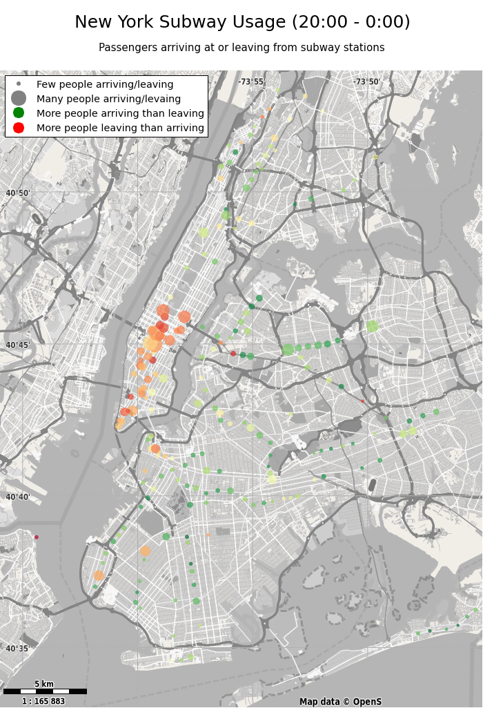
This Python program shows which subway stations are busy and where more people depart or arrive for different times of the day. The data is based on MTA turnstile data which is available here. The background map is based on openstreetmap data, rendered using Maperitive and these rules that I've slightly adapted.
This project was part of my Udacity nanodegree data analyst
Please note that I've manually created the animated gif from the png files that the Python program generates.
Just some suggestions:
- Automatic creation of the gif
- Better data basis by directly using MTA's data rather than the data provided here (which spans just a week).