Updated homepage why codeigniter section centering the elements #1
Conversation
|
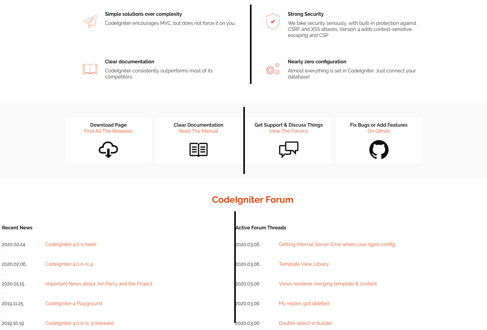
I like the idea of what you've done, but this exacerbates the issue I've brought up before that the centerlines of the sections have never seemed to line up. It's even more obvious now. Please see the screenshot for an example. If we could get those all to line up visually that would be amazing. Also, this makes the bottom section feel much wider than the previous sections.
|
|
I'm aware of the problem, The idea of this merge was to get thing rolling on that matter. My idea is to narrow down the next two sections too putting the center lines aligned that way. But I didn't want to do all the sections if this was not something you guys wanted. I'll work on that then. |
|
hi there, I think the issue is solved (in large screens) but I wanted you guys to see it before I do all the media queries to solve the problems in smaller screens.
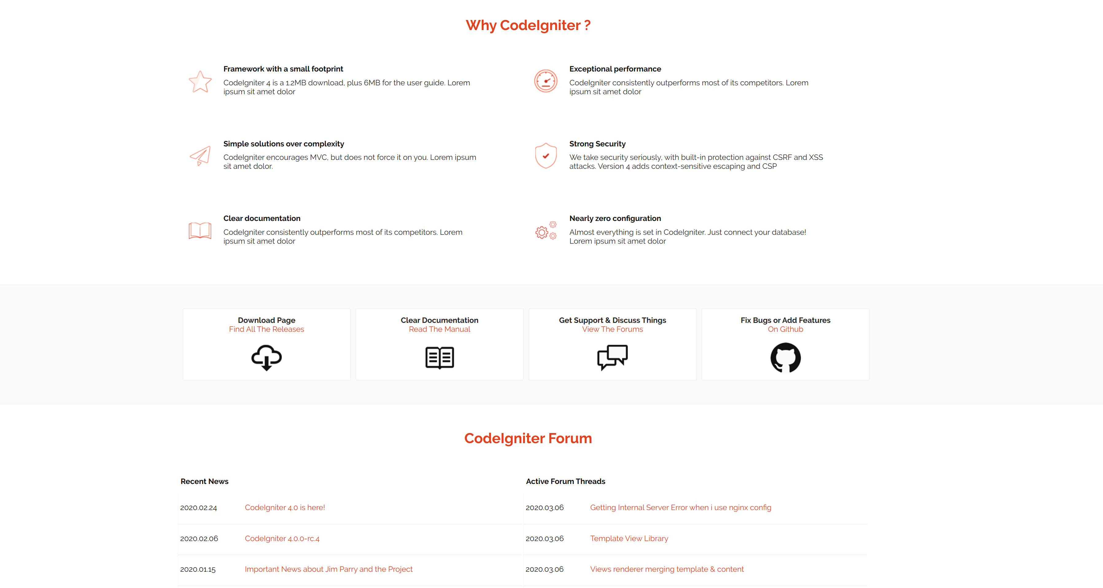
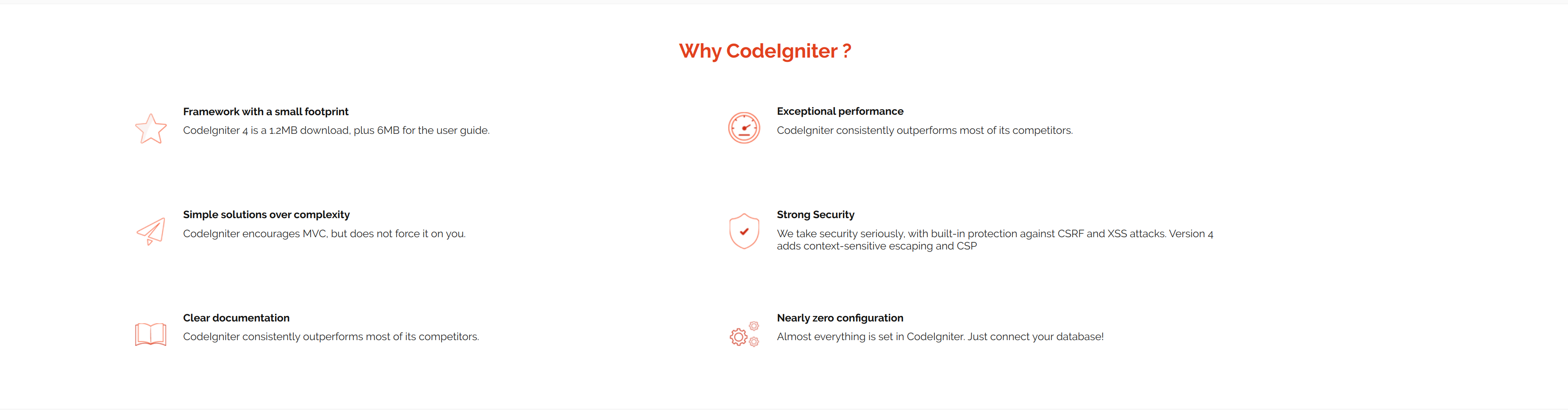
The other thing I think it would help visually would be if all the boxes in the "why" section have two lines of text. As you can see in my print. I didn't change anything in the header and footer, but those probably need to come down a bit more in large screens. As you can see in my screen (large 4k screen) the having the header and footer content take 80% of the width I think that's too much. That's good for HD and down. One other thing that I noticed was that the fact that the boxes in the "why" section don't have a border by default they will always look like they are not centered when in fact they are.
VS
Anyway, let me know what you guys thing about all this and I'll move forward after your comments :) |
|
@mpmont I think that's looking much better, at least in the screenshots. I didn't pull the latest changes to test locally but looks good there. We can always address the content requirement changes when we integrate to the code, but I agree that would be better. |
|
@lonnieezell Ok, so I'll work on the media queries next so that this can look good on screens smaller than FHD and 4k. That way we can finish this pull request with all the changes to the homepage. |
|
Sounds great, thanks! |
|
Hey Team! Sorry I only got around to have some time to do this today. I rested the responsive on the page more and changed some stuff around. The footer still needs work on phone devices, but that was not yet done in the original version too. If some of you have some time and can pull this version to test it out that would be great. :) |
2 participants
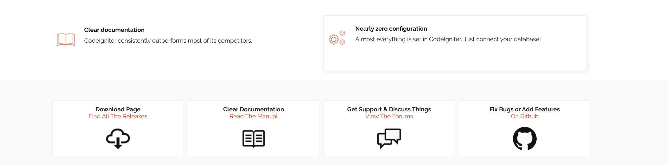
Before:
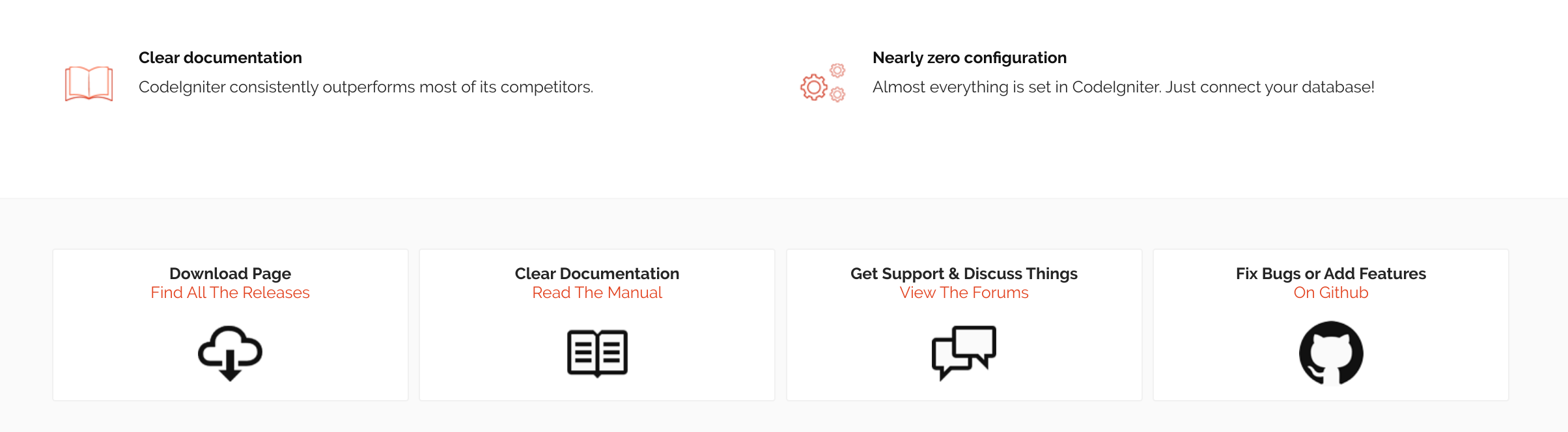
After:
I also changed the spacing in the links at the homepage, the padding on the top of those squares were not the same as the one on the bottom.
Before (the titles were a bit too close to the top compared to the padding on the bottom of the square):
After:
ps. I'm sorry I didn't noticed that I had my text editor set to remove extra spaces, that's why there's so many blank lines changed. At least now there's no extra spaces anywhere :p