A project from my CSE 487: Data Intensive Computing Course.
A twitter application was implemented in R to gather over 10,000+ tweets with hashtags involving the user’s keyword input using the rtweet library.
The learning goals of this project were:
- Familiarize with R language through Jupyter environment
- Data Collection
- Gathered data from a CDC site of flu data and analysis and Twitter's Tweet Search REST API
- Process the data collected for simple data analysis and charting
- Visualize geo spatial information extracted from the tweets
- Compare CDC's flu HeatMaps with my flu HeatMaps of the USA derived from the twitter data that I obtain
In this directory, it consists of statistical and graphical examples that I have done while learning R for first time.
- Barplots
- Boxplots
- Histograms
- HeatMaps (Required libraries ggmap, maptools, maps, and used Google geolocations API service)
- Scatterplots
- Lines and plots graphs
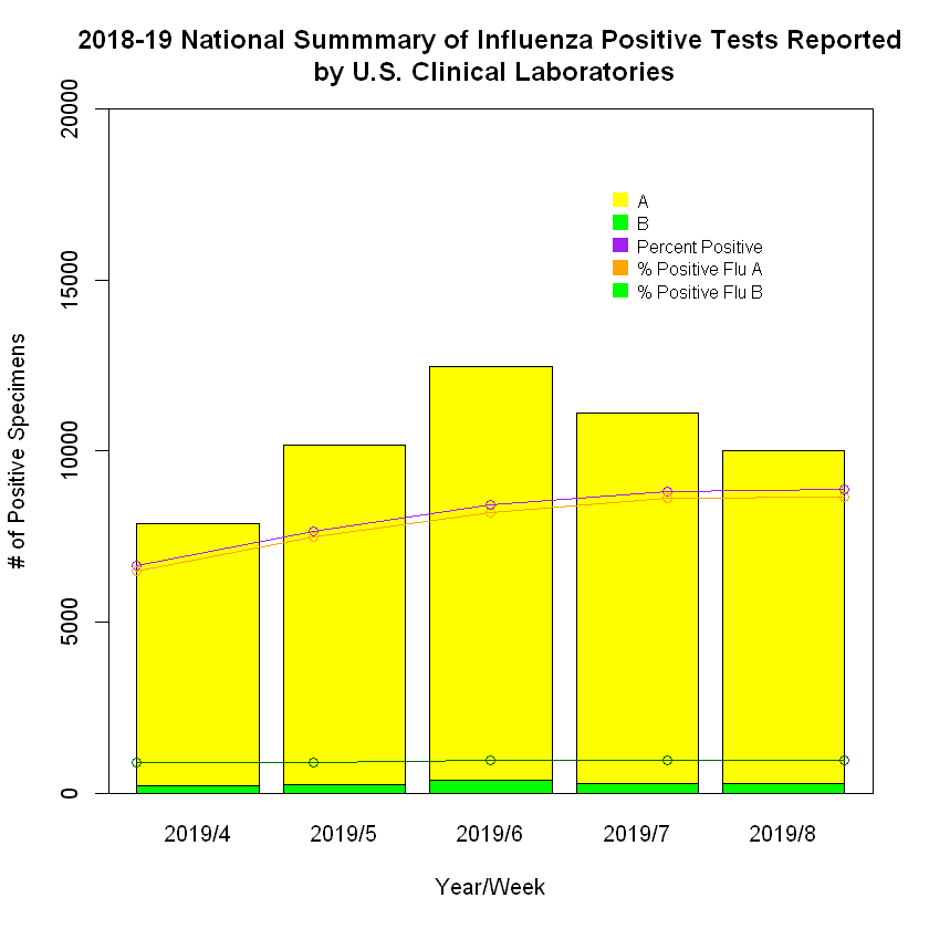
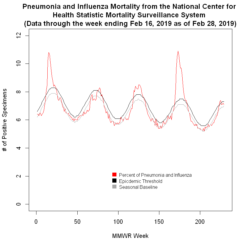
We make graphs like in part 1, but this time using the data gathered from the CDC site
Here's a few that I made:
For this part, we will start developing a twitter application.
We need to use Twitter API and do a keyword query search for tweets.
(For me, I searched for 10,000 tweets for each keywords "Flu", "Flu Season", and "Sick".)
After gathering the tweets, we would need to extract tweets only from users with geolocations found in the data collected.
(Note: Not all users provided their geolocations in the twitter data)
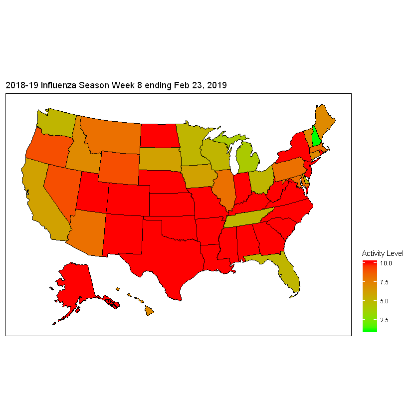
As a result, I successfully made heatmaps representing each keyword.
Below is the original CDC Heatmap:

"Flu" Heatmap

"Flu Season" Heatmap

"Sick" Heatmap

I concluded that my "Sick" Heatmap resembled closest to CDC Heatmap.
Thanks for reading! I hope you enjoyed seeing my heatmaps!