✨ Modalium — Animated modals with superpowers for React Native & Expo.
Create smooth, elegant, and highly customizable modals with animations, blur effects, and multiple presentation styles. Fully compatible with React Native & Expo.
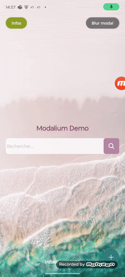
Experience Modalium in action:
Or see it below:
npm install @infinitui/modalium
# or
yarn add @infinitui/modaliumModalium relies on several external packages to function properly. You must install these in your project:
npm install react-native-safe-area-context react-native-gesture-handler react-native-reanimated expo-blurSome of these libraries require additional configuration:
react-native-reanimated: Add the Babel plugin and enable Reanimated in yourbabel.config.jsreact-native-gesture-handler: Wrap your app inGestureHandlerRootViewexpo-blur: Works out of the box with Expo, but requiresexpo-modules-corein bare projects
Refer to each library’s documentation for full setup instructions.
import React, { useState } from 'react';
import { View, Button, Text } from 'react-native';
import Modalium from '@infinitui/modalium';

export default function App() {
  const [visible, setVisible] = useState(false);

  return (
    <View style={{ flex: 1 }}>
      <Button title="Open Modal" onPress={() => setVisible(true)} />

      <Modalium
        visible={visible}
        onRequestClose={() => setVisible(false)}
        animationType="slide"
        presentationStyle="overFullScreen"
        useBlurOverlay={true}
        blurIntensity={80}
        swipeToClose={true}
        modalBgColor="#ffffff"
        statusBarTranslucent={true}
      >
        <View style={{ backgroundColor: '#ffffff', padding: 20, borderRadius: 12 }}>
          <Text style={{ fontSize: 18 }}>Hello from Modalium 👋</Text>
          <Button title="Close" onPress={() => setVisible(false)} />
        </View>
      </Modalium>
    </View>
  );
}| Prop | Type | Default | Description |
|---|---|---|---|
visible |
boolean |
— | Show or hide the modal |
onRequestClose |
() => void |
— | Called when modal should close |
onShow |
() => void |
— | Called when modal is shown |
onDismiss |
() => void |
— | Called when modal is dismissed |
duration |
number |
333 |
Animation duration in ms |
children |
React.ReactNode |
— | Modal content |
transparent |
boolean |
true |
Use semi-transparent background |
animationType |
`'fade' | 'slide' | 'scale' |
statusBarTranslucent |
boolean |
false |
Make status bar translucent |
presentationStyle |
`'fullScreen' | 'overFullScreen' | 'formSheet' |
blockBackgroundInteraction |
boolean |
true |
Prevent interaction with background |
swipeToClose |
boolean |
true |
Enable swipe-down to close |
barStyle |
`'light-content' | 'dark-content'` | 'dark-content' |
useBlurOverlay |
boolean |
false |
Enable blur background |
blurIntensity |
number |
50 |
Blur intensity |
blurTint |
`'light' | 'dark' | 'default'` |
circleBgColor |
string |
'white' |
Background color of animated circle |
circleScaleMax |
number |
10 |
Maximum scale of the circle animation |
circleSize |
number |
100 |
Initial size of the circle |
startX / startY |
number |
— | Coordinates for circle origin |
modalBgColor |
string |
— | Background color of modal content container |
- ✅ React Native
- ✅ Expo
- ✅ Android & iOS
- ✅ Works with
react-native-safe-area-context,expo-blur,react-native-reanimated, andreact-native-gesture-handler
Modalium is actively evolving and I’m looking for contributors to help improve it!
If you love animation, UI polish, or just want to help build beautiful React Native components — fork the repo, open a PR, or start a discussion.
Ben-Jamin MK
Creator of modern UI components for React Native.
GitHub