Interactive paging indicator widget, compatible with the ViewPager from the
Android Support Library.
 ------
For a working implementation of this project see the sample/ folder.
- Include the following dependency to your gradle file.
compile 'com.jpardogo.materialtabstrip:library:1.0.8'Or add the library as a project. I tried to send a pull request, but looks like the original developer doesn't maintain it anymore.
-
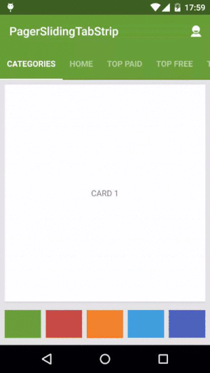
Include the PagerSlidingTabStrip widget in your layout. This should usually be placed above the
ViewPagerit represents.<com.astuetz.PagerSlidingTabStrip android:id="@+id/tabs" android:layout_width="match_parent" android:layout_height="?attr/actionBarSize" android:background="?attr/colorPrimary" />
-
In your
onCreatemethod (oronCreateViewfor a fragment), bind the widget to theViewPager.// Initialize the ViewPager and set an adapter ViewPager pager = (ViewPager) findViewById(R.id.pager); pager.setAdapter(new TestAdapter(getSupportFragmentManager())); // Bind the tabs to the ViewPager PagerSlidingTabStrip tabs = (PagerSlidingTabStrip) findViewById(R.id.tabs); tabs.setViewPager(pager); -
If your adapter implements the interface
CustomTabProvideryou can past you custom tab view/s. In case the the view returned contains the idR.id.tab_title, this view should be aTextviewand will be used to placed the title.Otherwise the default tab will be use (That's a TextView with id
R.id.tab_title) -
(Optional) If you use an
OnPageChangeListenerwith your view pager you should set it in the widget rather than on the pager directly.// continued from above tabs.setOnPageChangeListener(mPageChangeListener);
From theme:
android:textColorPrimaryvalue (from your theme) will be applied automatically to tab's text color , underlineColor, dividerColor and indicatorColor, if any of these values are define in the xml layout.
Notes about some of the native attr:
android:textSizeTab text sizeandroid:textColorTab text colorandroid:paddingLeftorandroid:paddingRightLayout padding. Only the biggest of both will be applied to each side.
Custom attr:
pstsIndicatorColorColor of the sliding indicatorpstsUnderlineColorColor of the full-width line on the bottom of the viewpstsUnderlineHeightHeight of the full-width line on the bottom of the viewpstsDividerColorColor of the dividers between tabspstsDividerPaddingTop and bottom padding of the dividerspstsDividerWidthStroke width of divider line, defaults to 0pstsIndicatorHeightHeight of the sliding indicatorpstsTabPaddingLeftRightLeft and right padding of each tabpstsScrollOffsetScroll offset of the selected tabpstsTabBackgroundBackground drawable of each tab, should be a StateListDrawablepstsShouldExpandIf set to true, each tab is given the same weight, default falsepstsTextAllCapsIf true, all tab titles will be upper case, default truepstsPaddingMiddleIf true, the tabs start at the middle of the view (Like Newsstand google app)pstsTextStyleSet the text style, default boldpstsTextSelectedStyleSet the text style of the selected tab, default boldpstsTextAlphaSet the text alpha transparency, default 0.5pstsTextSelectedAlphaSet the text alpha transparency of the selected tab, default 1
Almost all attributes have their respective getters and setters to change them at runtime , open an issue if you miss any.
- Andreas Stuetz - andreas.stuetz@gmail.com
- Check contributors list.
- Kirill Grouchnikov - Author of an explanation post on Google+
Copyright 2013 Andreas Stuetz

Licensed under the Apache License, Version 2.0 (the "License");
you may not use this file except in compliance with the License.
You may obtain a copy of the License at

   http://www.apache.org/licenses/LICENSE-2.0

Unless required by applicable law or agreed to in writing, software
distributed under the License is distributed on an "AS IS" BASIS,
WITHOUT WARRANTIES OR CONDITIONS OF ANY KIND, either express or implied.
See the License for the specific language governing permissions and
limitations under the License.