Material UI Text Field component for UIKit, iOS and tvOS (iOS 10+, tvOS 10+).
TvOS is still in beta, but would be tweaked wherever required soon.
For SwiftUI support, please look into MaterialFormSwiftUI pod (iOS 13+).
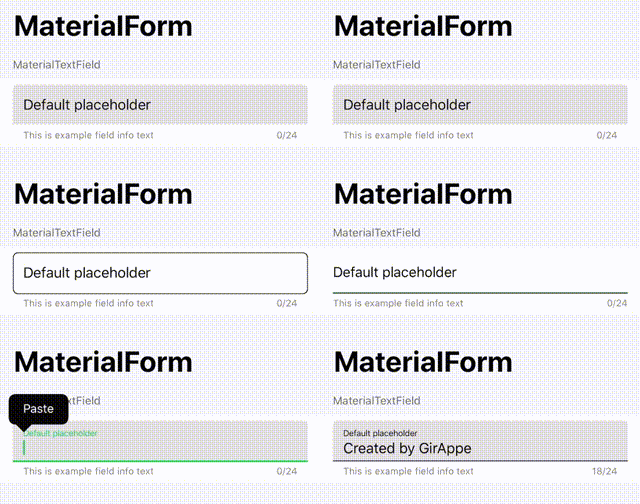
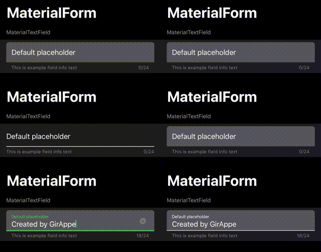
Default look and feel for light and dark theme style:
Add to your Package.swift, or setup within XCode 11+:
.package(url: "https://github.com/GirAppe/MaterialForm.git", from: "0.9.7"),Add to your Podfile:
pod 'MaterialForm'Add to your Cartfile:
github "GirAppe/MaterialForm"- KVO Observable text/event/state properties. In most cases you won't need to set it's delegate.
- Easy usage of left/right accessories, allows to easiuly add clickable action icons
- Built in error state handling, by setting
errorMessagevalue - Support for specifying max characters count
- Can define next text field, that the focus would pass to after return was tapped
- Built in characters counter
Place a UITextField in your IB file, and change it's class to 'MaterialUITextField'. Voila ;)
There are plenty of additional properties that are accessible through IB. For a different styles, set
borderStyleproperty from IB.
MaterialUITextField is a UITextField subclass. There is no additional setup required unless you want to.

