A customizable plugin for Strapi to integrate an icon field into your content types. This plugin allows users to easily select icons for different fields, improving the flexibility and user experience of your Strapi-based CMS.
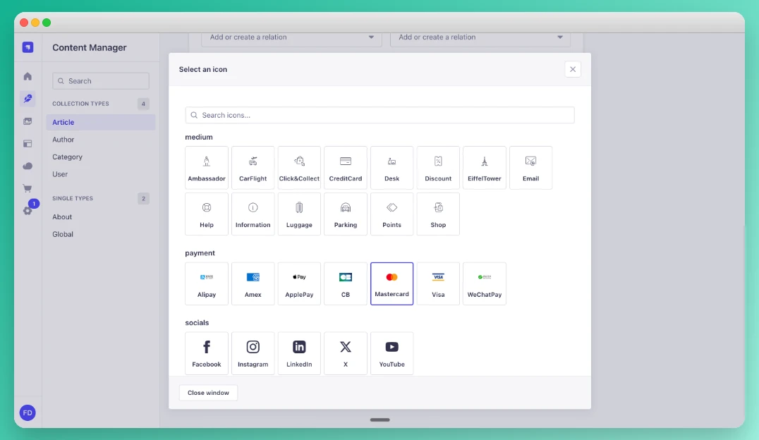
- Icon Picker: Adds an icon field to your content types, enabling users to select from a variety of preloaded icons.
- Search: Filter icons by name directly in the picker modal.
- Flexible output: Choose between returning the full SVG code or just the icon name — ideal for SVG sprite workflows.
- Customizable: You can add any svg icons code directly from the
publicfolder inside a custom subfolder (eg:public/icons), making this plugin adaptable to any design or theme. - Pass SVG code directly into your API: No additional package needed on your frontend. You can directly rendered the plugin with a custom component custom component on your frontend.
- Dark mode: The icon picker is fully compatible with Strapi's dark mode.
- User-friendly: Simple, intuitive field for content managers to pick and manage icons.
npm install strapi-plugin-icons-fieldNo additional configuration in
config/plugins.tsis required. The plugin is automatically registered once the package is installed.
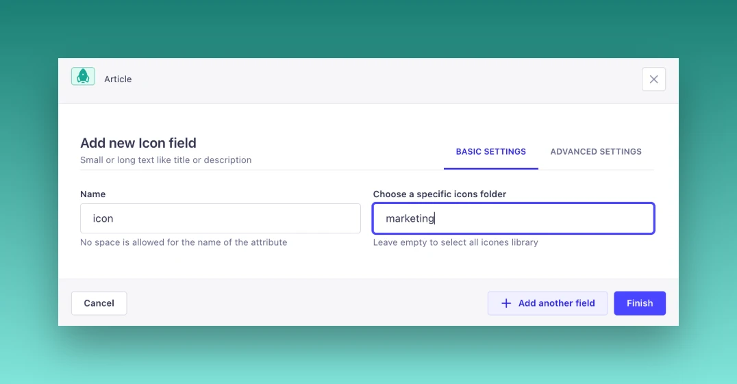
Create an icons folder (or any name you prefer) inside the /public directory and add your SVG icons there. You can also organize and group your icons into subfolders, for example: /icons/marketing.
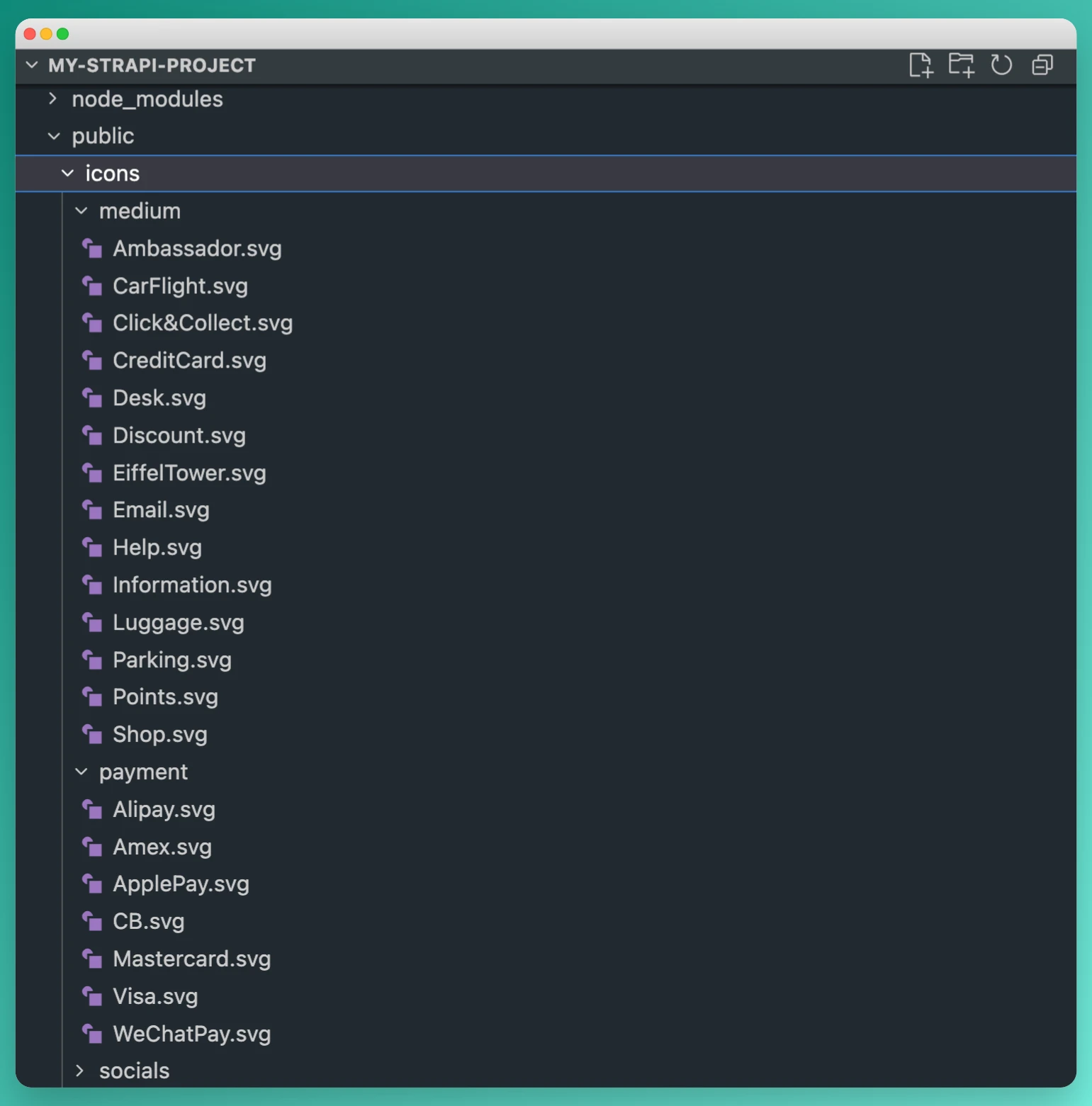
The system will directly scan the specified folder and its subfolders to make all SVG icons available for selection in the plugin.
After installing the plugin, rebuild your Strapi instance:
npm run build
npm run develop
or with yarn:
yarn build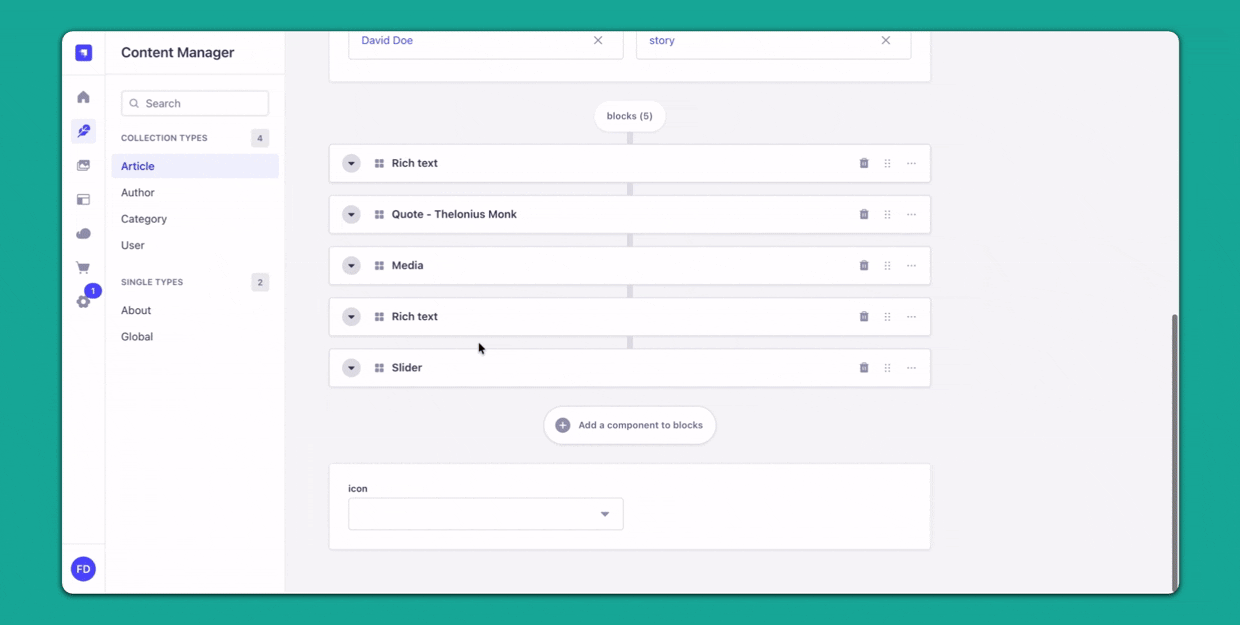
yarn developOnce the plugin is installed, you will be able to add an icon field to any collection type.
- Go to Content-Types Builder in the Strapi Admin Panel.
- Select the collection type where you want to add the icon field.
- Choose Icon from the available field types.
- Configure the field as needed (e.g., allowing custom subfolder icons selection or full list by default).
- Save and deploy your collection type.
If you don't want to display all your icons in the list, you can apply a custom selection by subfolder by entering their subfolder name attribute — one folder name per line.
You can enter multiple folder names to combine icons from different subfolders.
This allows your team to leverage icons that match your project or use cases.

| Option | Type | Description |
|---|---|---|
| Required field | Checkbox | Makes the field mandatory — the entry cannot be saved without selecting an icon |
| Show icon label | Checkbox | Displays the icon filename below each icon in the picker modal |
| API output format | Select | Chooses what value gets stored in the API (see below) |
When enabled, the icon's filename is displayed below each icon in the picker modal. Useful when icons are not self-explanatory by shape alone.
Choose what value gets stored in the API:
| Format | Stored value | Use case |
|---|---|---|
| SVG code (HTML) (default) | Full SVG string | Render the icon directly without any extra dependency |
| Icon name | Icon filename without extension | Reference icons in an SVG sprite (<use href="#icon-name" />) |
A typical use case is when using an SVG sprite system on your frontend. The SVG code would be duplicated (once in the sprite, once via the API), but it allows the frontend to reference the icon in the sprite by its label:
<svg><use href="#Ambassador" /></svg>See this sandbox example for a practical implementation.
Once the icon field is added to your collection type, you can select an icon from a predefined set or add your own. The icons will be displayed on the content manager interface and can be used for various purposes like UI customization, categorization, and more!
You can easily render the SVG icons from this plugin in your React components using the Icon component. This component allows you to pass in the raw SVG code (as a string) and render it directly in your React app.
First, ensure you have html-react-parser installed, as it's used to parse the SVG code.
npm install html-react-parseror with yarn:
yarn add html-react-parserUse the Icon component to render SVG icons. Here’s an example:
import React from 'react';
import Icon from '../components/Icon';  // Import your Icon component

export default function Page () {
  const iconSvgCode = `<svg xmlns="http://www.w3.org/2000/svg" viewBox="0 0 24 24" width="24" height="24"><path d="M12 2L2 7l3 11h14L22 7z"/></svg>`; // Example SVG icon code, you should replace with your Strapi API Call

  return (
    <div>
      <h1>Render SVG Icon</h1>
      {/* Render the SVG using the Icon component */}
      <Icon icon={iconSvgCode} className="my-icon" />
    </div>
  );
};
The homemade component
import React, { HTMLAttributes }  from 'react';
import parse from 'html-react-parser';

interface RenderSvgProps extends HTMLAttributes<SVGElement> {
  icon: string;
}

export default function Icon({ icon, ...props }: RenderSvgProps) {
  const parsedElement = icon && parse(icon.trim());
  if (parsedElement && React.isValidElement(parsedElement)) {
    return React.cloneElement(parsedElement, props);
  }
  return null;
}iconProp: Theiconprop takes the raw SVG code as a string. You can get this string either from your Strapi CMS or any other source.props: You can pass additional props likeclassName,style, oronClickdirectly to customize the rendered SVG element.parse: Theparsefunction from thehtml-react-parserlibrary is used to convert the SVG code into React elements.
You can also customize the SVG attributes (like width, height, or fill) by passing them as props to the Icon component.
<Icon
  icon={iconSvgCode}
  className="custom-icon"
  width="48"
  height="48"
  fill="blue"
/>
In this example, the SVG will be rendered with a custom size (48x48) and a blue color fill.
We welcome contributions! If you'd like to contribute to this project, please fork the repository and create a pull request with your changes.
Before submitting, make sure to:
- Follow the existing code style and conventions.
- Write clear and concise commit messages.
- Ensure tests pass (if applicable).
This project is licensed under the MIT License - see the LICENSE file for details.
If you encounter any issues or have questions, feel free to create an issue on GitHub, and we will get back to you as soon as possible!