Fix dark mode colours #882
Conversation
Improves the ugly button situation on macOS
|
… and in the first commit is the simple fix that makes the text for the error count always black. |
|
Yeah, not sure. I think the alternative would be to replace all buttons with a Label with a border and some hover effect … Should also not be too hard. |
|
If this doesn't break Linux or Windows I think we can live with it. This will make the status bar grey in Linux and Windows too, right? This is a downgrade, but I think it's less important. If you come up with a better solution for the buttons then we can revert it. Or maybe just fix the black text issue in one separate PR, so we can bikeshed the buttons and status bar stuff a bit longer independent of the fix? A point release with the fix would be welcome, so that my students with Macs can work properly, is it doable? |
|
Yeah, will publish the first commit with the black text separately. (You can also tell the students to disable dark mode. :) ) I experimented with Labels instead of Buttons in Tk but they have a bit of a sluggish feel to them (if we want to have some tricks like changing the background color on hover). If I have some more ideas over the weekend, I’ll add the screenshots here and we can decide. Otherwise we will just release the first commit and do the rest later. |
|
Maybe we can make the dark status bar work when we make it smaller? Like putting all buttons in one row? |
|
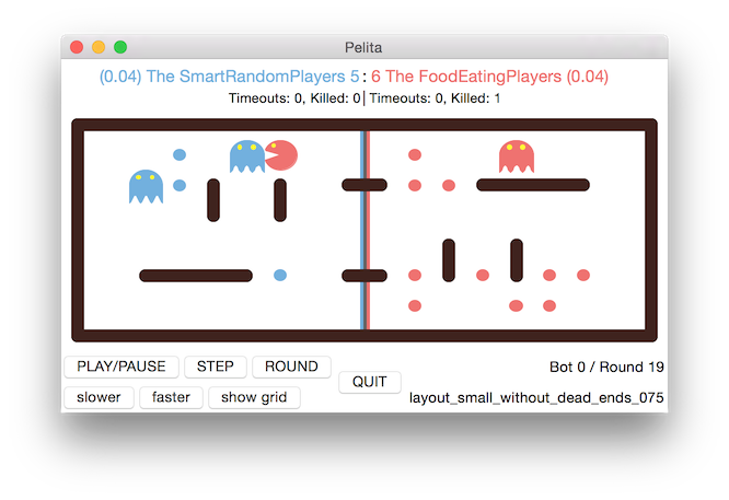
With only two rows it looks better. (I also think we can get rid of the fps?) We can also discuss if we need all of the buttons. 

|
|
Historic reminder, we used to have only two rows of status info (as can be seen in our Readme still – last changed 10 years ago): Interestingly, back then, it was possible to have the white buttons on a white background on macOS look normal, but when I run 
In PyQt6 #756 it was also not really possible to design the background frame colour, I think (or was I just lazy? screenshots for reference) so all in all I believe that this is just something that we have to live with in macOS from now. (At least in Qt we could however move the whole game inside the Canvas and draw our own buttons and it would still look fine with anti-aliasing on Linux and Windows as well. Plus we’d have a workable dark mode.) 

I also looked into https://github.com/flet-dev/flet (completely different framework; has library problems in Linux) and https://customtkinter.tomschimansky.com (might work but its promises of an anti-aliased canvas are unfortunately not quite true?). All that said, my suggestion would be to not mess with third-party Tk wrappers (not even ttk) at all for now and go with the frame styling suggested in this PR. I’ll see that I clean up the button spacing. It really gives use the most natural and bug-free button appearance in macOS that seems to be possible with Tk. As far as Linux and Windows are concerned: If you thing the grey background is a step backwards, we could have conditional colourisation and make it white as before on these systems. |
|
No, let's go for grey everywhere then. Conditionals are evil ;) |
Removes the fps and rearranges the layout in the status section.
The title section is not a separate canvas anymore; we draw the team
names directly on the game canvas. This allows for tighter spacing.

Default geometry has been changed to make the cells square again.
ffac457 to
60a8094
Compare
|
Two small additional technical changes made: The title section is not a separate canvas anymore; we draw the team names directly on the game canvas. This allows for tighter spacing (MeshGraph takes an offset parameter now). Default geometry has been changed to make the cells square again. |

|
|
Some issues on Linux still:
|


|
This is for another time, but what about changing the button labels like this:
|
|
Another glitch in Linux: the button bar now has almost no padding anymore on the border with the maze. It was a bit more spaced before. Or maybe it wasn't, but because it was the same color, it wasn't noticeable. Now that it is grey, it seems a bit crammed to me... |
Ah, too bad. We are off by two rows of pixels compared to macOS here (macOS is still rather close but I think it works and doesn’t overlap). Will see if I can solve this with better font sizes.
Yeah, I wanted to remove the visual weight from the second row there. (The ‘nothing selected’ text is also in a smaller font.) If it’s not readable (or you think it looks worse), we can revert it.
I wanted to give the buttons to the left more space when the window is made smaller and adjusted the weights for the grid layout. (Resizing still doesn’t work too well, I haven’t figured out a good way to make all the buttons shrink at the same time.) People who regularly use the quit button and still have trouble finding it, should really learn about the letter q. ;)
In principle yes. The problem is: This will make them even further apart on macOS and if you’re not careful and use the wrong button styles (like height), they will change their look on macOS completely. It’s all a big mess.
Windows and Linux looked similar but I am not sure how much this is actually dependent on how Python itself is installed.
Yeah, I agree. It kind of works on macOS I think but the effect on Linux is worse. |
This sign clearly means play until the end without stopping.
The canonical icons are 🐢 and 🐇.
I think slower and faster are also debug-mode buttons. (In the sense that in a normal game you should never need to press them.) We can test it but I’m a little doubtful that this will have an improved look with Tk. The only thing that makes these oversized buttons work is that we have oversized text in them. :) |
yes, but please do not make the labels smaller: old people (me) still need to see it ;)
it's ok for the slower and faster buttons. The
I don't know. To me it looked better before, but I am not terribly attached to that either.
Yes. Is there anything bad to expect if we just remove the
OK, go for it!
Then maybe until we have the right™ solution we just go for the conditional above even in this case?
so, another conditional? |
no, really, I see a lot of students pressing faster faster faster when they test their bot without using the debug mode. They should learn
yes, yes, the unicode thing is just to nice to be applicable here ;) |
No, I agree, people use it a lot and it should be easily reachable. But what I meant is, once you press it, you are – by my definition – not in a normal game anymore but you are debugging. Therefore the button location should be adjacent to the other debug tools and not next to the regular game controls. That said, I think these buttons gives an illusion of power that is not really there, suggesting infinite steps of speed that are neither useful nor possible. Something like this would be more fitting: 
OTOH, buttons are easier to press, so we should keep them I guess, but maybe reduce the number of available steps? |
We can have flite screen-read the numbers for you. Would that help? :)
I agree that vastly oversized is better than this mid-range size button (it just needs to be able to auto-shrink). The large quit button really ties the status area together.
I guess so. Why did we add it in the first place? |
79df4f6 to
5801edf
Compare
|
(Not tested on Windows yet) |
5801edf to
00e2890
Compare
|
Look on Windows. 
|

|
Looks good! |
|
Buttons on Linux are bigger (there is commented-out code for this in the PR but in the end I think this has been enough fine-tuning already) |

|
Merge and make a point release then? |
|
release! |
Fix dark mode colours da96487
Suggestion for #881
Makes the buttons on macOS all in all nicer by removing the colouring completely, thereby getting rid of grey or black background mismatches. (There are alternative button sets like https://pypi.org/project/tkmacosx/ that solve the whole issue much nicer but it is not really clear, how stable these solutions are in the long run.)
As the default background colour for Tk has this sad grey, this obviously sets the whole status section apart. Can we live with that? Is this all in all worse?
Tk unfortunately doesn’t have any border-top or margin-top stylings to improve the appearance here. I had to resort to a dummy row on top of the status section with ipady=2 to add a few more pixels on top of the status bar, otherwise it wouldn’t really look ok.
Haven’t tested on Linux yet or with anything other than macOS.