Tune body text for readability #576
Description
Issue Description
Follow-on from #569
This switched to the system font stack to avoid including a web font. The specific font switched to, on macOS systems, is SF Pro (specifically SF Pro Display I believe).
(As a side note, Proxima Nova is still both loaded onto the page via Typekit, and used in the body font-family rule.
SF Pro is a great font for UI, but it's not fantastic for body text at large sizes. Our regular body text is 18px, which is much larger than the designed use cases for SF Pro Display. As such, the font doesn't have great readability; the visual weight of the text is now much higher than previously, and the antialiasing looks a little off. (The visual weight is noticeable in the side-by-side screenshot on #569)
Currently, the font weight on .App is set to 400. Removing this to move to the default (300) per #453 improves the readability a bit, but SF Pro still looks a bit weird at this size. If we want to stick to the SF family, SF Pro Text is a much more legible alternative font at these sizes.
Alternatively, and probably a better long-term solution, is to lower the text size. 18px is one of those choices inherited from the pattern library, and I think is probably just straight up too big given the width of the content columns. This would increase the information density in both posts, and importantly, comments. Adjusting the root text size has a bunch of flow-on effects due to rem sizing though, so it'll need some other changes.
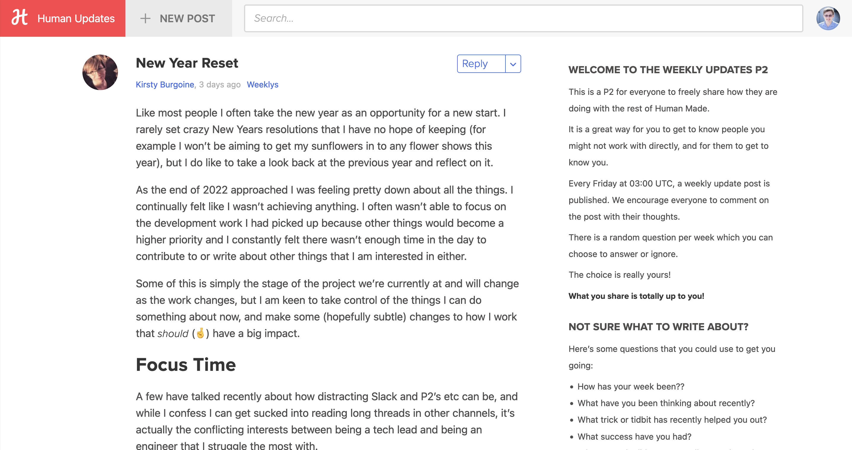
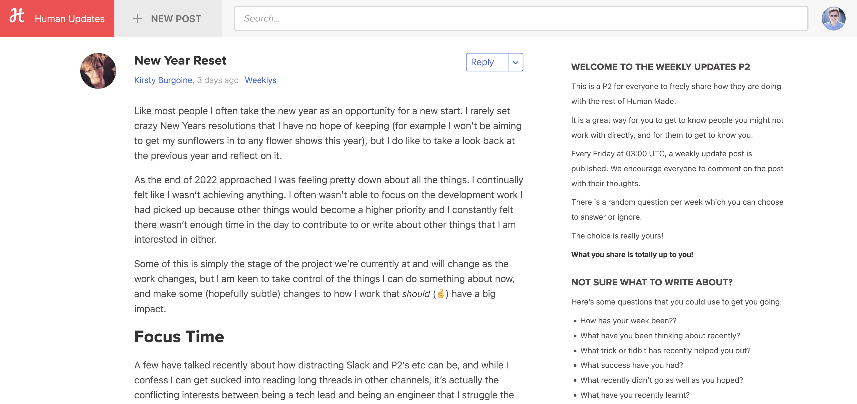
| 18px, 400 SF Pro Display | 16px, 300 SF Pro Text |
|---|---|
 |
 |
Steps to reproduce:
Only reproducible on macOS, as SF Pro only exists there.