Dashboard isn't formatted correctly #21
Description
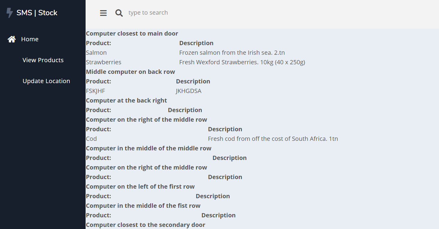
On the initial landing page the contents have not been formatted or organised properly yet, making it hard to follow and unsightly. This has a negative impact on the user experience
Context
After logging into the system, the user is redirected to the dashboard. This dashboard is supposed to display a lot of the product information and locations from the database. In its current state, the information is being taken from the database and displayed but not in a nicely formatted way. Added to this, if an area is empty, the table still displays headings with no content below.
Process
- User logs into their account
- Dashboard page is loaded up, displaying information taken from the database
Expected result
The products stored at each location should be displayed in a table on the dashboard. The table should be styled with CSS so that the information is clearly readable and pleasing to the eye. If an area has no products a message should be displayed saying such.
Current result
Each area and its products are displayed in an unstyled table with no distinct background colour. If an area has no products, the headings are displayed in the table but no contents under them.
Possible Fix
- Update the CSS files for the website to more appropriately style the table data
- Alter the code so that the table headings are not displayed if there are no contents in the area to be displayed
Unstyled dashboard screenshot