Data Labels for line and columns #3
Description
Hi. I use Power BI all the time and am always looking for useful visuals. This visual is missing just a couple things before it becomes very useful. I hope that you will review the suggestions below.
-
Data Labels are needed. Add some options so that data labels can be added in various colors so they can stand out. Especially for the lines.
-
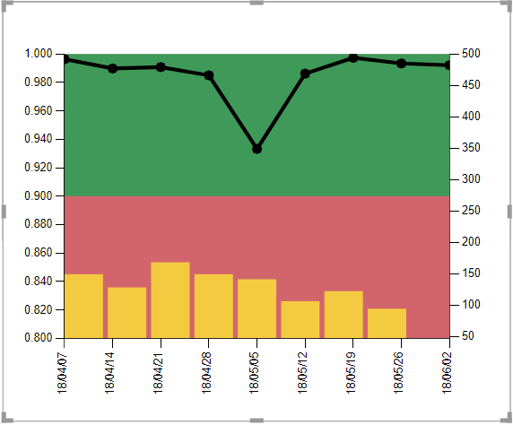
Y-axis formatting needs work. In the screenshot, you can see a y axis showing percentages as .96 and .88. You should be able to select "none" on the formatting and it display as a percentage as the other visuals do.
Otherwise, this is a cool visual with many use cases.