MOBILE: Style mobile menu #227
Description
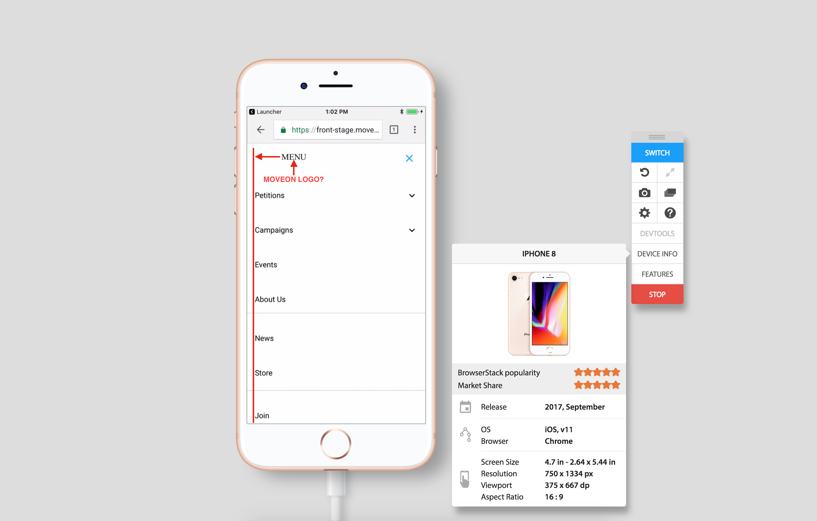
Description: Expanding the menu in mobile display a white background and black text. Should the mobile menu display some branding elements to tie in the overall experience?
ENV: STG
Browser: CHROME (latest)
OS: iOS 11
Priority: LOW
Steps To Reproduce:
- On a mobile device Navigate to: broom.moveon.org/ or front-stage.moveon.org
- Select the menu icon
Expected Result: The expanded menu exhibits similar design/branding elements to the main page (as is on desktop)
Actual Result: The expanded menu has minimal branding elements and feels like a new experience - the heading "Menu" also appears misaligned.
SCREENSHOT: